William Dobson Palette 3

Palette Analysis
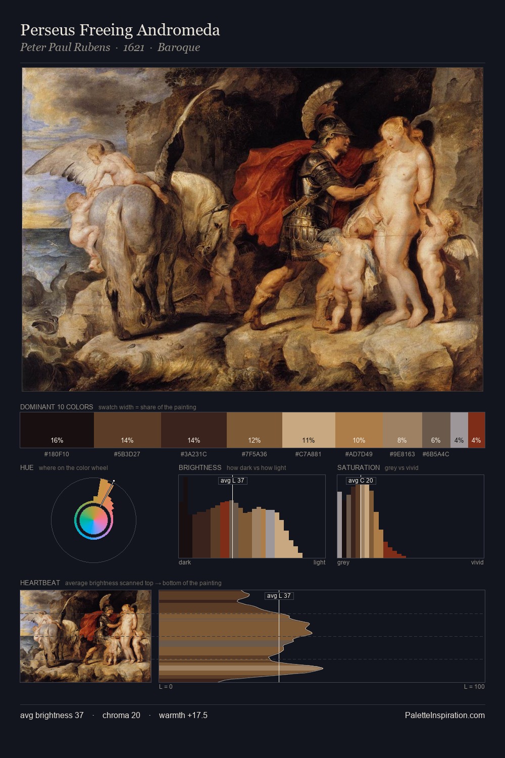
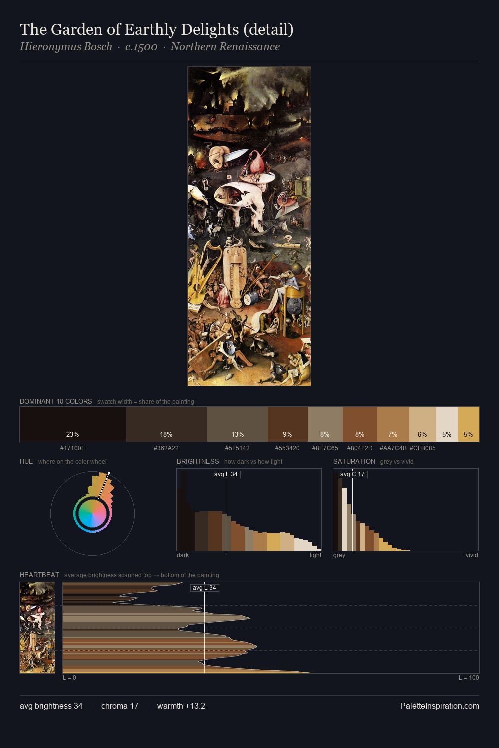
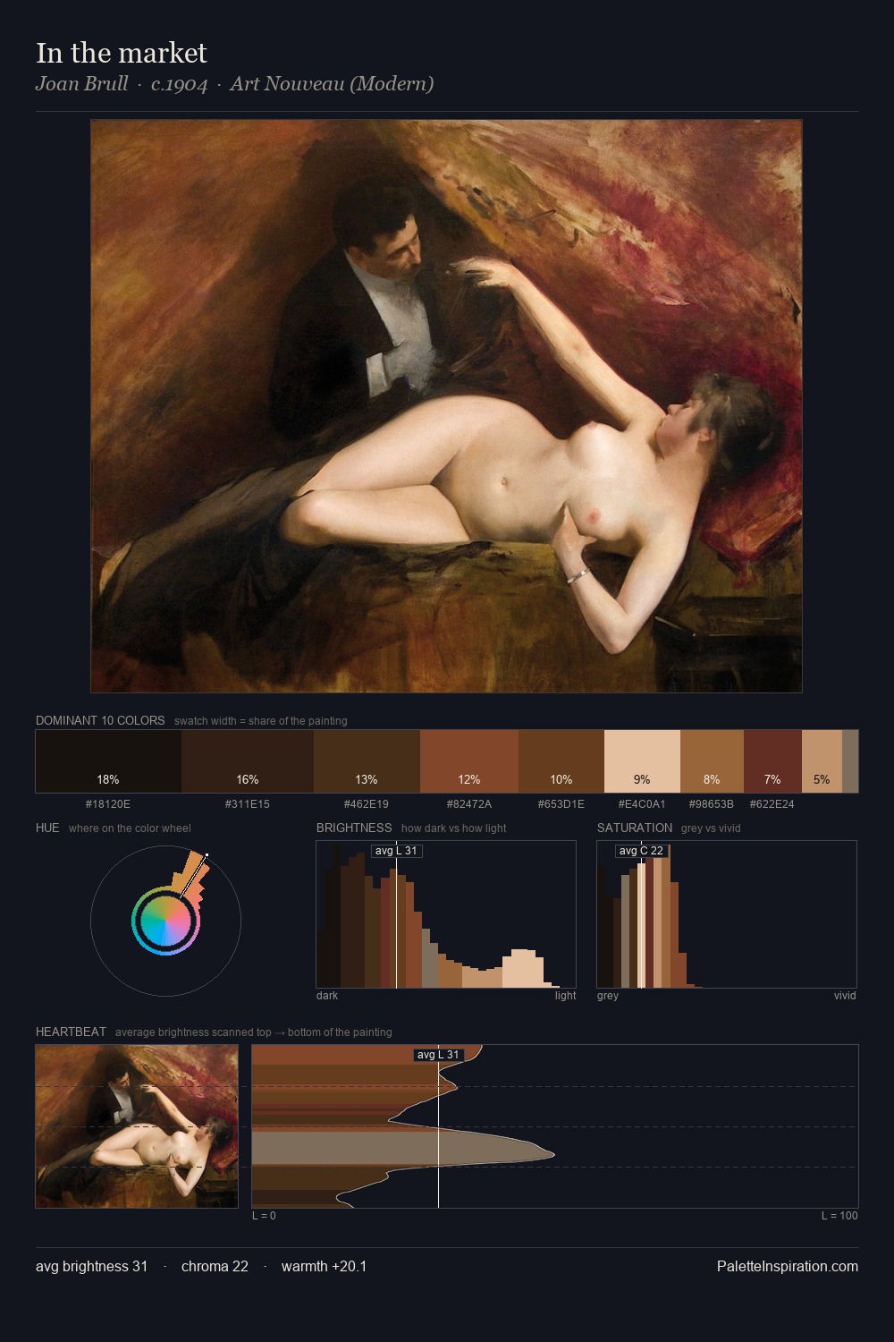
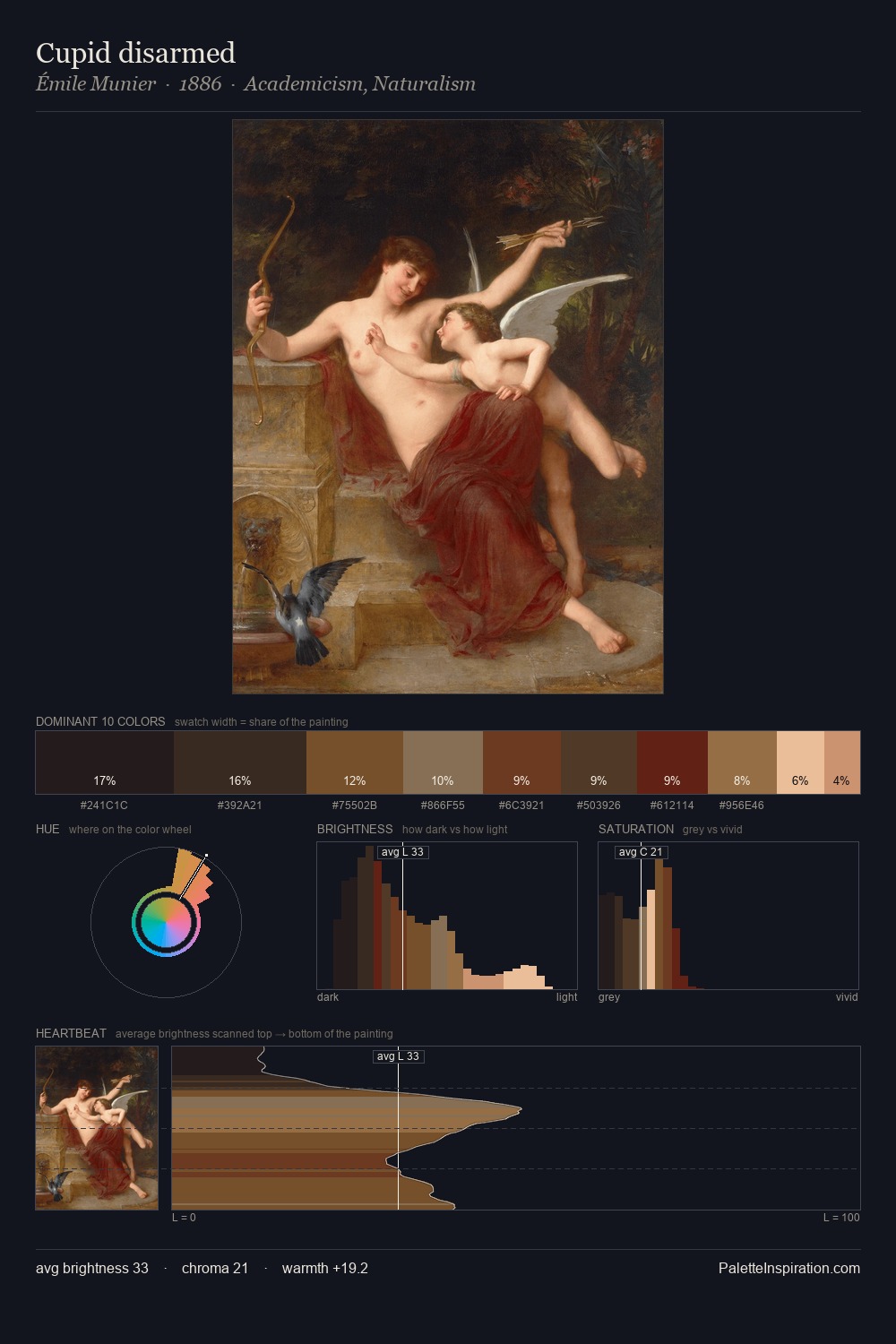
Low-key values are the structural spine of William Dobson, giving it gravity and atmosphere. Warmth dominates - the palette of William Dobson leans heavily on the yellow-orange-red arc of the colour wheel. Saturation is deliberately withheld - the beauty here lies in the near-monochromatic gradations rather than colour difference. #1E1A15 at 30.2% of the palette: an overwhelming presence that pulls all other colours into its gravitational field. The highest-chroma note - #9D6C35 - appears at just 4.3%, deployed as a precision accent against the quieter ground. A value spread of 63 units gives the palette both depth and air - shadows are genuinely dark, lights genuinely light. Together these qualities place William Dobson firmly in the tonal tradition - concerned with mood and atmosphere rather than chromatic display. William Dobson's palette 3 carries its own internal logic while remaining in conversation with the artist's broader colour intelligence.
Example use cases
- music labels
- luxury hospitality
- editorial photography
- leather goods
- premium streaming
I Love This!
Copy, export, or download for your project