William Dobson Palette 1

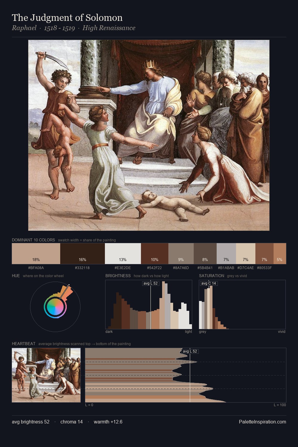
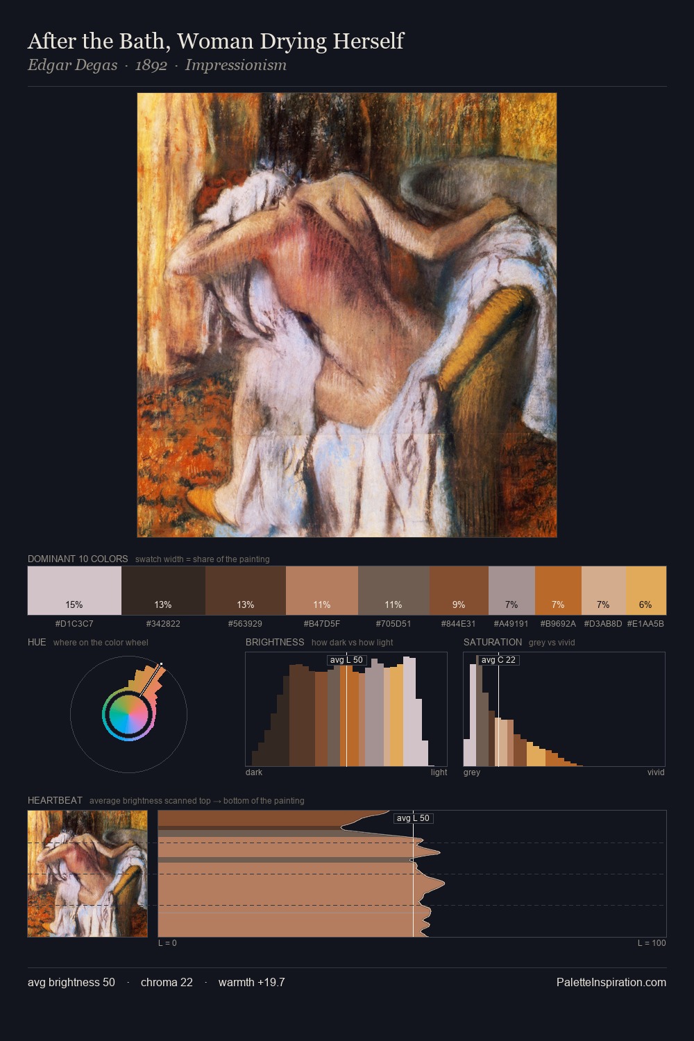
Palette Analysis
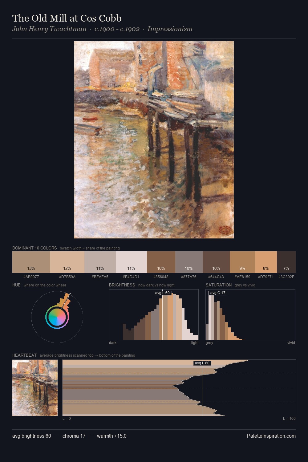
William Dobson distributes its values across the middle register, creating harmony without high contrast. Warmth dominates - the palette of William Dobson leans heavily on the yellow-orange-red arc of the colour wheel. Muted throughout, the palette achieves its effects through value and temperature rather than chromatic force. At 36.8%, #58463F functions less as a colour accent and more as a complete atmospheric environment. The highest-chroma note - #CA9358 - appears at just 10.1%, deployed as a precision accent against the quieter ground. Value range is moderate at 47 units - enough contrast for legibility, not so much as to fragment the tonal unity. This is palette 1 of William Dobson's sequence - a single chapter in a chromatic story told across many works.
Example use cases
- ceramics & pottery
- boutique hospitality
- menswear
- heritage food brands
- craft & artisan brands
I Love This!
Copy, export, or download for your project