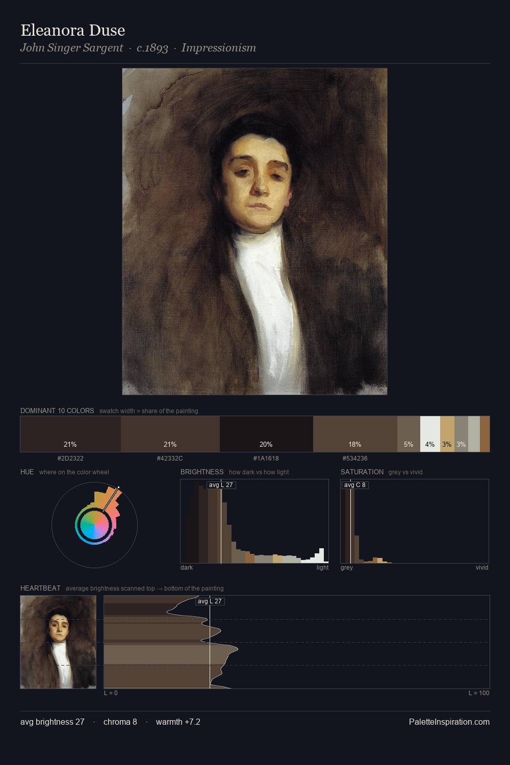
William Crawford Master Palette
Shadowed Tawny
Shadowed Low-key - values weighted toward shadow, the palette of dim interiors and overcast skies.
Tawny Warm orange-brown - a traditional term for the color of tanned leather or lion fur.

Palette Analysis
William Crawford sits in the centre of the value range, lending the palette a sense of even, sustained light. The palette achieves thermal balance - reds and blues, ochres and greens, each holding the other in check. Saturation is deliberately withheld - the beauty here lies in the near-monochromatic gradations rather than colour difference. Only 8.0% is devoted to #543321, yet that small allocation delivers the palette's entire chromatic tension. A value spread of 73 units gives the palette both depth and air - shadows are genuinely dark, lights genuinely light. This is the light William Crawford preferred, made measurable.
Example use cases
- music labels
- luxury hospitality
- editorial photography
- leather goods
- premium streaming
I Love This!
Use This Palette
Copy, export, or download for your project
Copy, export, or download for your project
Copy:
Download:
Share: