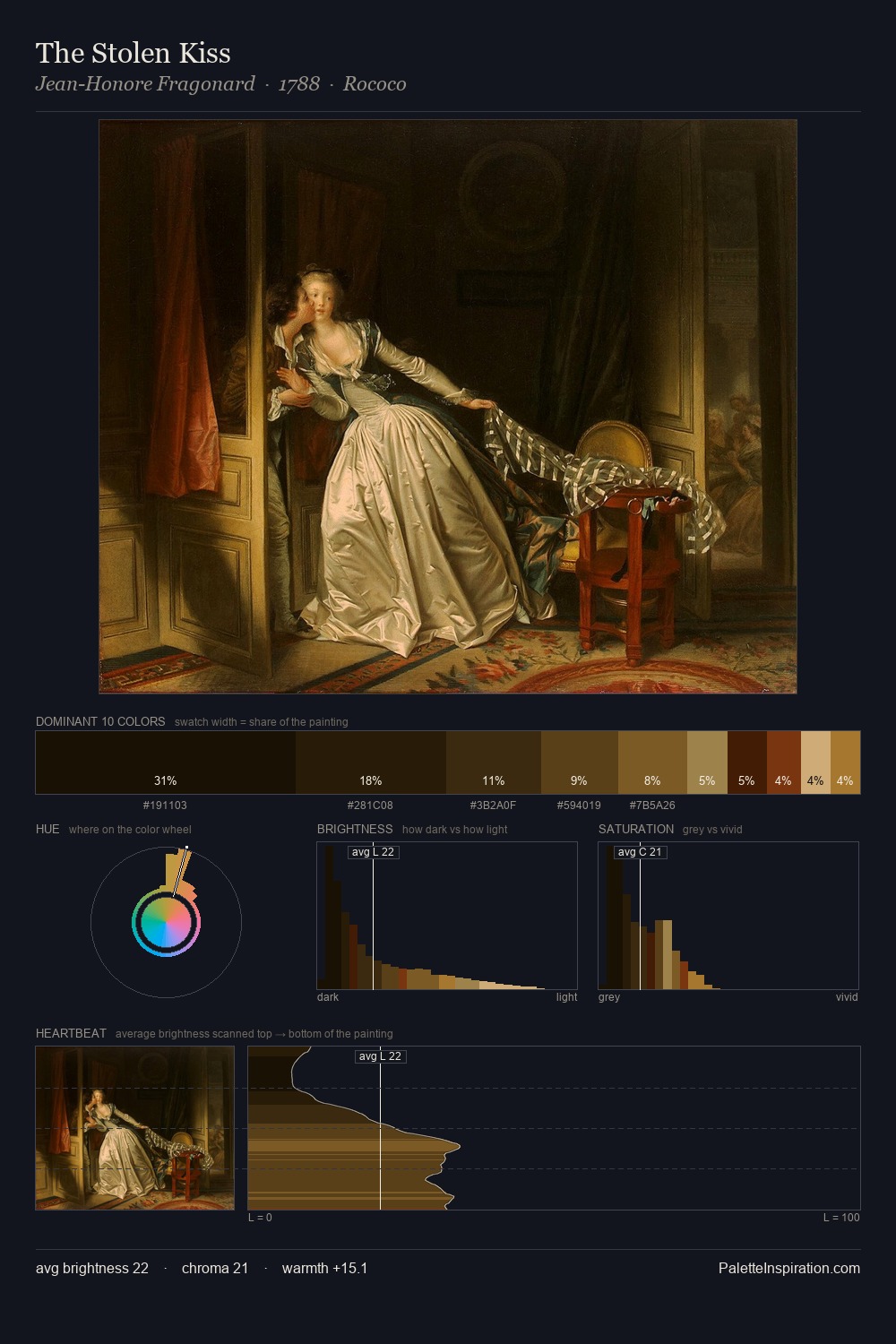
Willem Wissing Palette 2
Tenebrous Bister
Tenebrous Dark and murky - low-key values with obscured form, Baroque in temperament.
Bister Dark warm brown - a traditional ink and wash pigment made from wood soot.

Palette Analysis
Willem Wissing dwells firmly in the shadows, with no more than a whisper of light. Cool tones set the register here - the blues and greens easily outweigh any warm accents. Muted throughout, the palette achieves its effects through value and temperature rather than chromatic force. The highest-chroma note - #43330A - appears at just 13.8%, deployed as a precision accent against the quieter ground. 57 units of value range underpin the palette's structural clarity: the eye always knows where light falls. This tonal restraint is characteristic of the Willem Wissing approach: colour serves light, not the reverse. This is palette 2 of Willem Wissing's sequence - a single chapter in a chromatic story told across many works.
Example use cases
- theater design
- jewelry brands
- tobacco-adjacent retail
- event branding
- film & entertainment
I Love This!
Use This Palette
Copy, export, or download for your project
Copy, export, or download for your project
Copy:
Download:
Share: