Willem de Poorter Master Palette

Palette Analysis
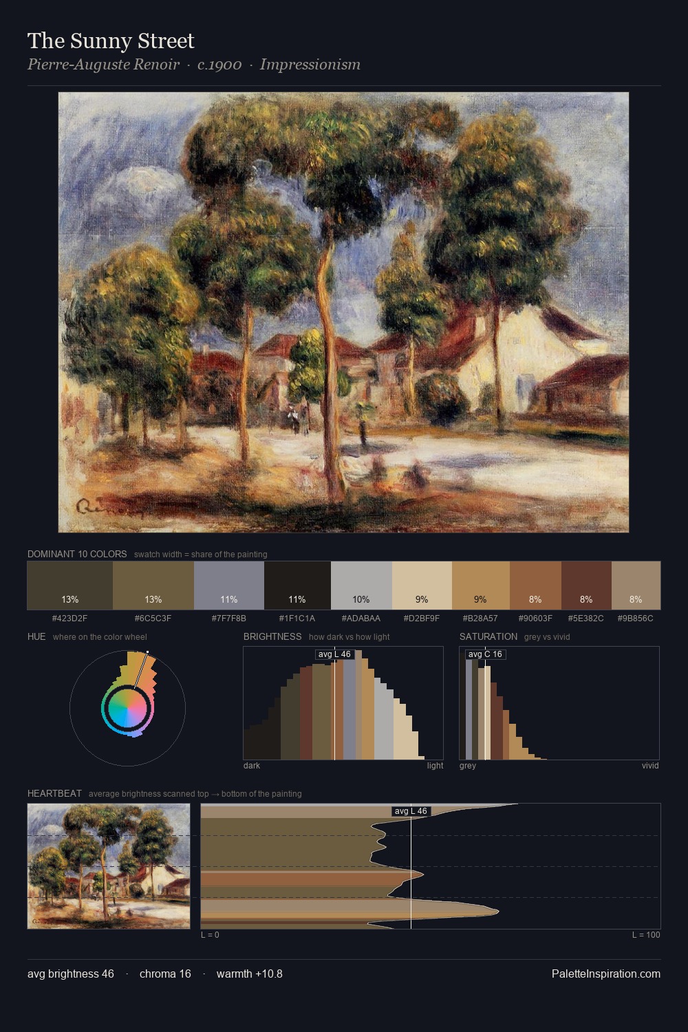
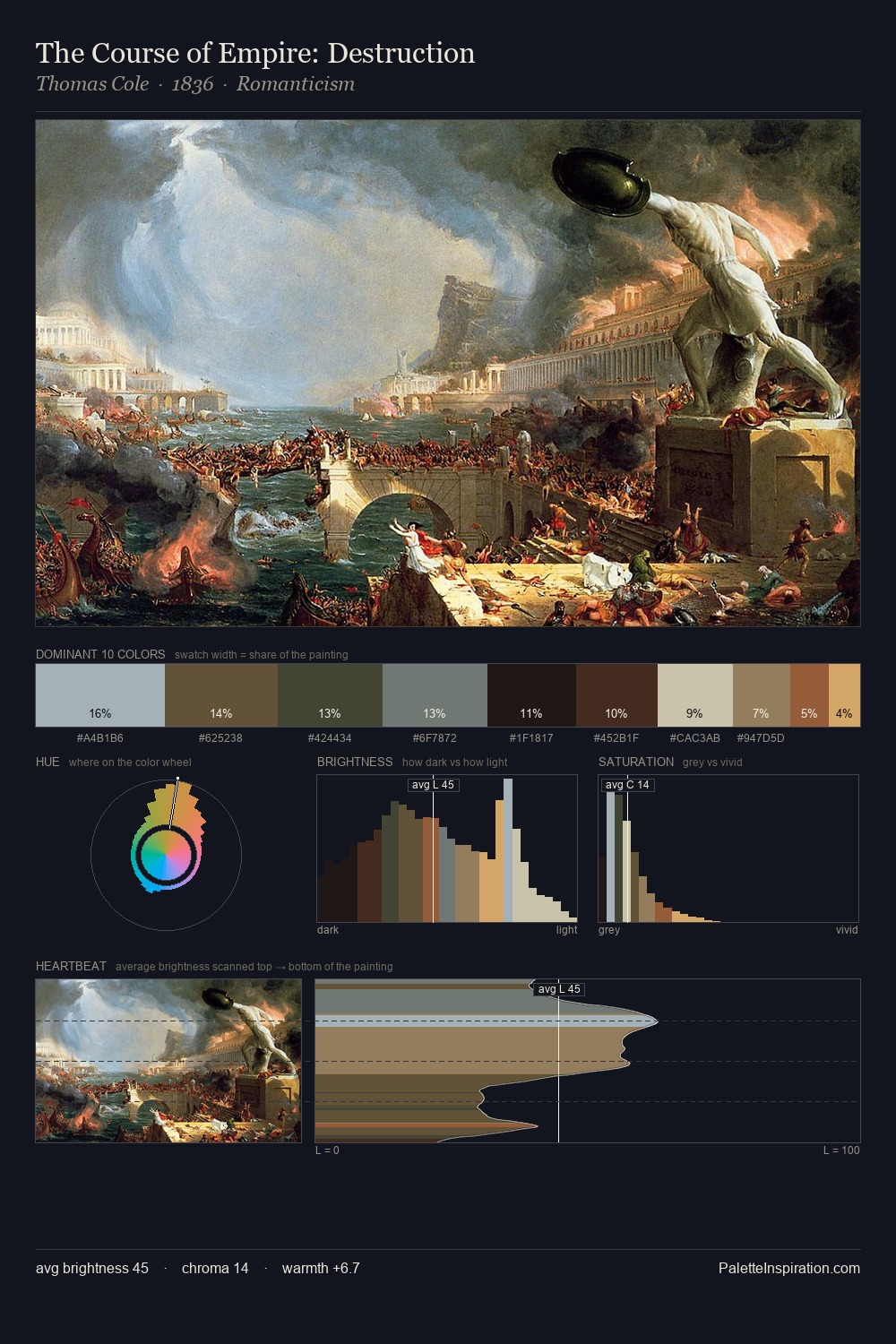
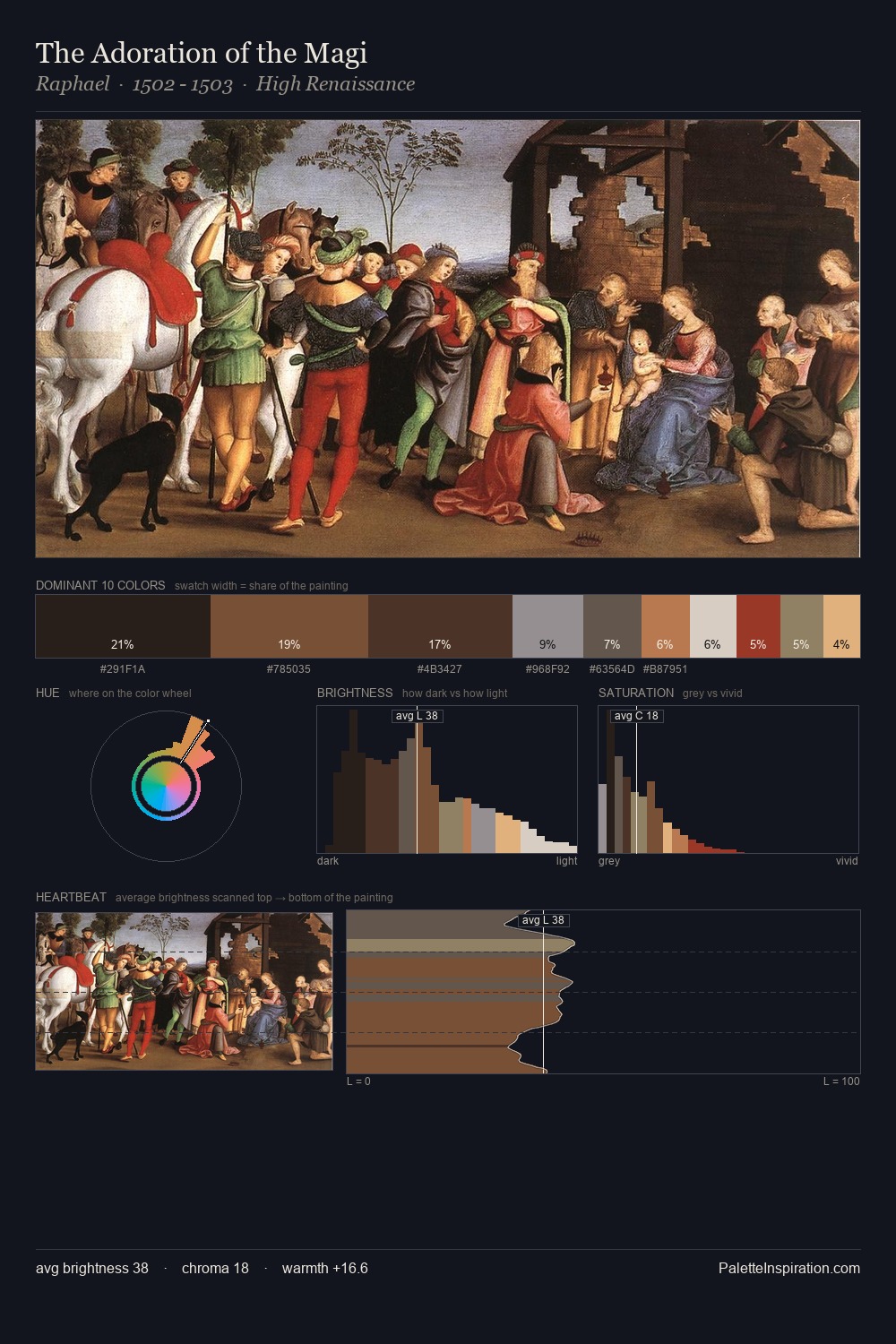
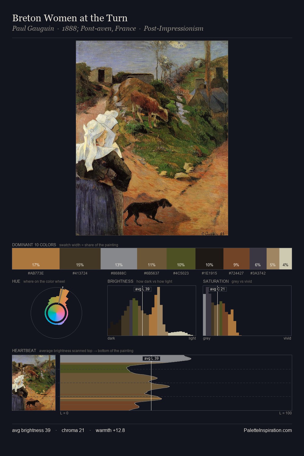
Willem de Poorter keeps values measured and balanced, a hallmark of tonal restraint. Cool hues prevail: blues, greens, and greys anchor the palette's emotional temperature. Saturation is deliberately withheld - the beauty here lies in the near-monochromatic gradations rather than colour difference. Only 5.0% is devoted to #8F5940, yet that small allocation delivers the palette's entire chromatic tension. The value range spans 61 units across the palette, providing the full gamut from deep shadow to near-white and ensuring clear tonal hierarchy. The mid-to-high key, cool bias, and moderate chroma point to outdoor observation - sky and diffused daylight as the dominant light source. Willem de Poorter arrived at this balance through long practice; the palette carries the weight of that experience.
Example use cases
- theater design
- jewelry brands
- tobacco-adjacent retail
- event branding
- film & entertainment
I Love This!
Copy, export, or download for your project