Wilhelm Frey Palette 1

Palette Analysis
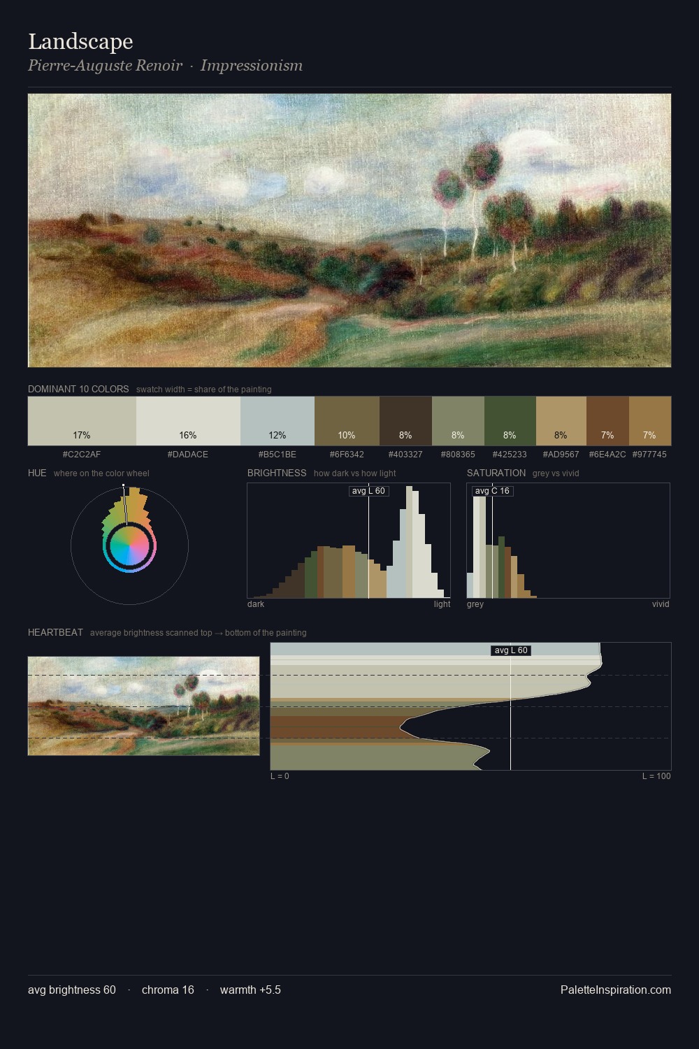
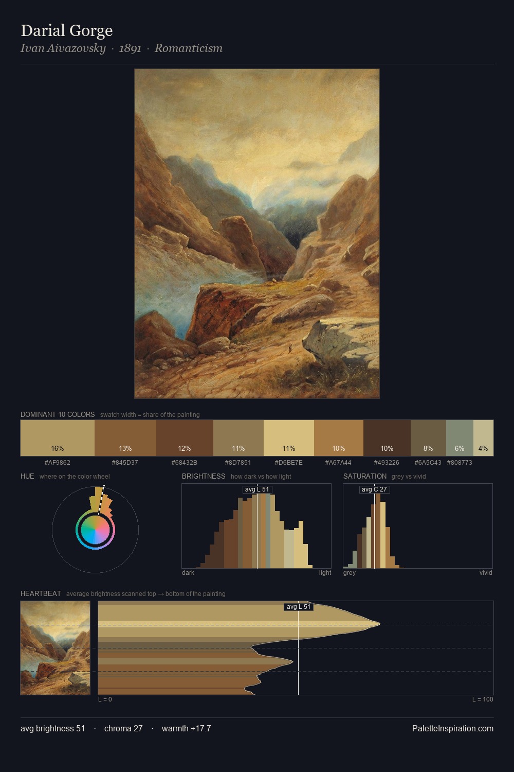
The value structure of Wilhelm Frey is mid-key: quiet, controlled, and cohesive. Blues and teal-greys govern the palette, lending it an aquatic or atmospheric quality. Saturation is deliberately withheld - the beauty here lies in the near-monochromatic gradations rather than colour difference. The dominant colour, #7D8571, takes 29.7% of the total area, establishing the overall mood before any other hue is introduced. At 3.1%, #6A4029 carries the palette's sharpest chromatic charge: an accent that earns its place precisely because it is withheld. The value range of 47 units sits in the comfortable middle: enough depth, enough light, neither extreme. The mid-to-high key, cool bias, and moderate chroma point to outdoor observation - sky and diffused daylight as the dominant light source. Palette 1 sits within the larger chromatic argument that Wilhelm Frey's complete body of work advances.
Example use cases
- museums & galleries
- academic publishing
- heritage brands
- auction houses
- exhibition design
I Love This!
Copy, export, or download for your project