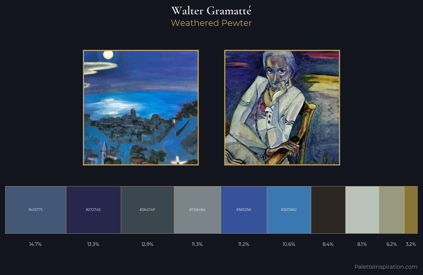
Walter Gramatté Palette 7
Palette Analysis
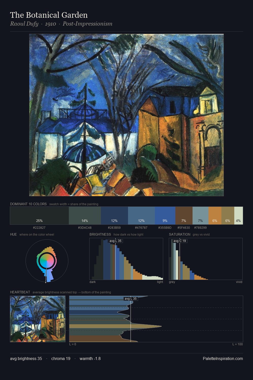
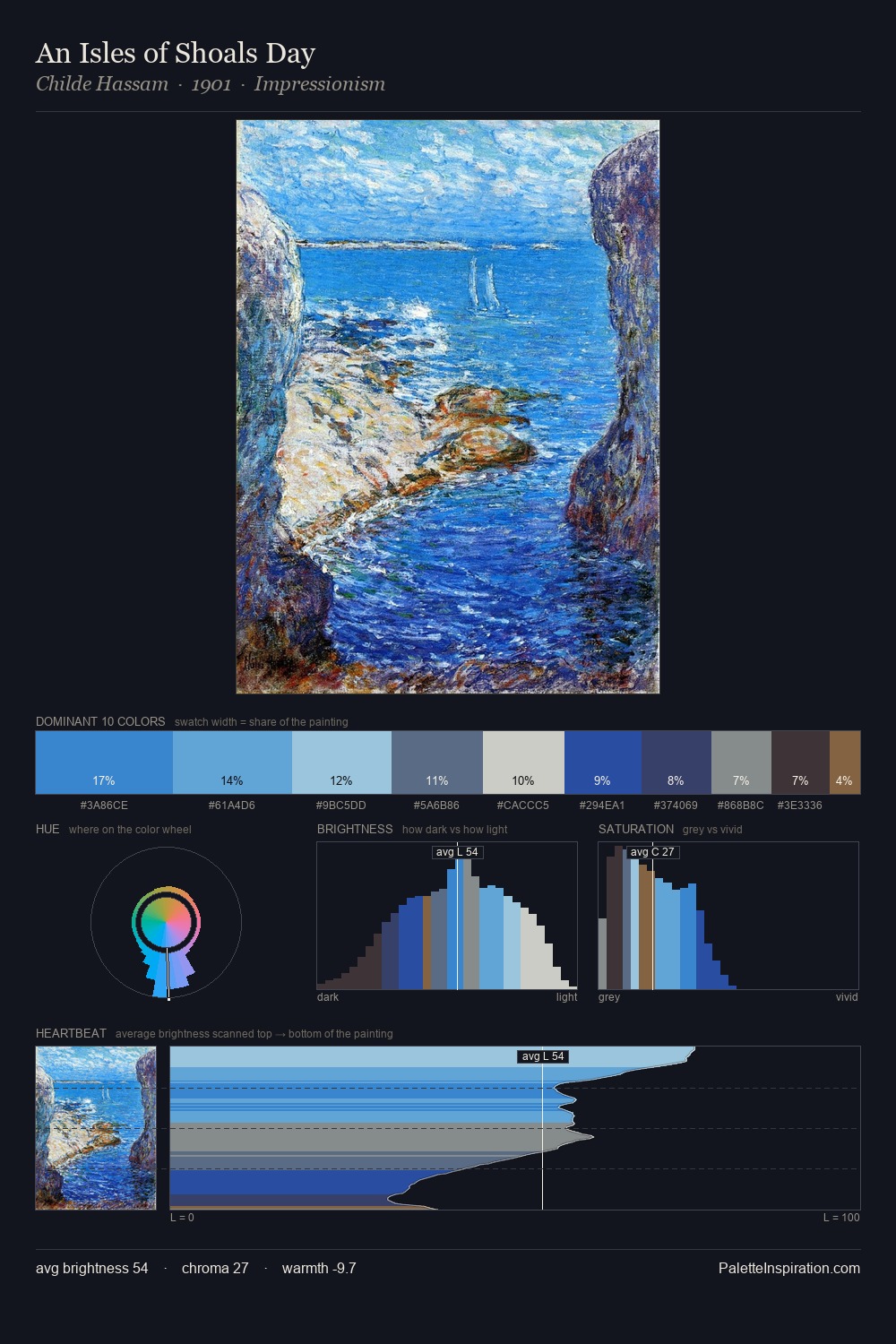
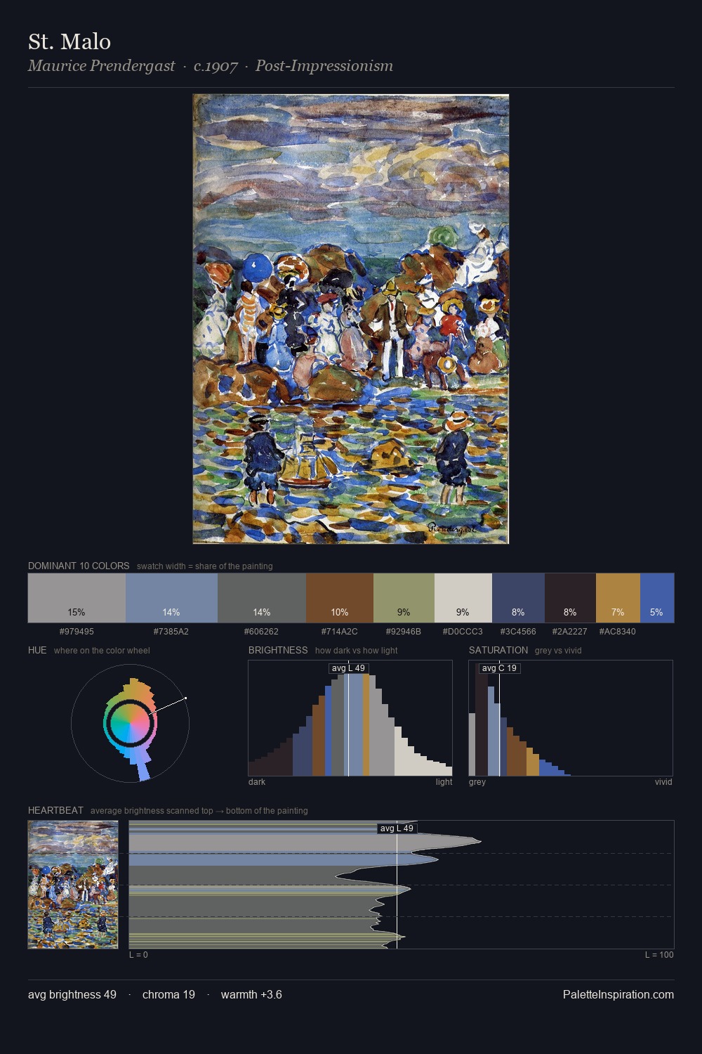
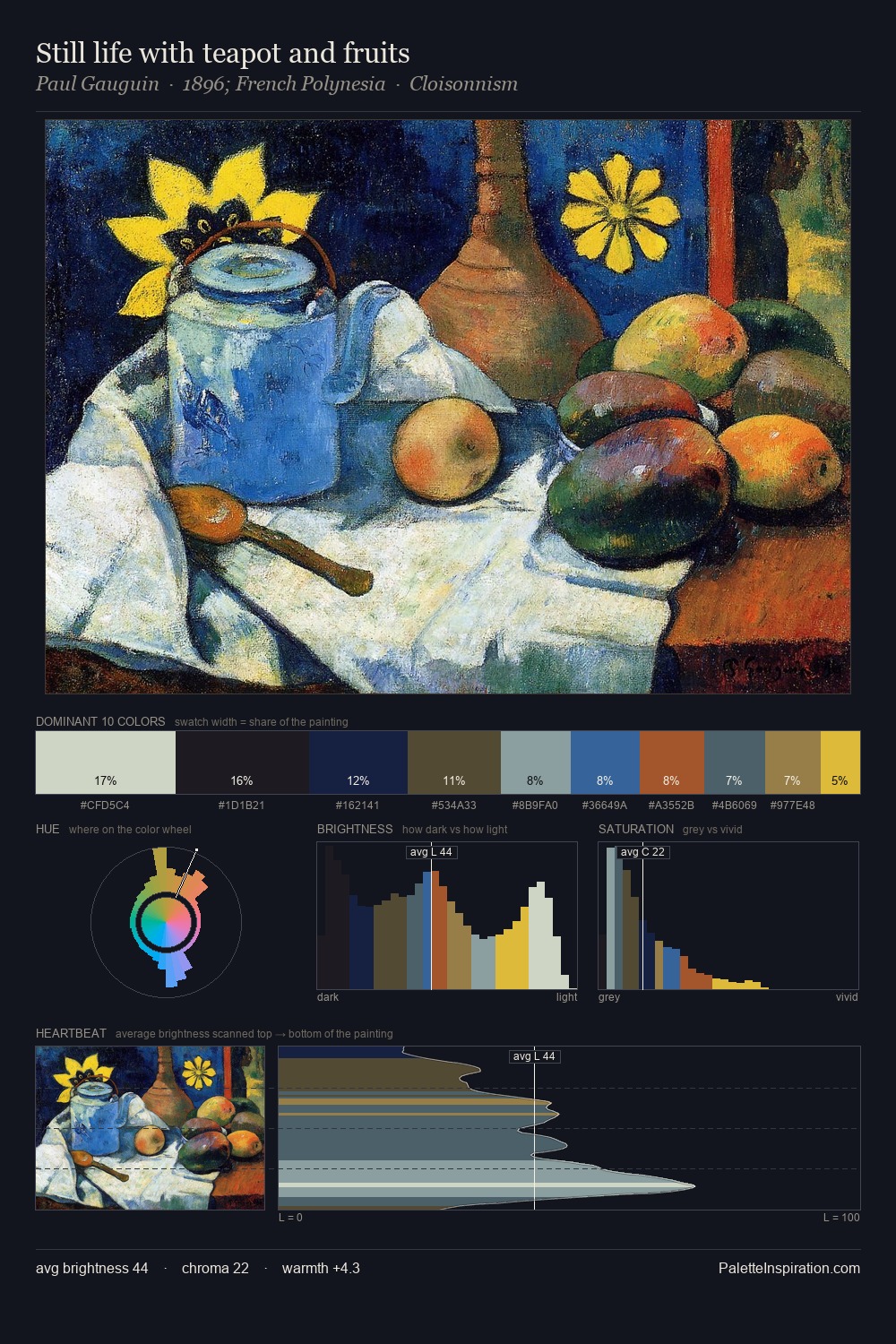
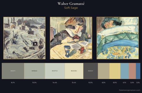
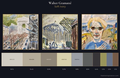
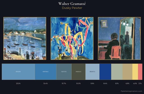
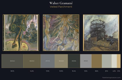
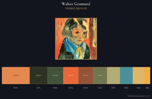
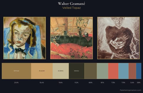
Walter Gramatté keeps values measured and balanced, a hallmark of tonal restraint. A distinctly cool atmosphere runs through this palette: sky, water, and mist given colour form. Chroma hovers near zero; colour declares itself through subtle shifts in hue rather than outright saturation. The most saturated colour, #36529A, is reserved to 11.2% of the surface, where it acts as a focal punctuation. Spanning 54 units on the value axis, the palette achieves the balance between tonal flatness and fragmentation. The mid-to-high key, cool bias, and moderate chroma point to outdoor observation - sky and diffused daylight as the dominant light source. This is palette 7 of Walter Gramatté's sequence - a single chapter in a chromatic story told across many works.
Example use cases
- publishing
- corporate identity
- consumer apps
- hospitality
- design agencies
I Love This!
Copy, export, or download for your project