Vittore Carpaccio Palette 3
Muted Gamboge
Muted Deliberately desaturated - chroma pulled toward gray, the restraint of tonal painting.
Gamboge Deep golden yellow - a traditional warm pigment, rich amber-gold.

Palette Analysis
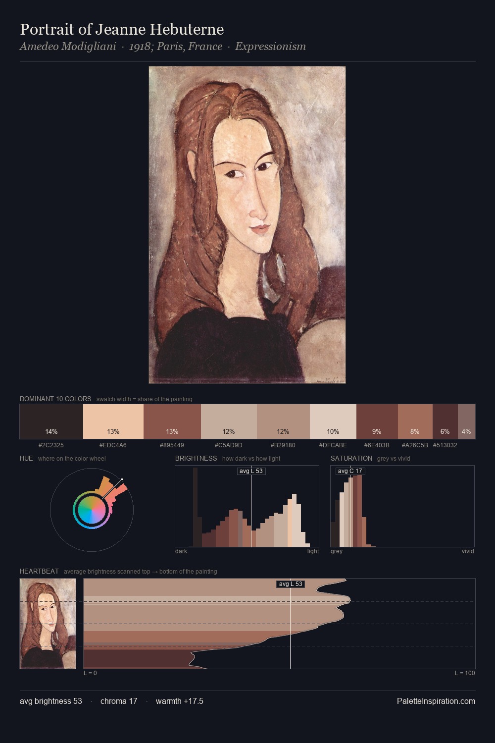
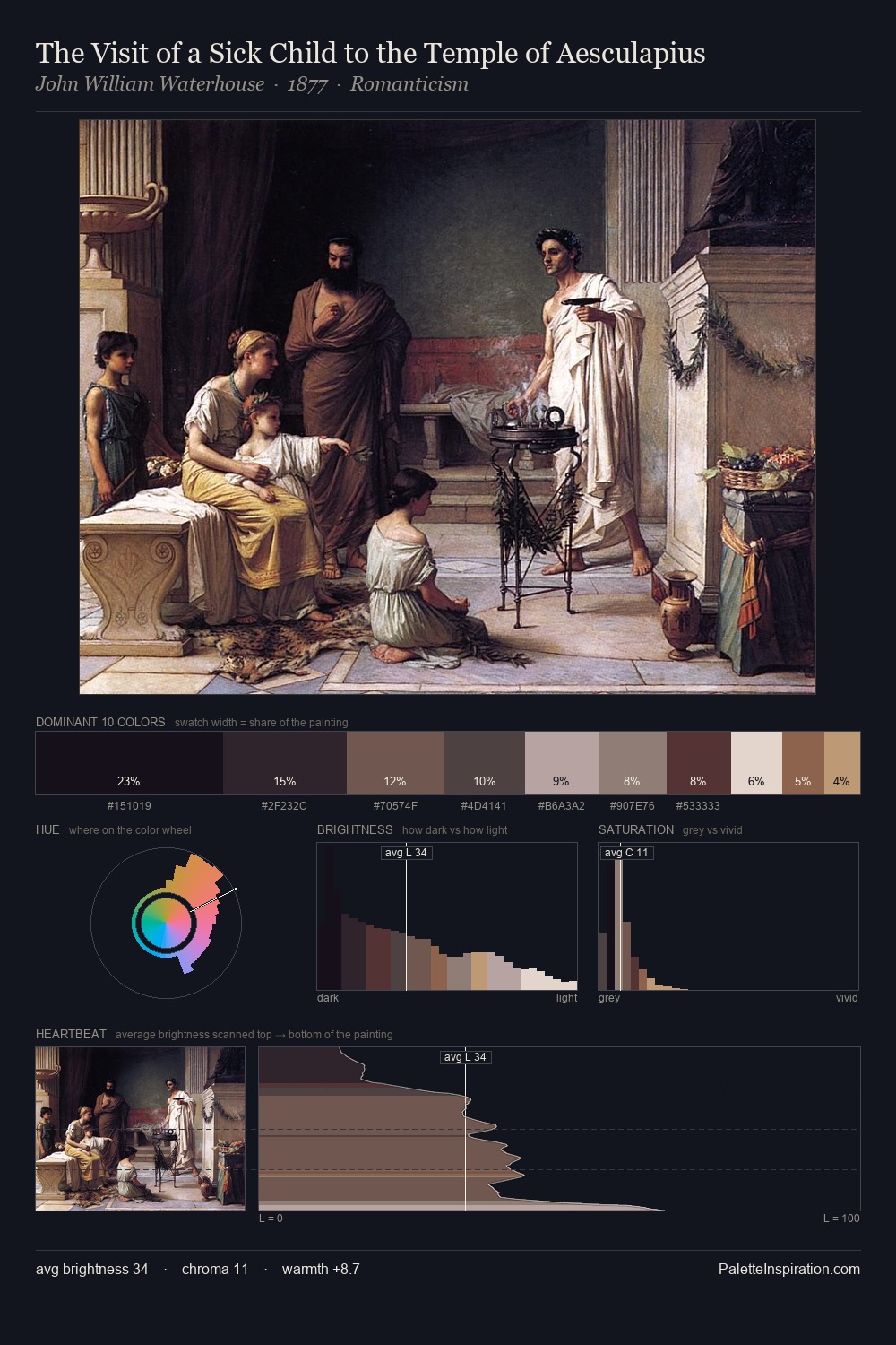
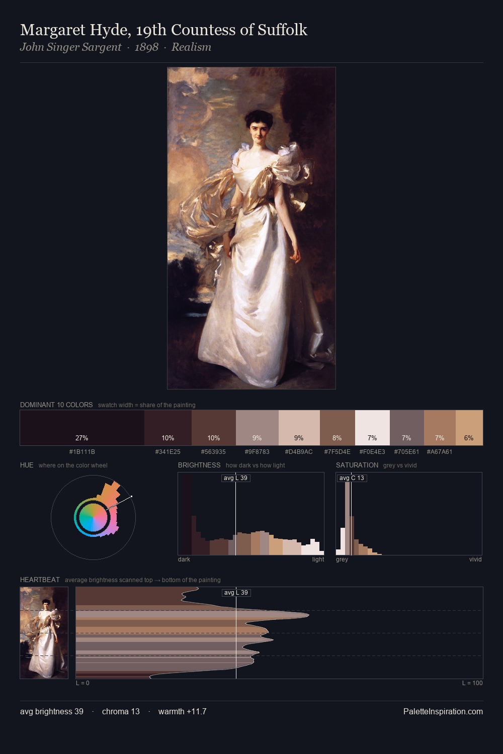
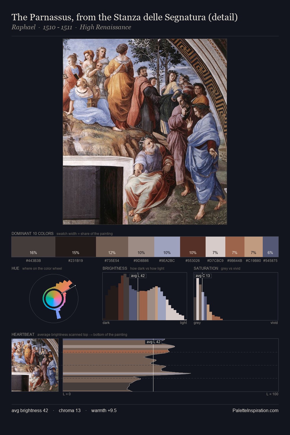
Vittore Carpaccio occupies the comfortable middle of the value scale, avoiding both extremes to hold the eye in a sustained middle grey. Temperature reads distinctly warm: the reds and earth tones from Vittore Carpaccio carry the compositional weight. All colours lean toward grey, building depth through value rather than colour punch. The most saturated colour, #BE9B81, is reserved to 9.6% of the surface, where it acts as a focal punctuation. The full value range is 63 units: broad enough to build convincing three-dimensional form. This is palette 3 of Vittore Carpaccio's sequence - a single chapter in a chromatic story told across many works.
Example use cases
- boutique hospitality
- film production
- menswear
- art prints & posters
- heritage brands
I Love This!
Use This Palette
Copy, export, or download for your project
Copy, export, or download for your project
Copy:
Download:
Share: