Vincenzo Irolli Palette 1

Palette Analysis
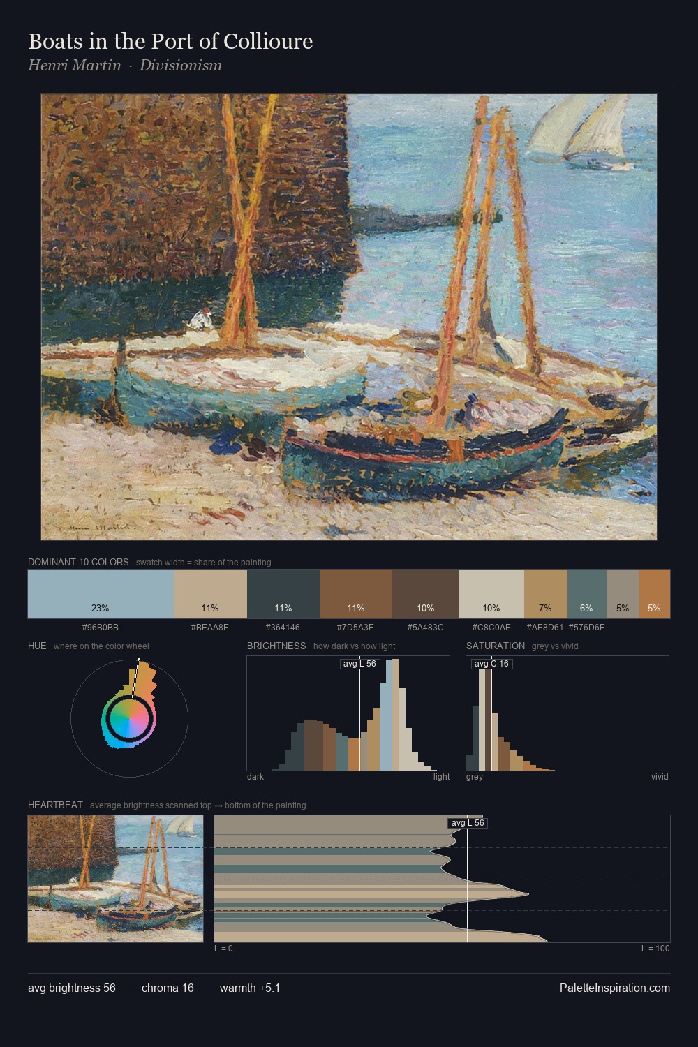
Vincenzo Irolli occupies the comfortable middle of the value scale, avoiding both extremes to hold the eye in a sustained middle grey. Vincenzo Irolli tilts toward cool - blues and silver-greys carry the structural weight. All colours lean toward grey, building depth through value rather than colour punch. The highest-chroma note - #97BCC0 - appears at just 6.3%, deployed as a precision accent against the quieter ground. 53 units of value spread create a palette that is varied but unified - contrast in the service of harmony. The palette has the character of outdoor light: cool, mid-bright, with colour rendered faithfully rather than expressively. In the context of Vincenzo Irolli's full range of palettes, group 1 represents one movement in an ongoing chromatic dialogue.
Example use cases
- ceramics & pottery
- boutique hospitality
- menswear
- heritage food brands
- craft & artisan brands
I Love This!
Copy, export, or download for your project