Vincenzo Camuccini Master Palette
Shadowed Gamboge
Shadowed Low-key - values weighted toward shadow, the palette of dim interiors and overcast skies.
Gamboge Deep golden yellow - a traditional warm pigment, rich amber-gold.

Palette Analysis
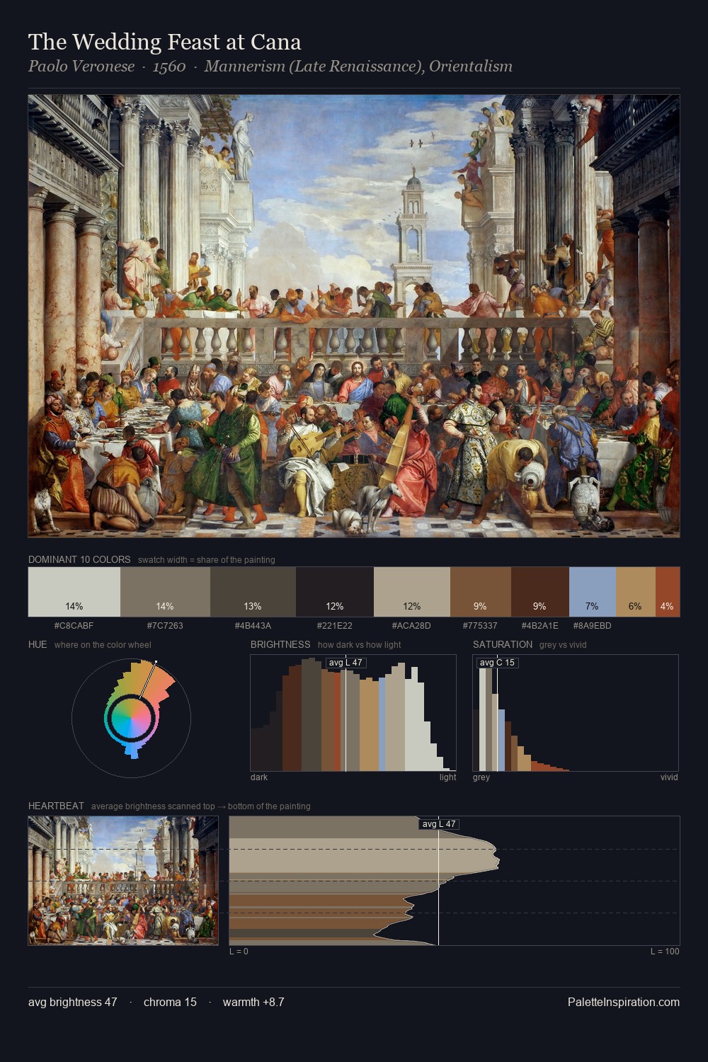
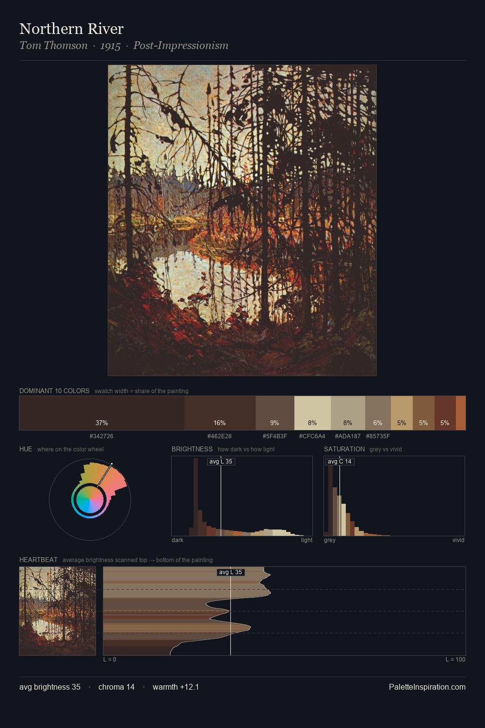
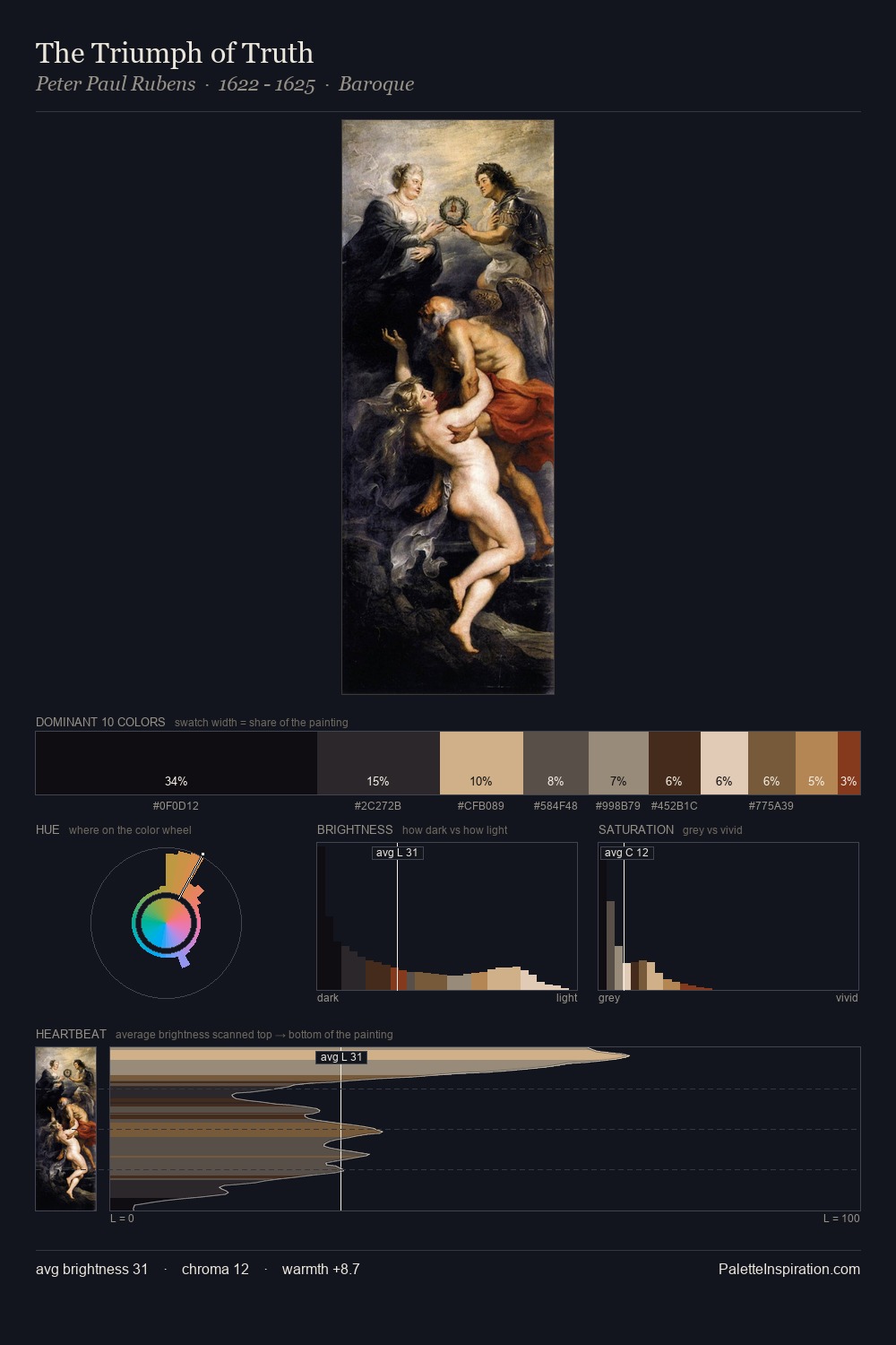
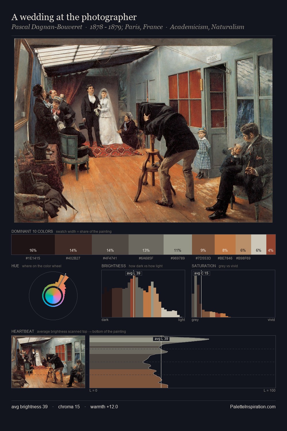
The value structure of Vincenzo Camuccini is mid-key: quiet, controlled, and cohesive. Vincenzo Camuccini orchestrates warmth above all else - reds, ambers, and siennas take the lead. The absence of saturated colour is itself an expressive choice: this is a palette of restraint and atmosphere. The most saturated colour, #BF7B4F, is reserved to 4.1% of the surface, where it acts as a focal punctuation. At 59 units of value range, the palette has the tonal breadth to sustain complex spatial readings. The palette is a signature: Vincenzo Camuccini's particular sense of value, warmth, and colour weight made legible.
Example use cases
- theater design
- jewelry brands
- tobacco-adjacent retail
- event branding
- film & entertainment
I Love This!
Use This Palette
Copy, export, or download for your project
Copy, export, or download for your project
Copy:
Download:
Share: