Vincenzo Camuccini Palette 6

Palette Analysis
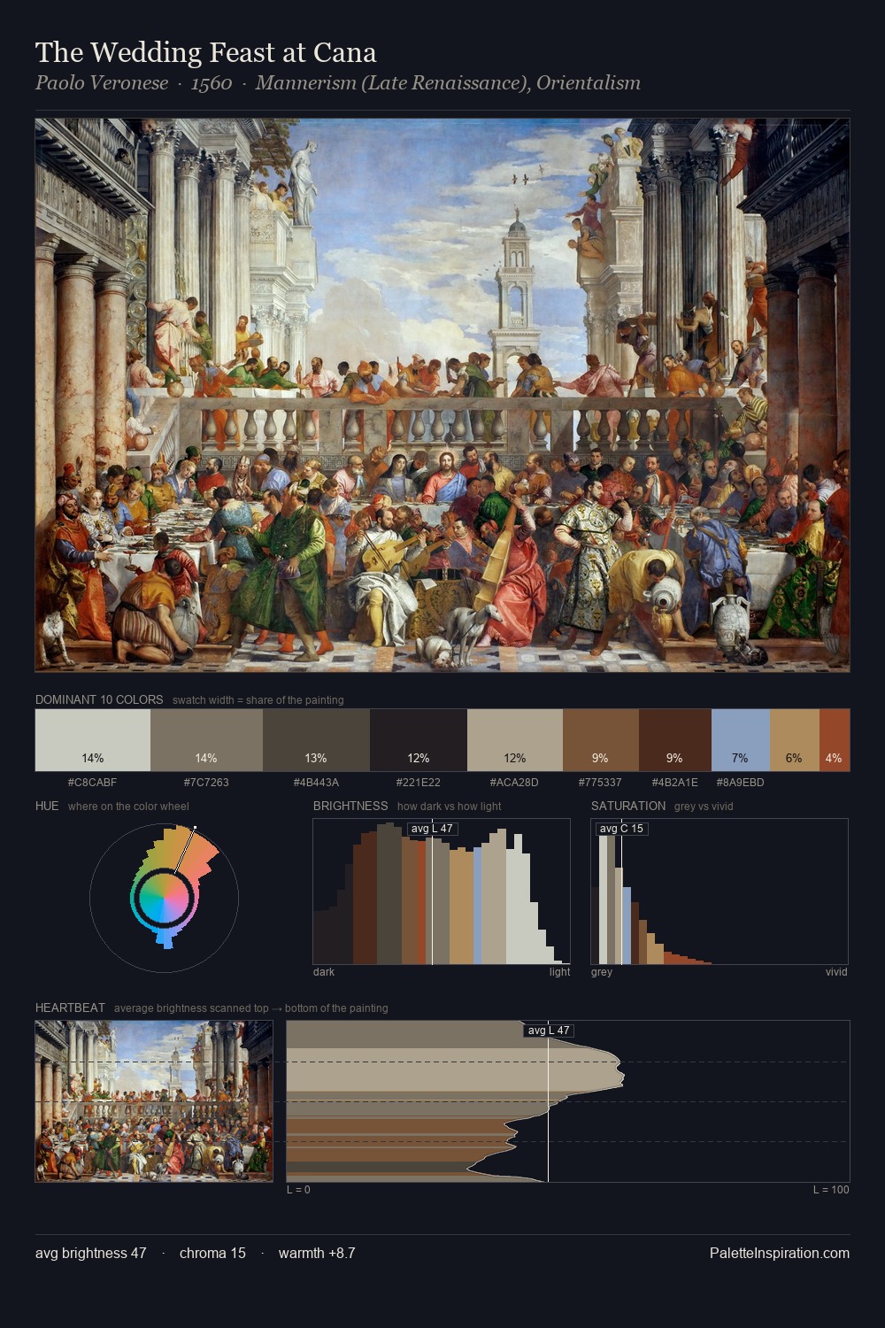
Values in Vincenzo Camuccini rest in the mid-range - neither dramatically lit nor steeped in shadow. Warm hues command this palette; Vincenzo Camuccini favours the reds, oranges, and yellows of firelight and earth. Chroma is kept low across all colours, producing the soft, enveloping quality that characterises tonal painting. The dominant colour, #594B3D, takes 27.7% of the total area, establishing the overall mood before any other hue is introduced. The saturated accent, #944326, registers at 4.0% - sparse enough to feel like a deliberate surprise. At 53 units across the value scale, the palette keeps contrast readable without letting it dominate. In the context of Vincenzo Camuccini's full range of palettes, group 6 represents one movement in an ongoing chromatic dialogue.
Example use cases
- theater design
- jewelry brands
- tobacco-adjacent retail
- event branding
- film & entertainment
I Love This!
Copy, export, or download for your project