Vilhelms Purvitis Palette 4

Palette Analysis
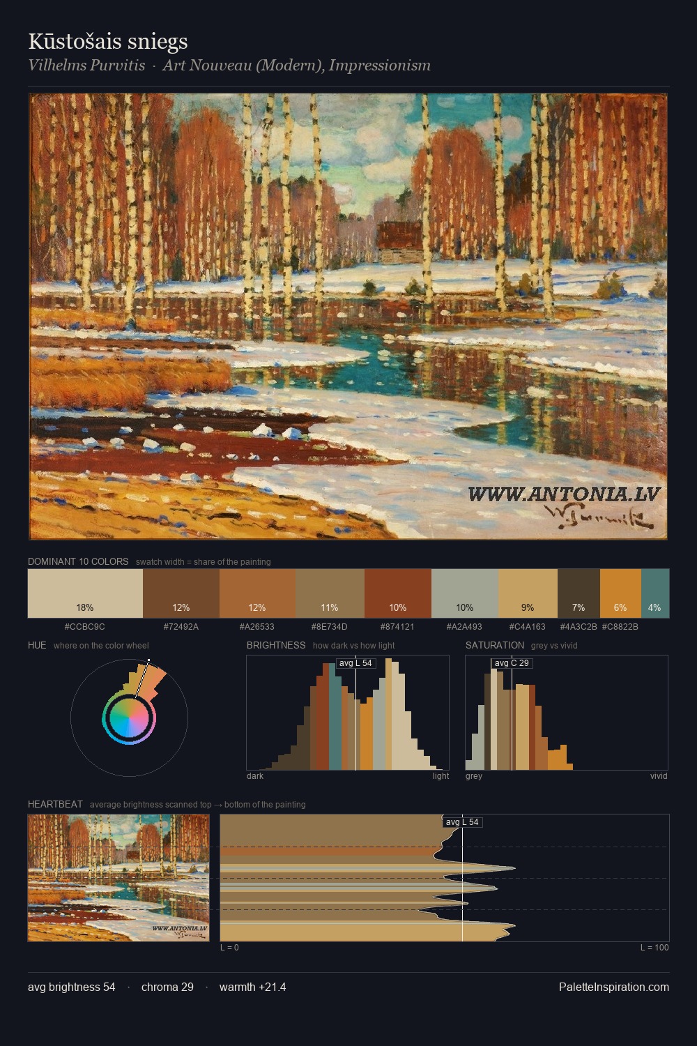
Vilhelms Purvitis sits in the centre of the value range, lending the palette a sense of even, sustained light. Warm and cool tones are held in careful balance - neither family dominates, creating tension and resolution simultaneously. Mid-range chroma keeps the palette grounded - colourful but not strident. At 5.0%, #C58232 carries the palette's sharpest chromatic charge: an accent that earns its place precisely because it is withheld. Value range is moderate at 44 units - enough contrast for legibility, not so much as to fragment the tonal unity. The palette reads as an Impressionist one - light-biased, chromatically direct, and built on temperature contrast rather than value opposition. Vilhelms Purvitis's palette 4 carries its own internal logic while remaining in conversation with the artist's broader colour intelligence.
Example use cases
- ceramics & pottery
- boutique hospitality
- menswear
- heritage food brands
- craft & artisan brands
I Love This!
Copy, export, or download for your project