Vilhelms Purvitis Palette 2

Palette Analysis
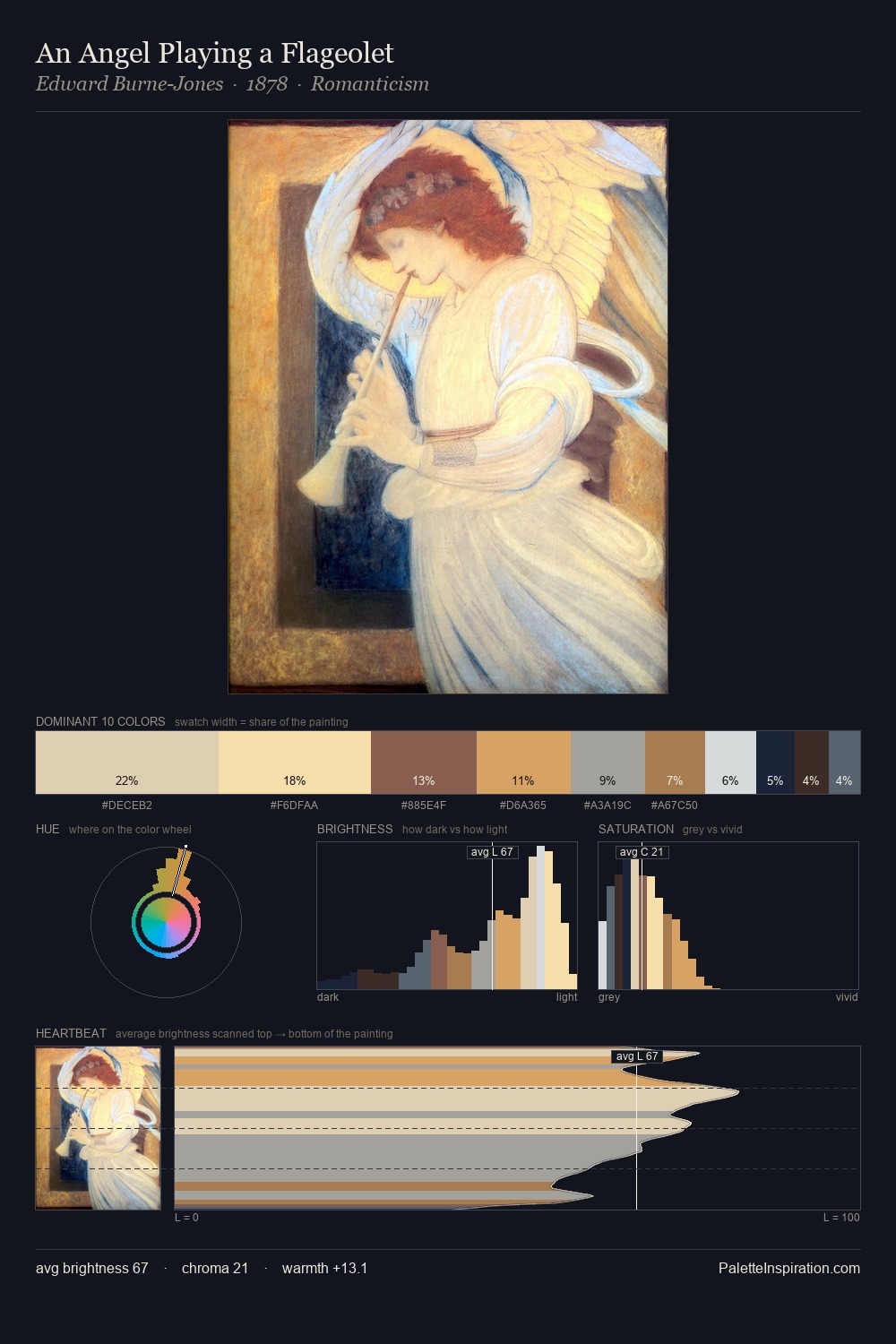
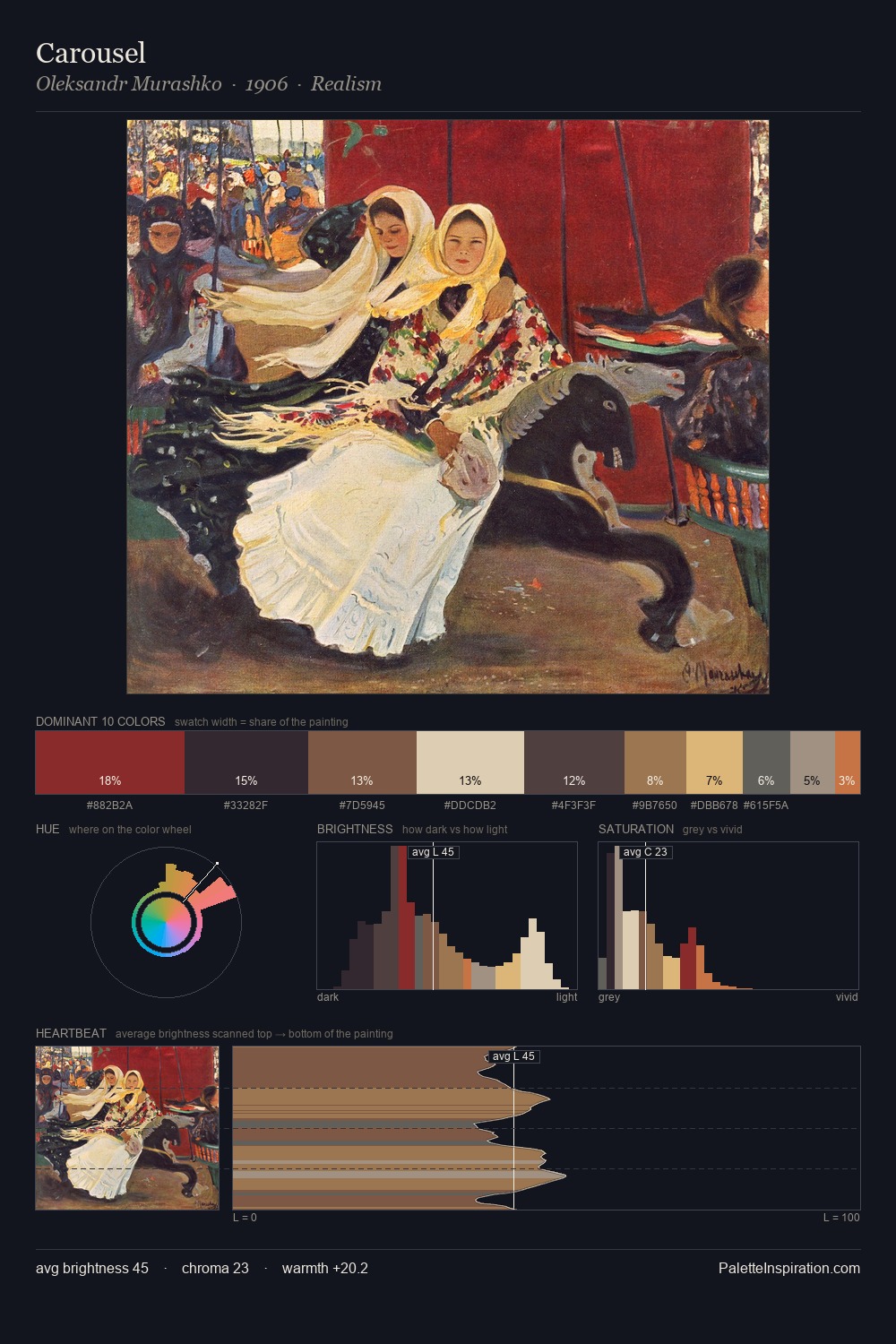
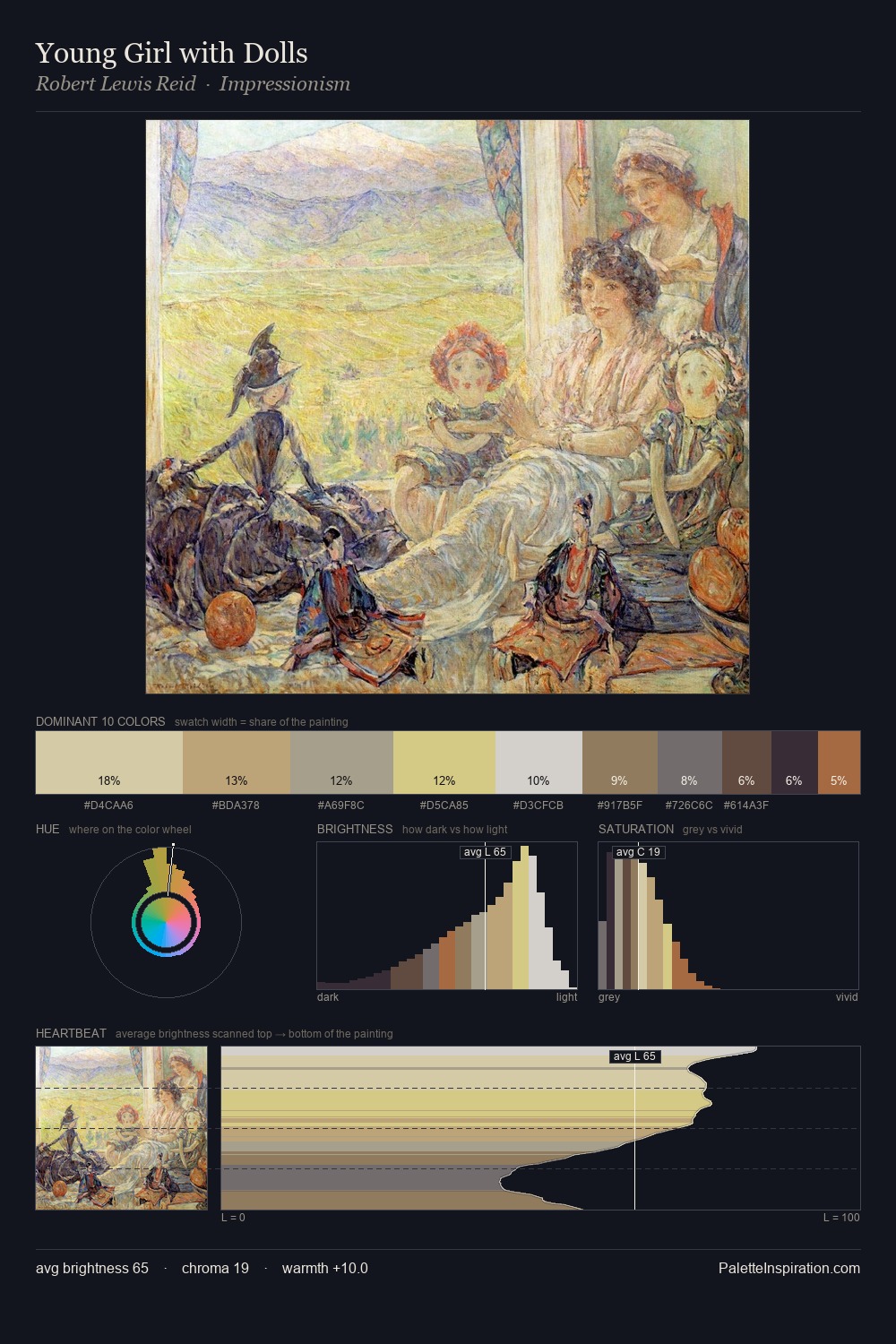
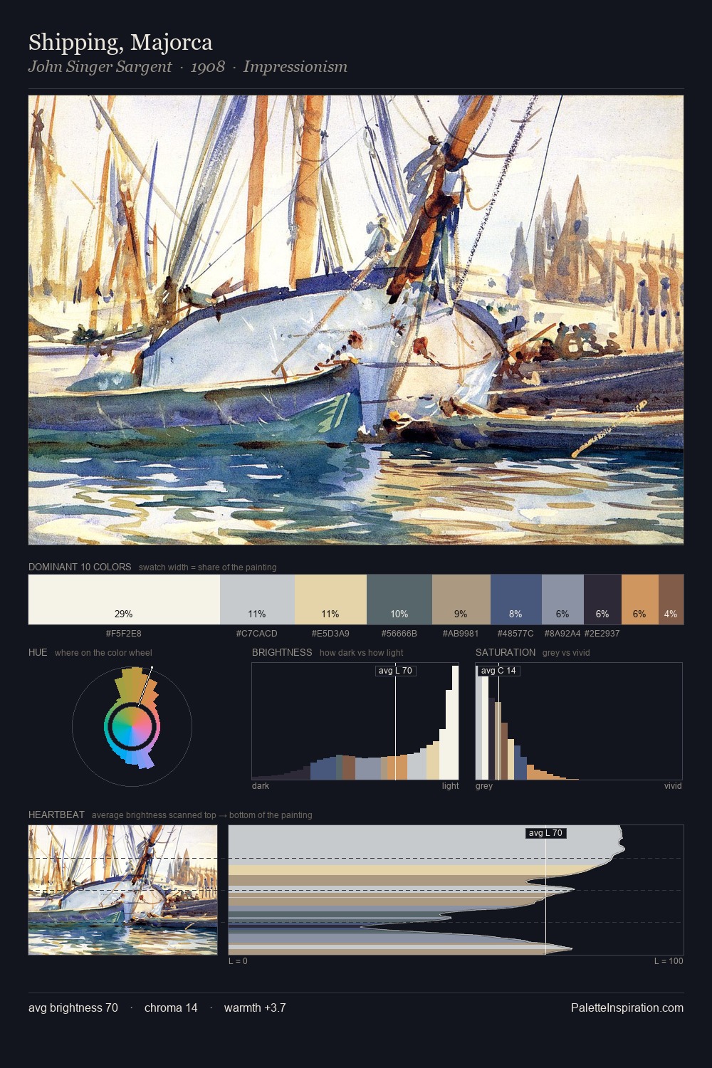
Values in Vilhelms Purvitis rest in the mid-range - neither dramatically lit nor steeped in shadow. Cool tones set the register here - the blues and greens easily outweigh any warm accents. Chroma is kept low across all colours, producing the soft, enveloping quality that characterises tonal painting. The saturated accent, #876451, registers at 8.1% - sparse enough to feel like a deliberate surprise. 61 units of value range underpin the palette's structural clarity: the eye always knows where light falls. The palette has the character of outdoor light: cool, mid-bright, with colour rendered faithfully rather than expressively. In the context of Vilhelms Purvitis's full range of palettes, group 2 represents one movement in an ongoing chromatic dialogue.
Example use cases
- archival print
- university identity
- rare books
- cultural institutions
- nonprofit identity
I Love This!
Copy, export, or download for your project