Viktor Vasnetsov Palette 2

Palette Analysis
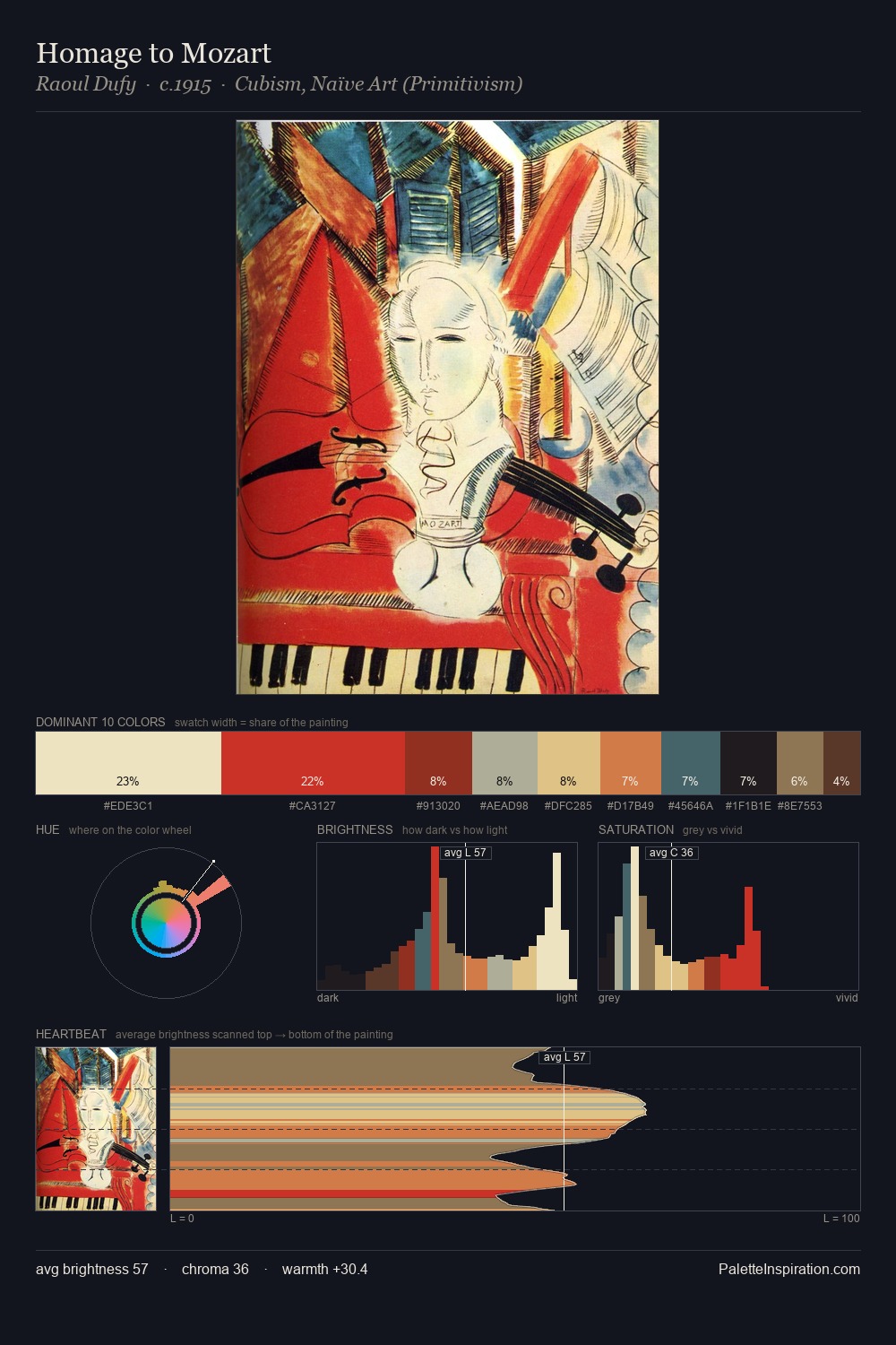
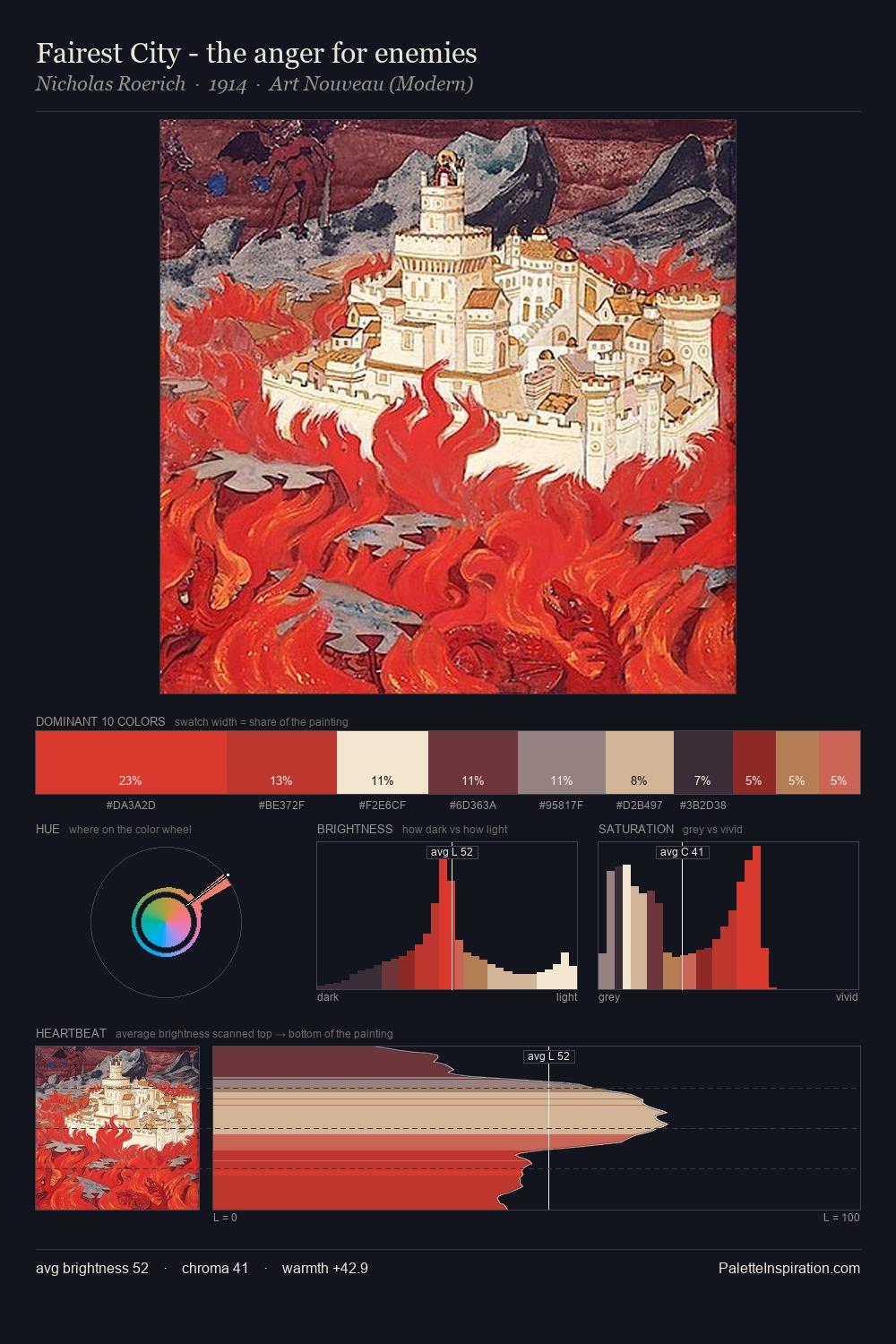
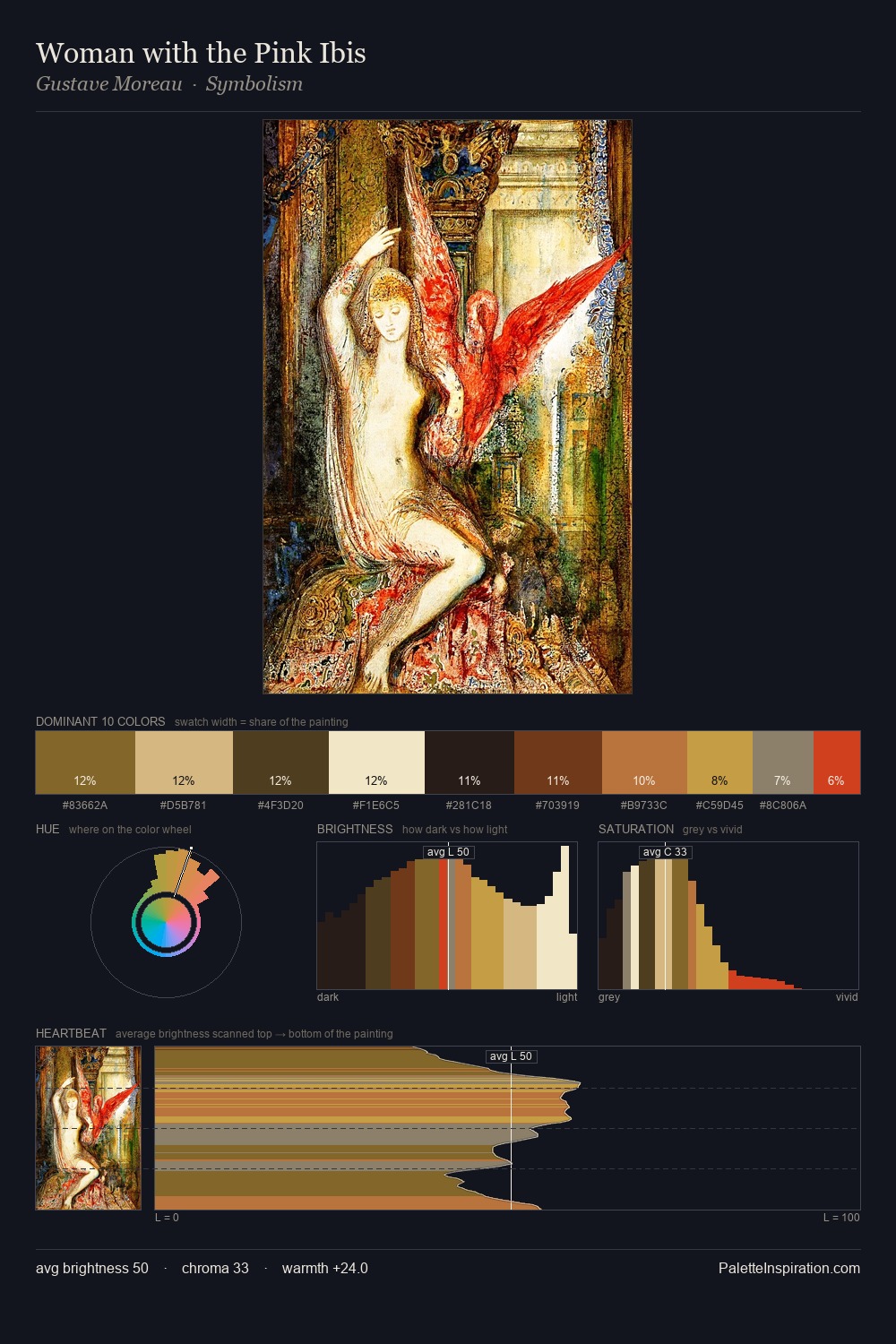
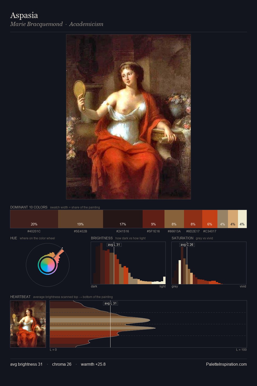
Values in Viktor Vasnetsov tilt decisively toward white, giving the palette its luminous character. Viktor Vasnetsov balances warm and cool with remarkable evenness, giving the composition its characteristic vibrancy. Mid-range chroma keeps the palette grounded - colourful but not strident. #E75E39 delivers the chromatic peak at only 6.1% - a small shot of colour with outsized visual impact. A value spread of 72 units gives the palette both depth and air - shadows are genuinely dark, lights genuinely light. The palette reads as an Impressionist one - light-biased, chromatically direct, and built on temperature contrast rather than value opposition. This is palette 2 of Viktor Vasnetsov's sequence - a single chapter in a chromatic story told across many works.
Example use cases
- publishing
- corporate identity
- consumer apps
- hospitality
- design agencies
I Love This!
Copy, export, or download for your project