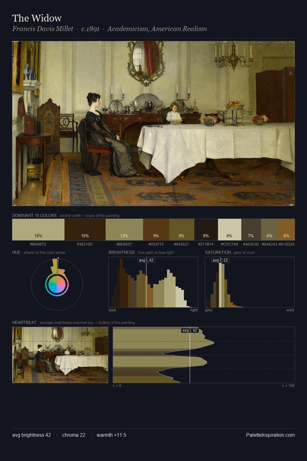
Viggo Johansen Palette 1

Palette Analysis
Viggo Johansen sits in the centre of the value range, lending the palette a sense of even, sustained light. Blues and teal-greys govern the palette, lending it an aquatic or atmospheric quality. Every colour is desaturated; the palette proceeds through near-neutrals and gently-coloured greys. At 27.1%, #1A1815 functions less as a colour accent and more as a complete atmospheric environment. The highest-chroma note - #DAD2B1 - appears at just 4.1%, deployed as a precision accent against the quieter ground. From deepest dark to palest light, the palette traverses 65 units of the value scale - a span that creates natural depth. The mid-to-high key, cool bias, and moderate chroma point to outdoor observation - sky and diffused daylight as the dominant light source. In the context of Viggo Johansen's full range of palettes, group 1 represents one movement in an ongoing chromatic dialogue.
Example use cases
- theater design
- jewelry brands
- tobacco-adjacent retail
- event branding
- film & entertainment
I Love This!
Copy, export, or download for your project