Victor Palmov Master Palette

Palette Analysis
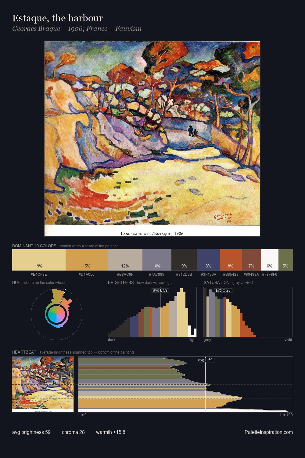
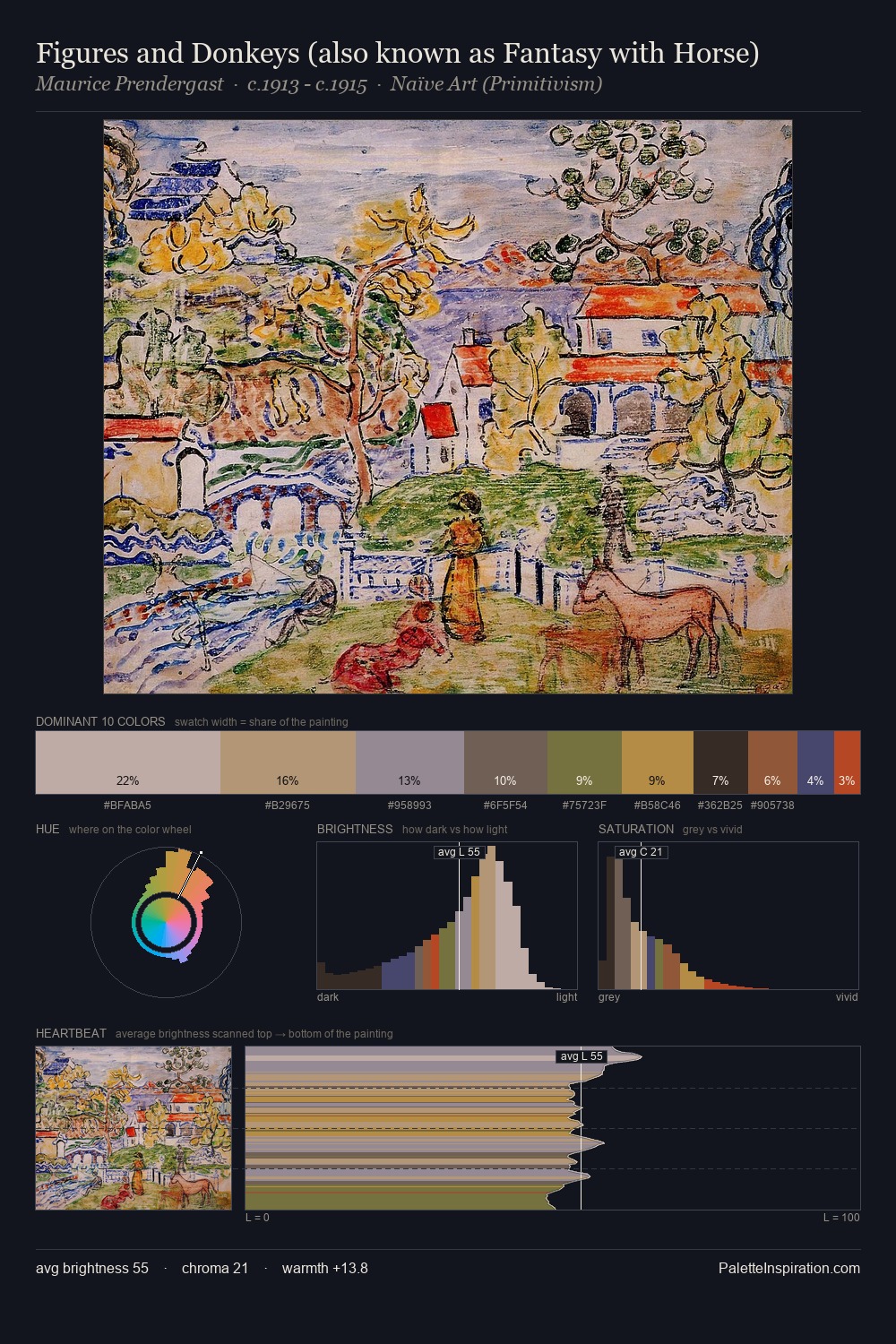
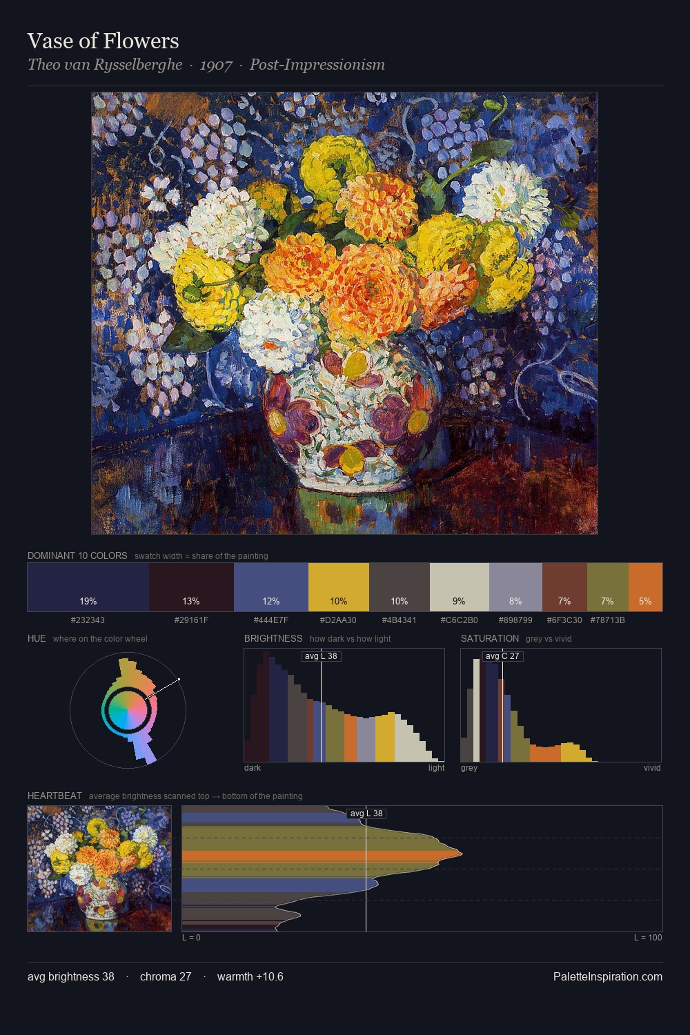
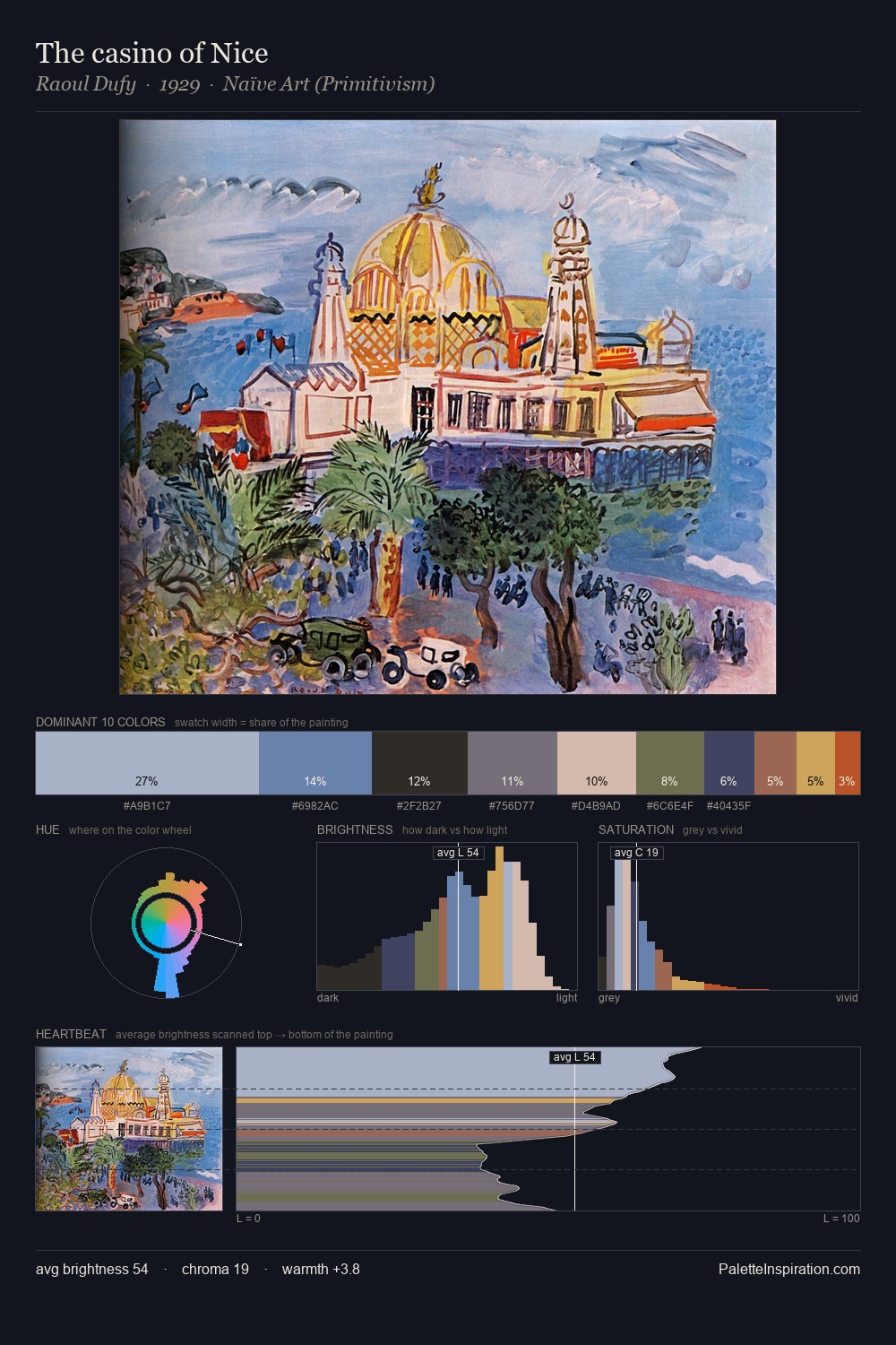
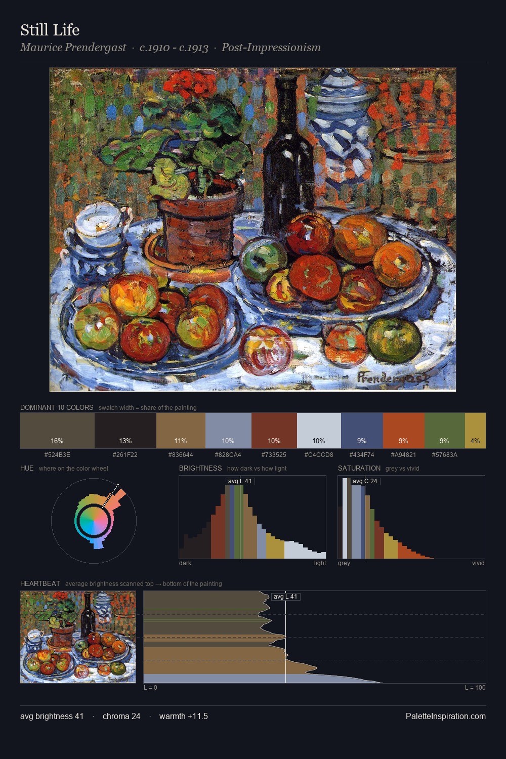
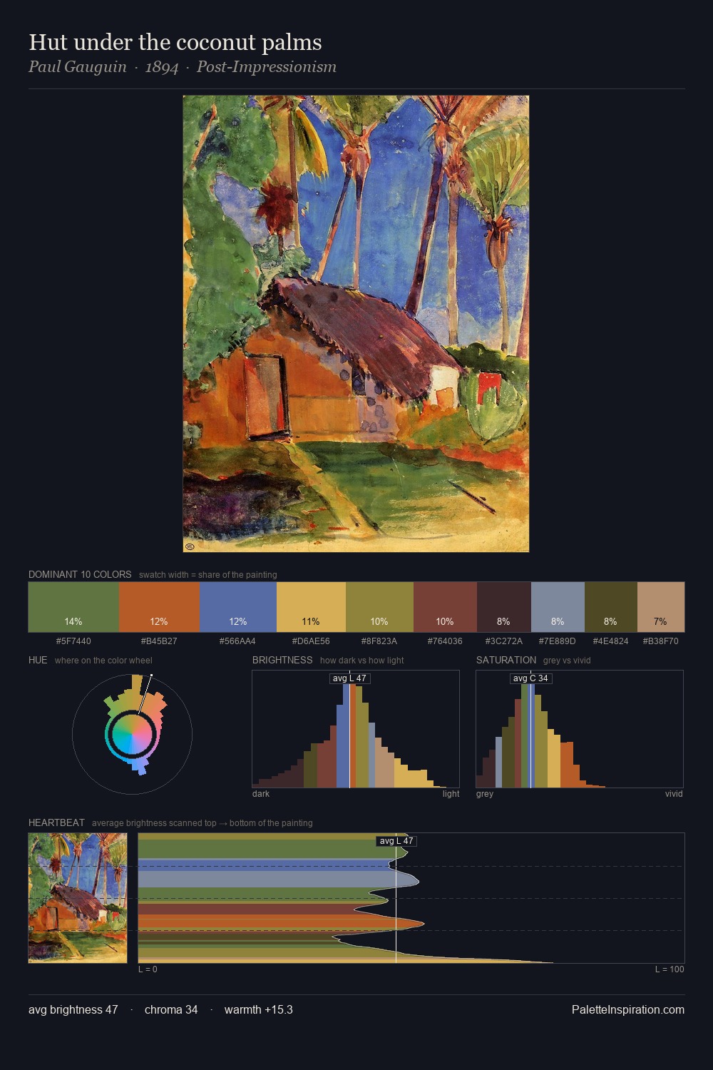
Victor Palmov distributes its values across the middle register, creating harmony without high contrast. Victor Palmov keeps warm and cool in parity, a balance that lends the work a perceptual shimmer. Chroma is moderate: colours carry enough saturation to be read as colour, but the palette stops well short of garish intensity. At 5.0%, #486129 carries the palette's sharpest chromatic charge: an accent that earns its place precisely because it is withheld. The palette spans 52 value units: a measured range that delivers coherence over drama. The palette reads as an Impressionist one - light-biased, chromatically direct, and built on temperature contrast rather than value opposition. The palette is a signature: Victor Palmov's particular sense of value, warmth, and colour weight made legible.
Example use cases
- ceramics & pottery
- boutique hospitality
- menswear
- heritage food brands
- craft & artisan brands
I Love This!
Copy, export, or download for your project