Vicenzo Maria Coronelli Master Palette

Palette Analysis
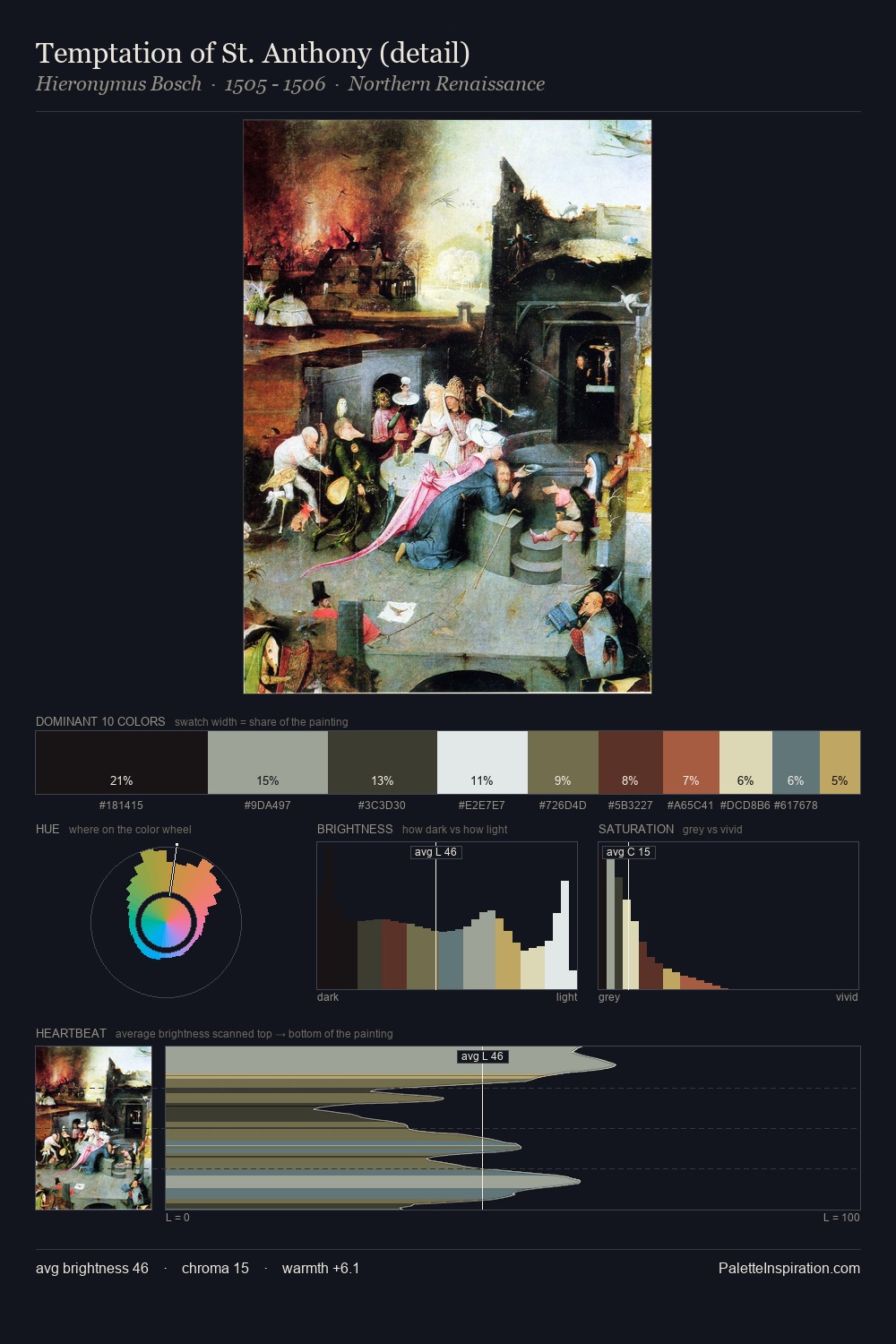
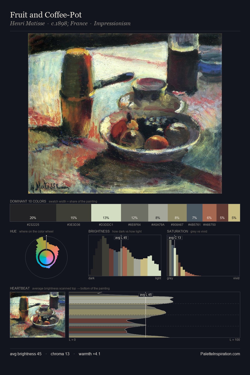
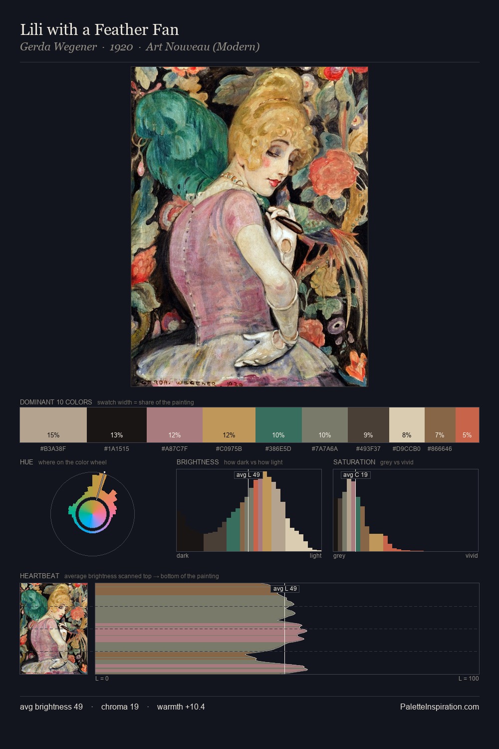
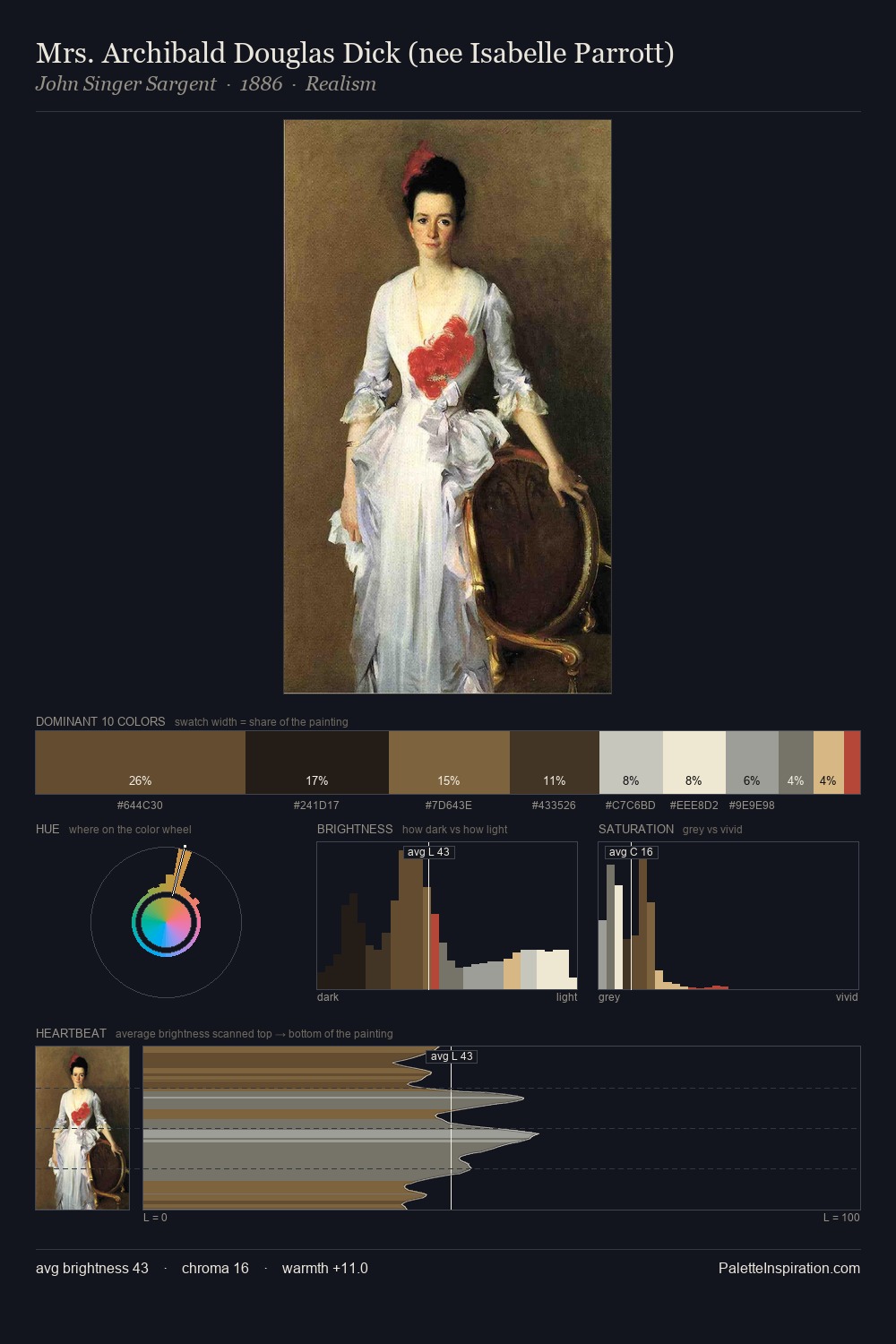
Vicenzo Maria Coronelli distributes its values across the middle register, creating harmony without high contrast. Blues and teal-greys govern the palette, lending it an aquatic or atmospheric quality. Saturation is deliberately withheld - the beauty here lies in the near-monochromatic gradations rather than colour difference. The dominant colour, #171112, takes 25.7% of the total area, establishing the overall mood before any other hue is introduced. #B6A867 delivers the chromatic peak at only 4.2% - a small shot of colour with outsized visual impact. From deepest dark to palest light, the palette traverses 73 units of the value scale - a span that creates natural depth. High luminosity and cool temperature suggest the plein-air condition: unfiltered daylight and open sky. The palette is a signature: Vicenzo Maria Coronelli's particular sense of value, warmth, and colour weight made legible.
Example use cases
- exhibition design
- foundation branding
- estate management
- art education
- museums & galleries
I Love This!
Copy, export, or download for your project