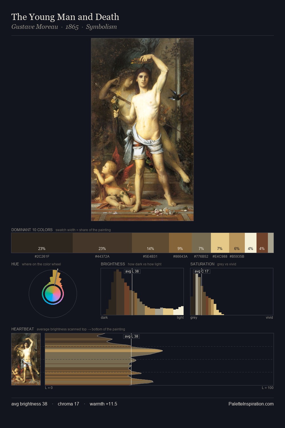
Verism Palette 6
Penumbral Bisque
Penumbral Partial shadow - the transitional zone between light and full dark, soft-edged.
Bisque Pale warm beige - soft, slightly pinkish neutral, the color of unglazed ceramic.

Palette Analysis
Verism distributes its values across the middle register, creating harmony without high contrast. Blues and teal-greys govern the palette, lending it an aquatic or atmospheric quality. All colours lean toward grey, building depth through value rather than colour punch. 27.7% of the palette belongs to #7C6D54, a concentration that makes it the unmistakable visual centre. #6C462E functions as the palette's exclamation mark: highest chroma, lowest percentage (1.6%). A value spread of 67 units gives the palette both depth and air - shadows are genuinely dark, lights genuinely light. The palette has the character of outdoor light: cool, mid-bright, with colour rendered faithfully rather than expressively.
Example use cases
- theater design
- jewelry brands
- tobacco-adjacent retail
- event branding
- film & entertainment
I Love This!
Use This Palette
Copy, export, or download for your project
Copy, export, or download for your project
Copy:
Download:
Share: