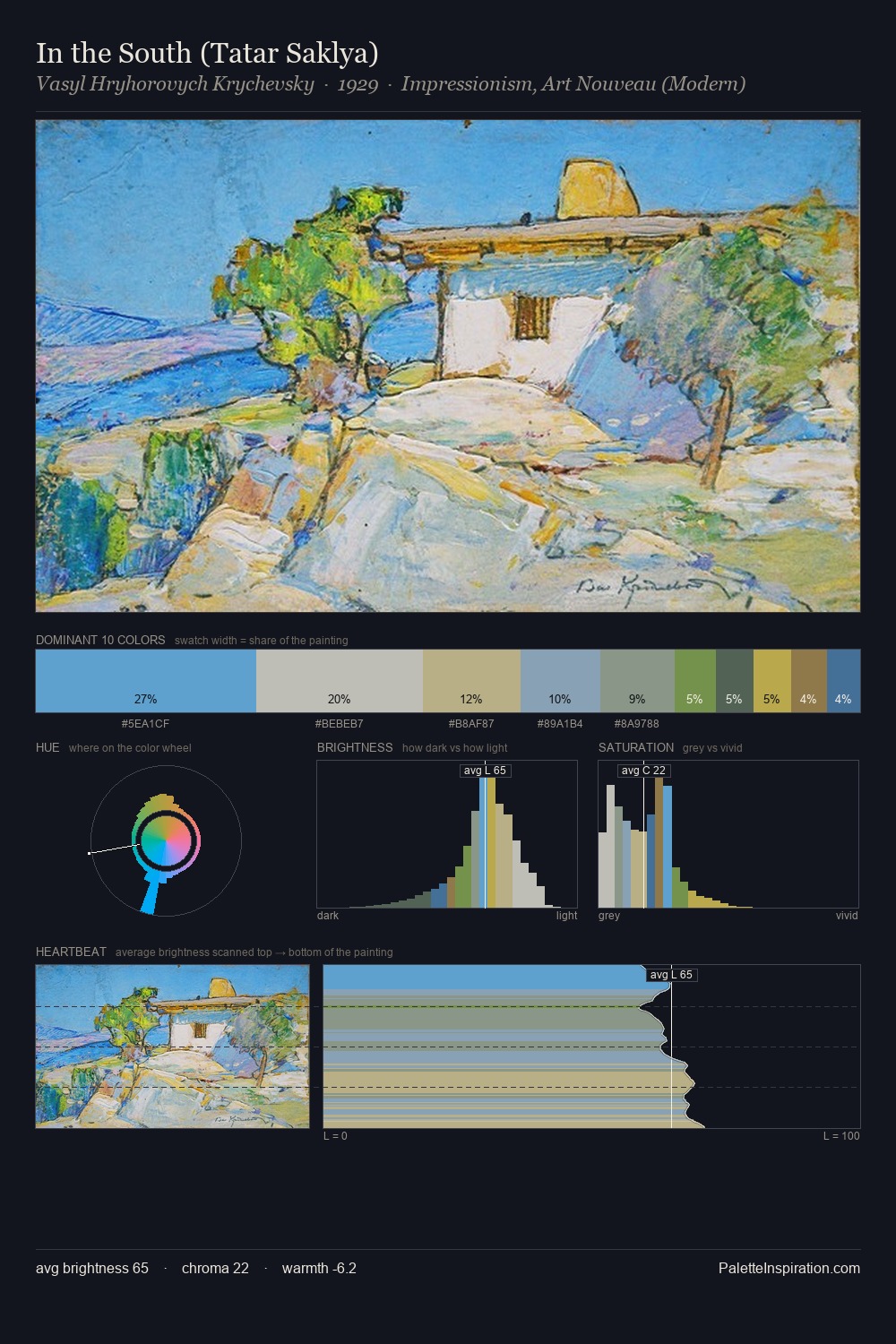
Vasyl Hryhorovych Krychevsky Palette 4
Pearlescent Whisper
Pearlescent Iridescent light quality - high-key with subtle hue variation, like mother-of-pearl.
Whisper Barely-there pale neutral - so light it barely registers, the quietest color.

Palette Analysis
The high-key values of Vasyl Hryhorovych Krychevsky give it an effulgent, almost bleached quality. Cool hues prevail: blues, greens, and greys anchor the palette's emotional temperature. Chroma is kept low across all colours, producing the soft, enveloping quality that characterises tonal painting. Only 8.9% is devoted to #BCAF82, yet that small allocation delivers the palette's entire chromatic tension. Spanning 54 units on the value axis, the palette achieves the balance between tonal flatness and fragmentation. High luminosity and cool temperature suggest the plein-air condition: unfiltered daylight and open sky. Palette 4 sits within the larger chromatic argument that Vasyl Hryhorovych Krychevsky's complete body of work advances.
Example use cases
- garden centers
- natural beauty
- park & rec design
- sustainable fashion
- sustainability
I Love This!
Use This Palette
Copy, export, or download for your project
Copy, export, or download for your project
Copy:
Download:
Share: