Vasily Perov Palette 13

Palette Analysis
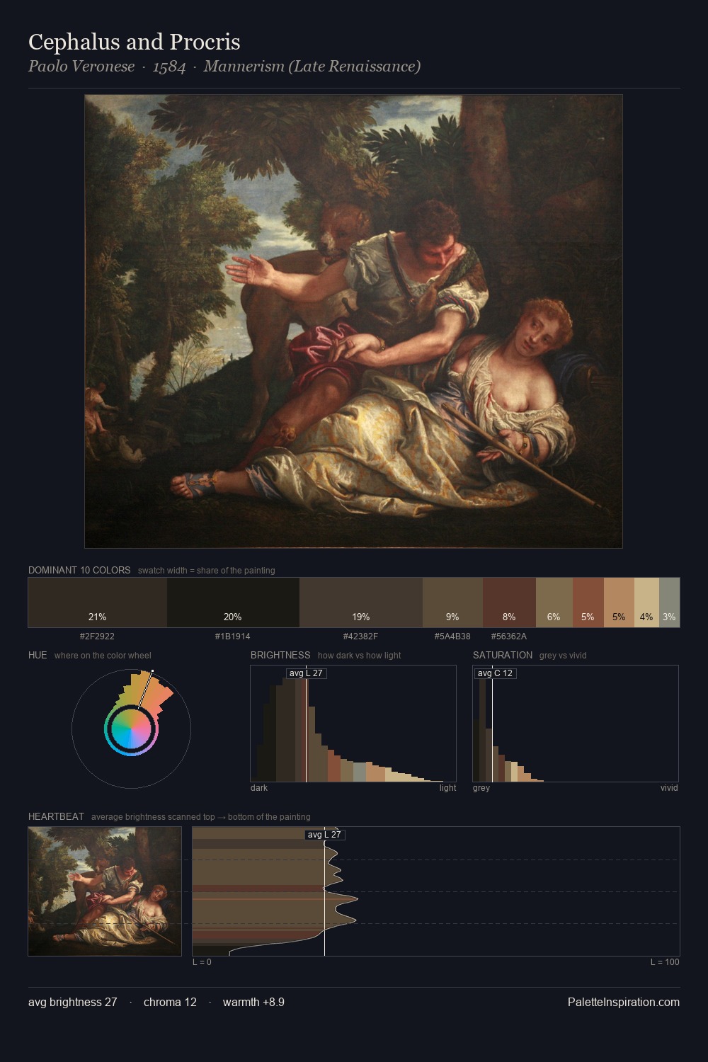
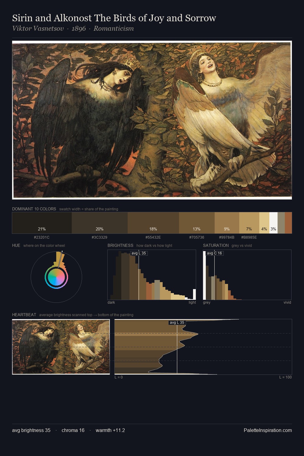
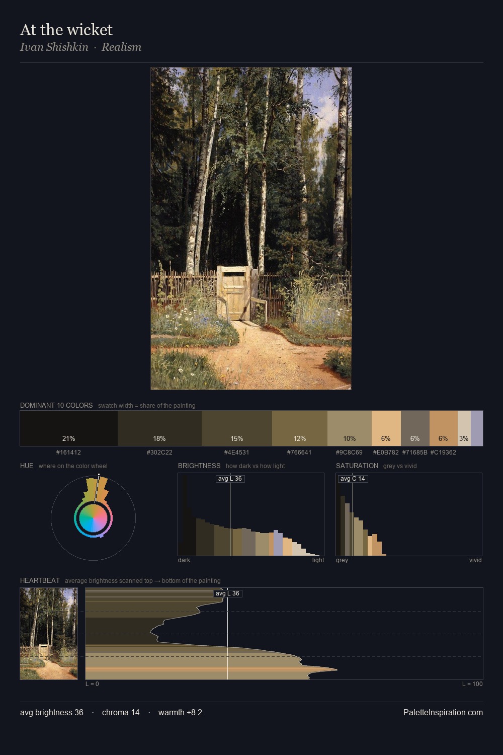
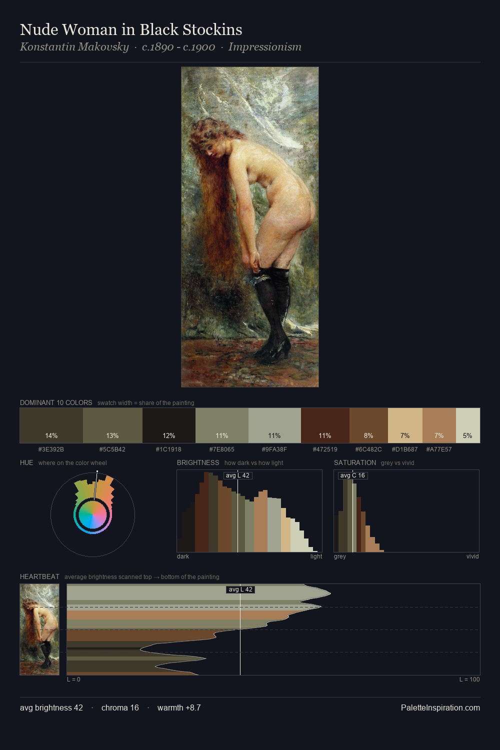
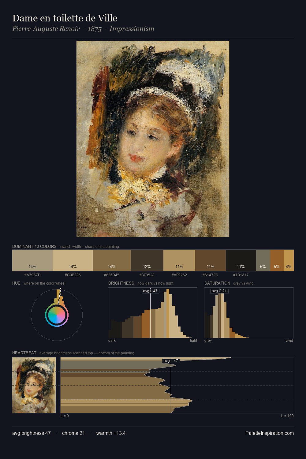
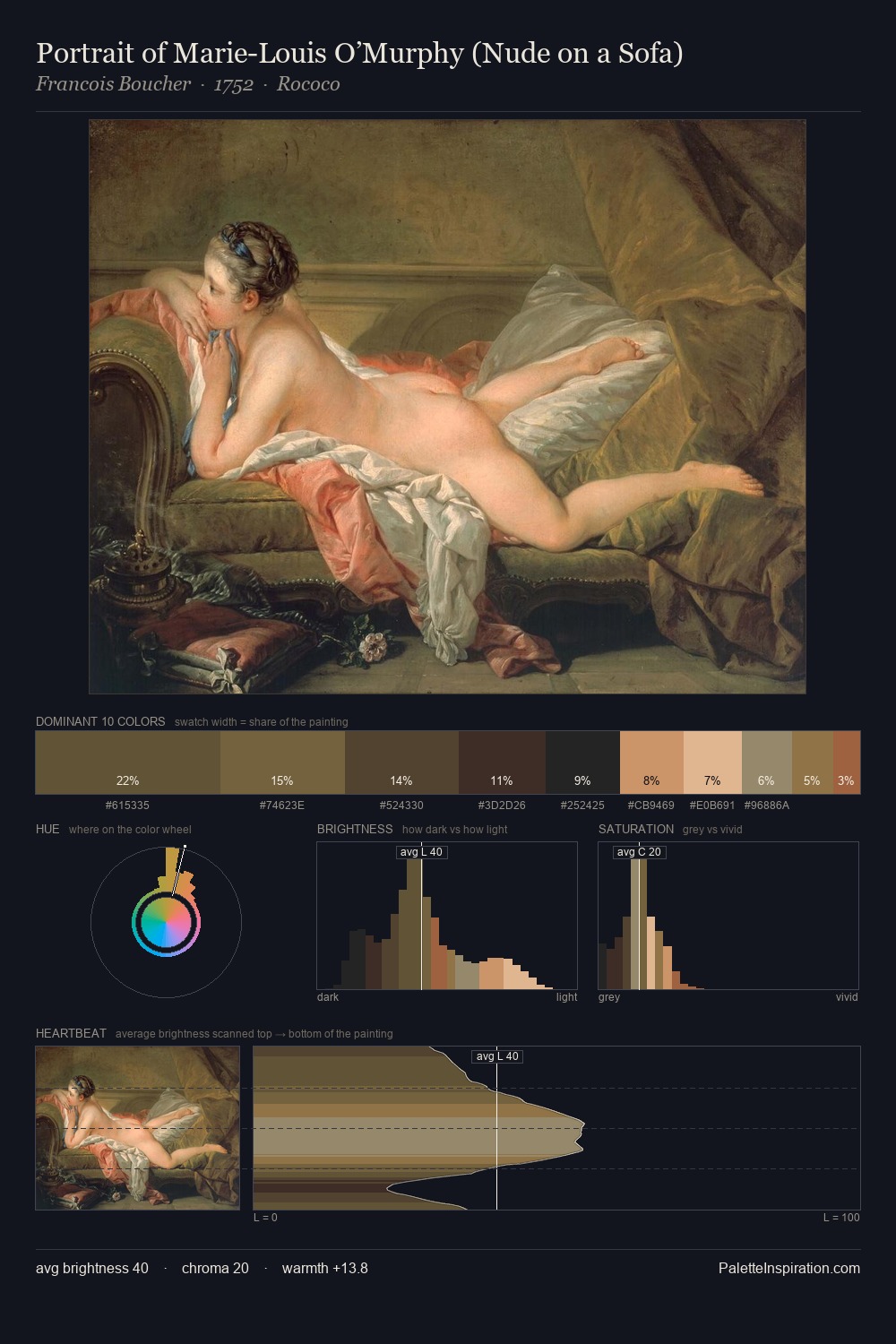
The palette of Vasily Perov sits in the lower register of the value scale - dense, contained, and weighted. Warmth dominates - the palette of Vasily Perov leans heavily on the yellow-orange-red arc of the colour wheel. All colours lean toward grey, building depth through value rather than colour punch. A single dominant - #2B241F at 31.2% - sets the character of the whole composition. Only 2.8% is devoted to #AB8155, yet that small allocation delivers the palette's entire chromatic tension. From deepest dark to palest light, the palette traverses 61 units of the value scale - a span that creates natural depth. This tonal restraint is characteristic of the Vasily Perov approach: colour serves light, not the reverse. In the context of Vasily Perov's full range of palettes, group 13 represents one movement in an ongoing chromatic dialogue.
Example use cases
- theater design
- jewelry brands
- tobacco-adjacent retail
- event branding
- film & entertainment
I Love This!
Copy, export, or download for your project