Vartan Mahokian Palette 1

Palette Analysis
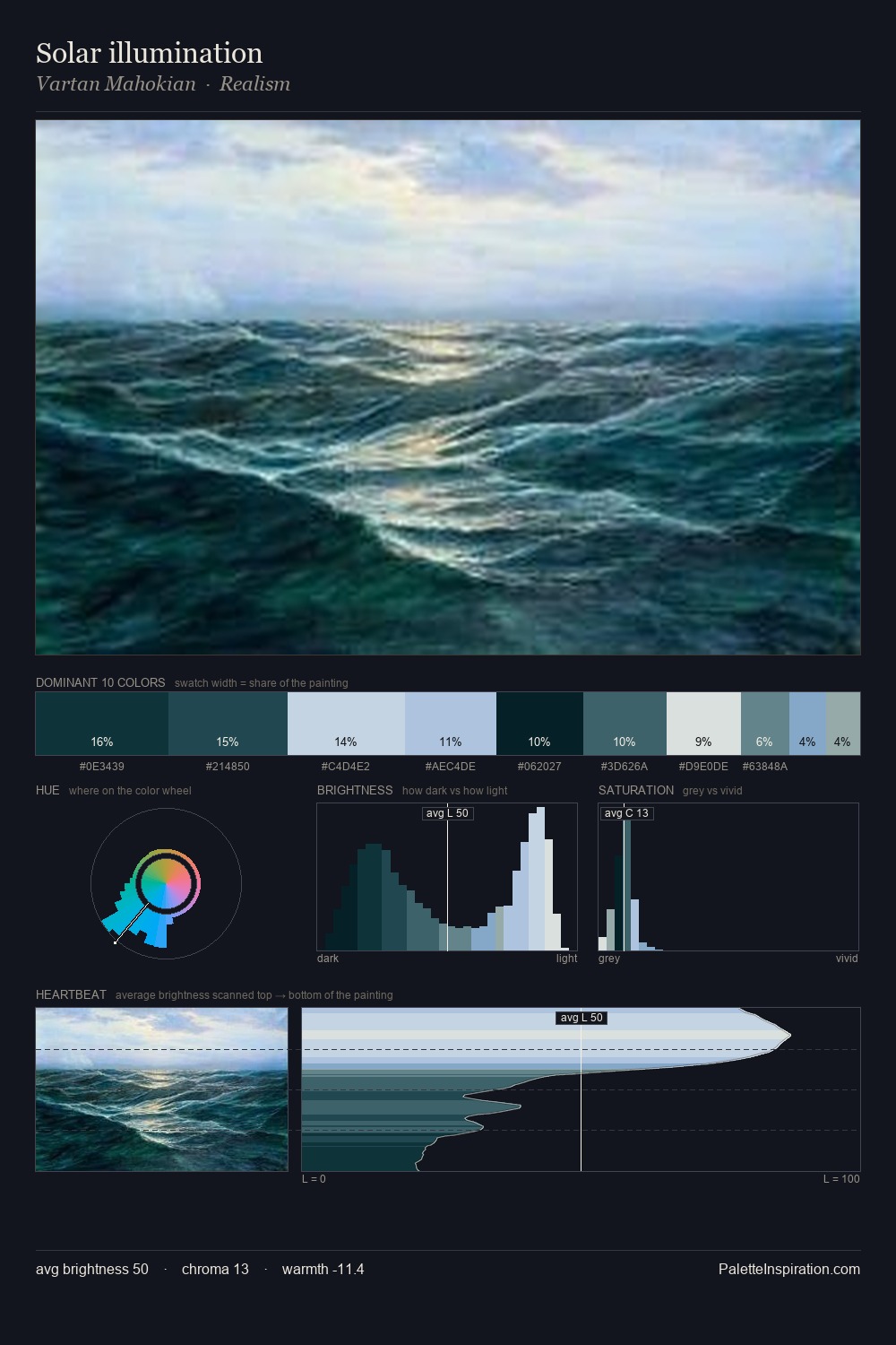
Vartan Mahokian distributes its values across the middle register, creating harmony without high contrast. Vartan Mahokian tilts toward cool - blues and silver-greys carry the structural weight. Chroma is kept low across all colours, producing the soft, enveloping quality that characterises tonal painting. The most saturated colour, #B0C5DF, is reserved to 8.0% of the surface, where it acts as a focal punctuation. A value spread of 68 units gives the palette both depth and air - shadows are genuinely dark, lights genuinely light. The mid-to-high key, cool bias, and moderate chroma point to outdoor observation - sky and diffused daylight as the dominant light source. Palette 1 sits within the larger chromatic argument that Vartan Mahokian's complete body of work advances.
Example use cases
- publishing
- corporate identity
- consumer apps
- hospitality
- design agencies
I Love This!
Copy, export, or download for your project