Valentine Hugo Palette 1
Muted Parchment
Muted Deliberately desaturated - chroma pulled toward gray, the restraint of tonal painting.
Parchment Aged warm neutral - the color of old manuscript parchment, tan and slightly yellowed.

Palette Analysis
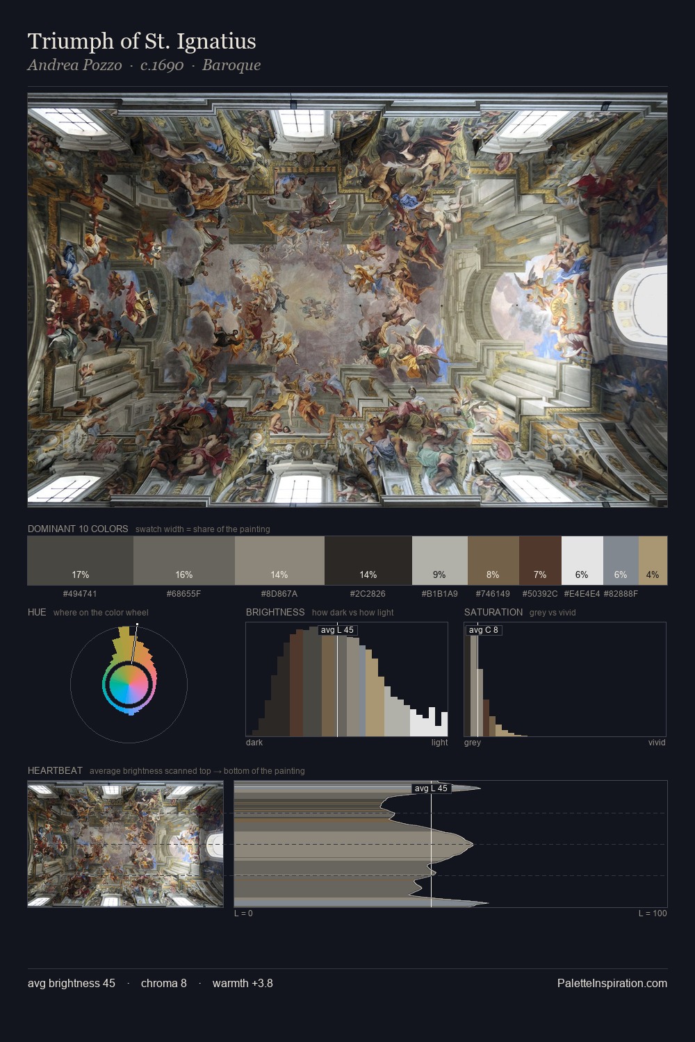
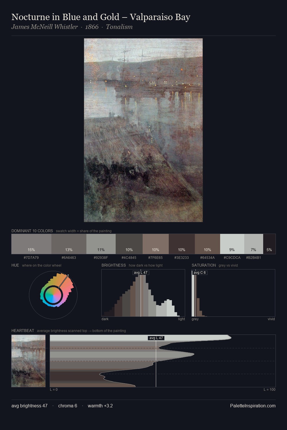
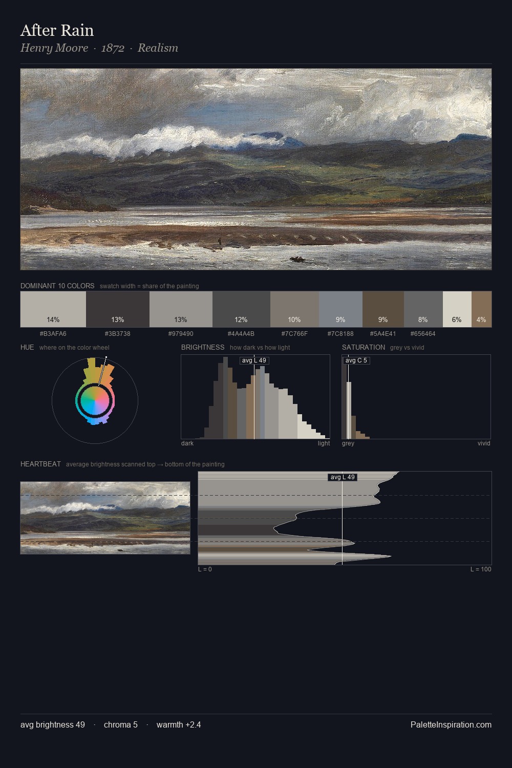
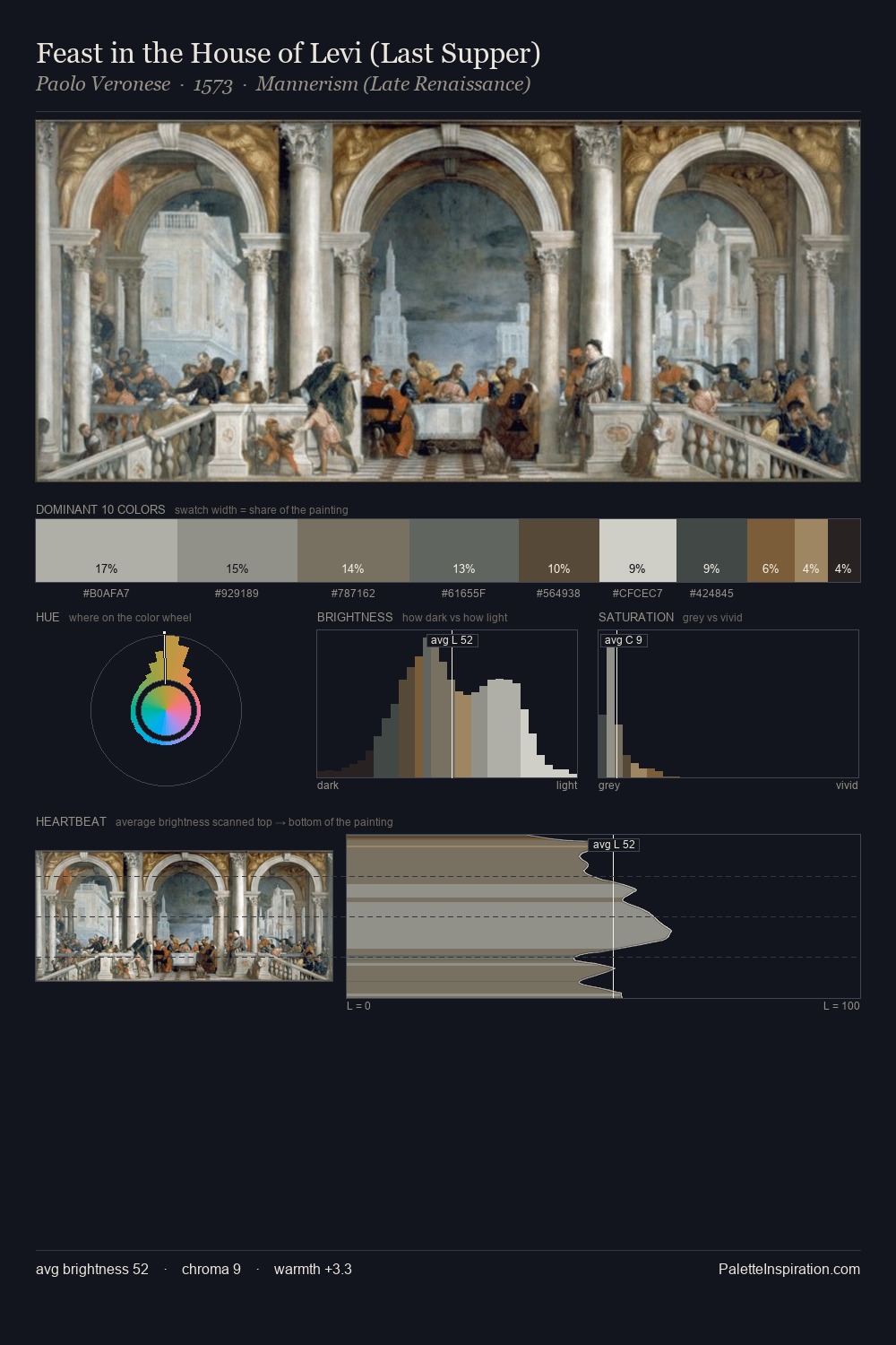
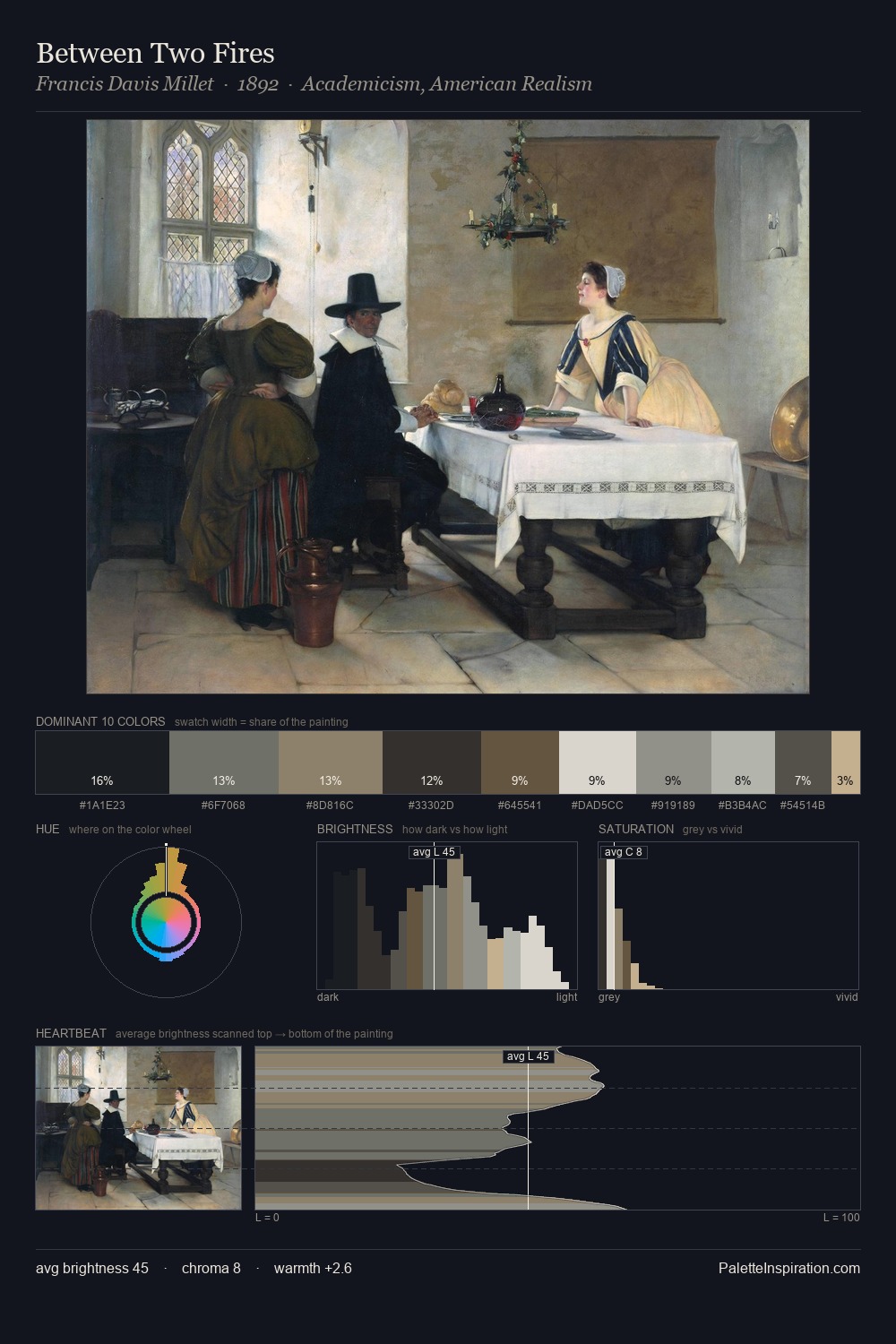
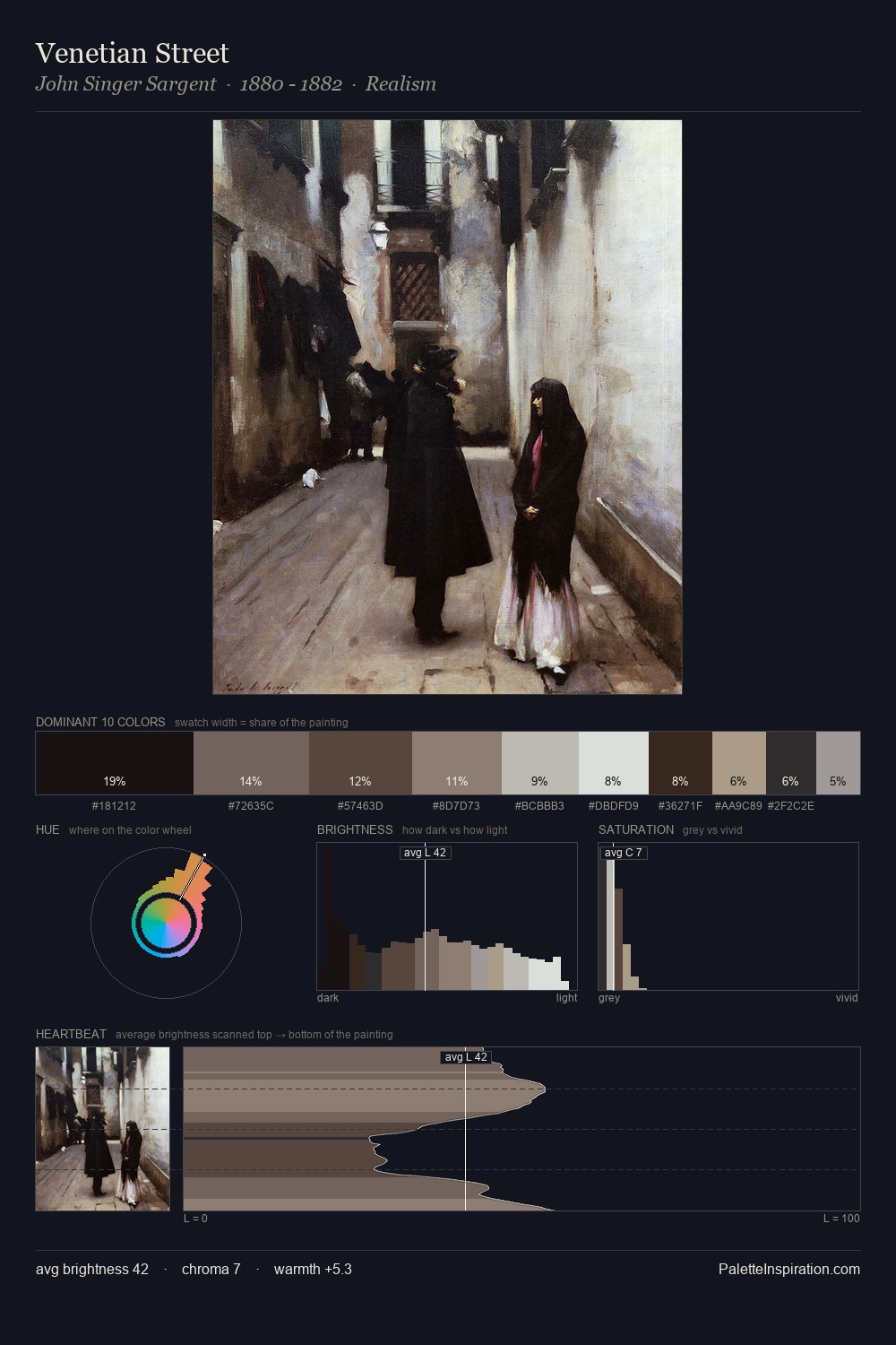
Values in Valentine Hugo rest in the mid-range - neither dramatically lit nor steeped in shadow. Warm hues command this palette; Valentine Hugo favours the reds, oranges, and yellows of firelight and earth. The absence of saturated colour is itself an expressive choice: this is a palette of restraint and atmosphere. Rather than a studied accent, #806661 takes 3.9% - a bold allocation that saturates the composition's atmosphere. 57 units of value range underpin the palette's structural clarity: the eye always knows where light falls. In the context of Valentine Hugo's full range of palettes, group 1 represents one movement in an ongoing chromatic dialogue.
Example use cases
- museums & galleries
- academic publishing
- heritage brands
- auction houses
- exhibition design
I Love This!
Use This Palette
Copy, export, or download for your project
Copy, export, or download for your project
Copy:
Download:
Share: