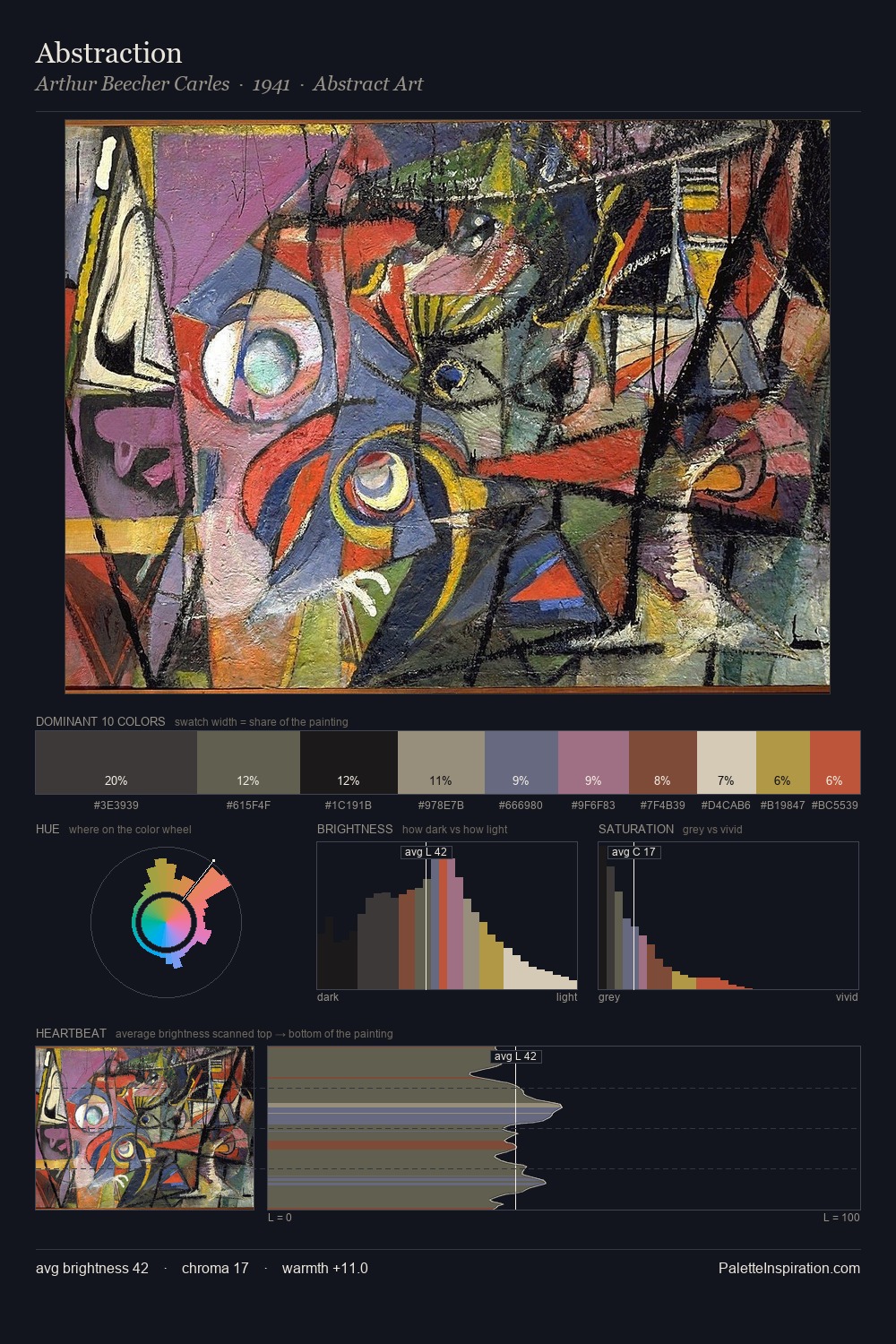
Utagawa Toyokuni Palette 7

Palette Analysis
Utagawa Toyokuni works in the upper reaches of the value scale, creating an atmosphere of brightness and expansiveness. Blues and teal-greys govern the palette, lending it an aquatic or atmospheric quality. Saturation is deliberately withheld - the beauty here lies in the near-monochromatic gradations rather than colour difference. 53.2% of the palette belongs to #E7D7B2, a concentration that makes it the unmistakable visual centre. #AF8F3D delivers the chromatic peak at only 0.8% - a small shot of colour with outsized visual impact. 77 units of value range underpin the palette's structural clarity: the eye always knows where light falls. The palette has the character of outdoor light: cool, mid-bright, with colour rendered faithfully rather than expressively. Palette 7 sits within the larger chromatic argument that Utagawa Toyokuni's complete body of work advances.
Example use cases
- ceramics & pottery
- boutique hospitality
- menswear
- heritage food brands
- craft & artisan brands
I Love This!
Copy, export, or download for your project