Utagawa Toyokuni Palette 3
Pale Vellum
Pale High-key and low-chroma - delicate, bleached, washed with light.
Vellum Smooth pale tan - the color of prepared calf-skin vellum, warmer than parchment.

Palette Analysis
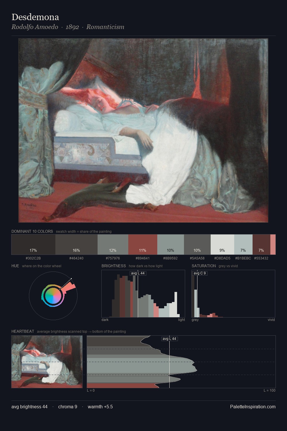
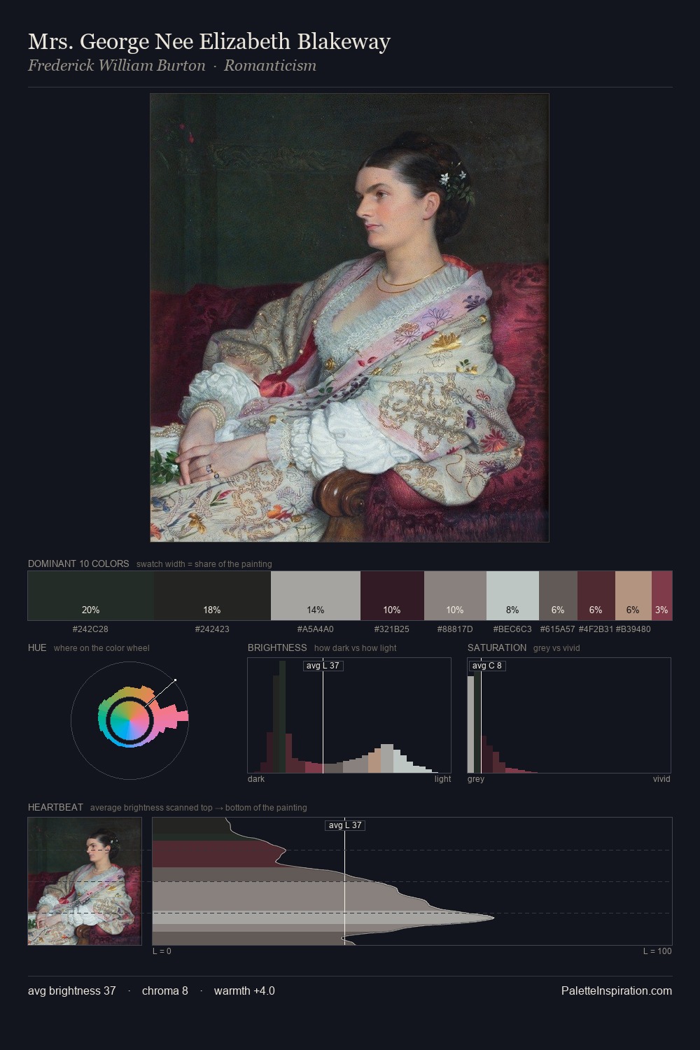
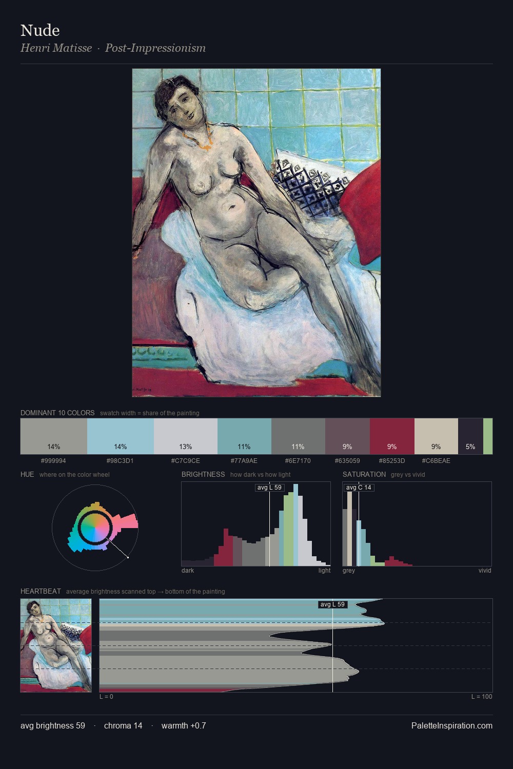
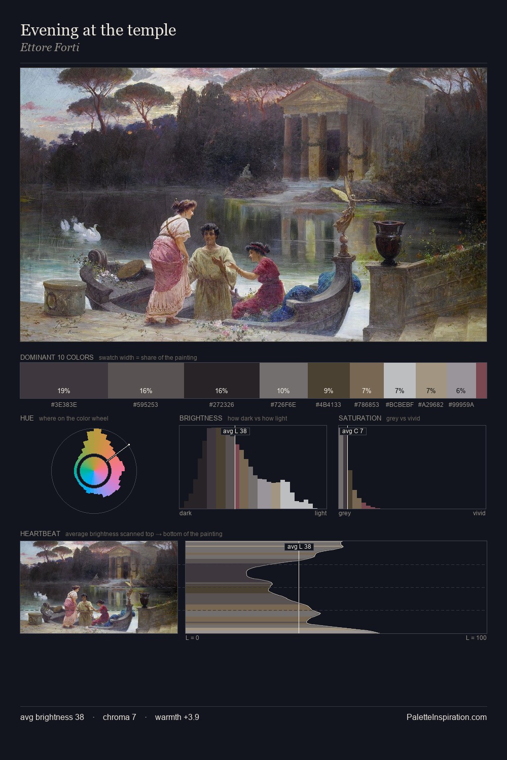
The high-key values of Utagawa Toyokuni give it an effulgent, almost bleached quality. Cool hues prevail: blues, greens, and greys anchor the palette's emotional temperature. The absence of saturated colour is itself an expressive choice: this is a palette of restraint and atmosphere. Only 6.3% is devoted to #5B3740, yet that small allocation delivers the palette's entire chromatic tension. From deepest dark to palest light, the palette traverses 60 units of the value scale - a span that creates natural depth. High luminosity and cool temperature suggest the plein-air condition: unfiltered daylight and open sky. Palette 3 sits within the larger chromatic argument that Utagawa Toyokuni's complete body of work advances.
Example use cases
- archival print
- university identity
- rare books
- cultural institutions
- nonprofit identity
I Love This!
Use This Palette
Copy, export, or download for your project
Copy, export, or download for your project
Copy:
Download:
Share: