Utagawa Toyokuni II Palette 1

Palette Analysis
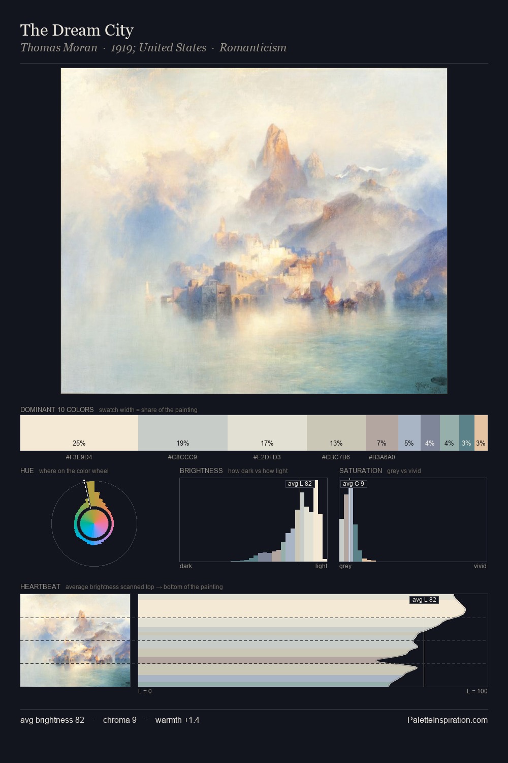
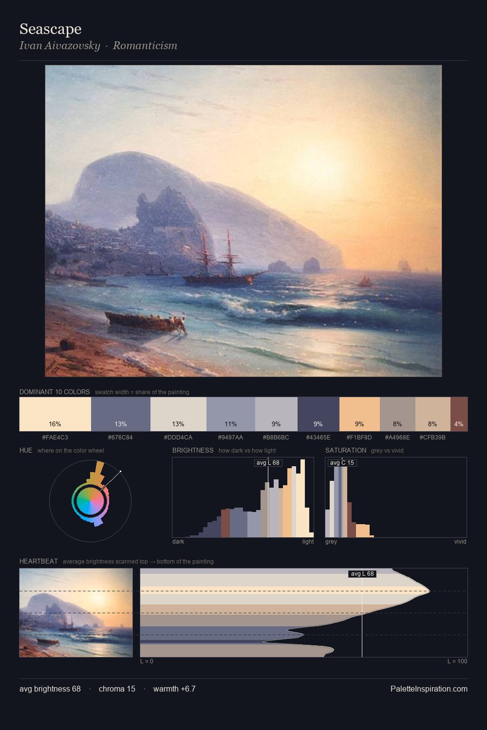
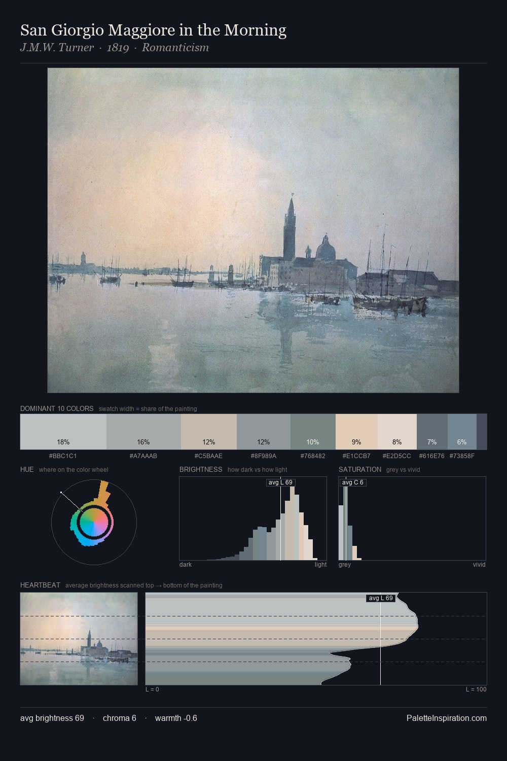
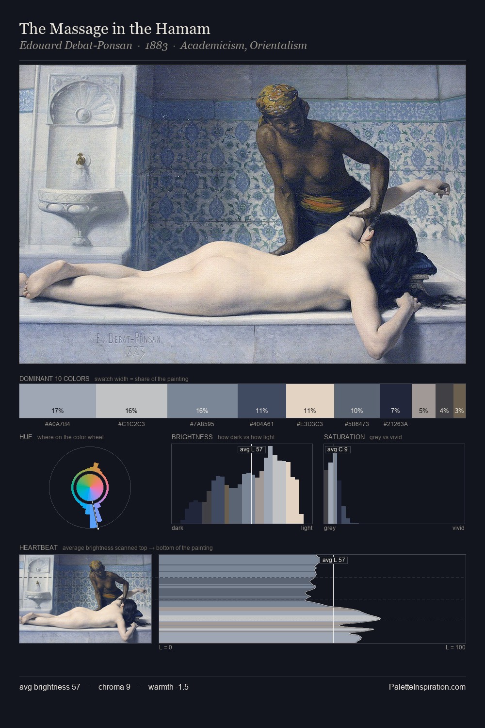
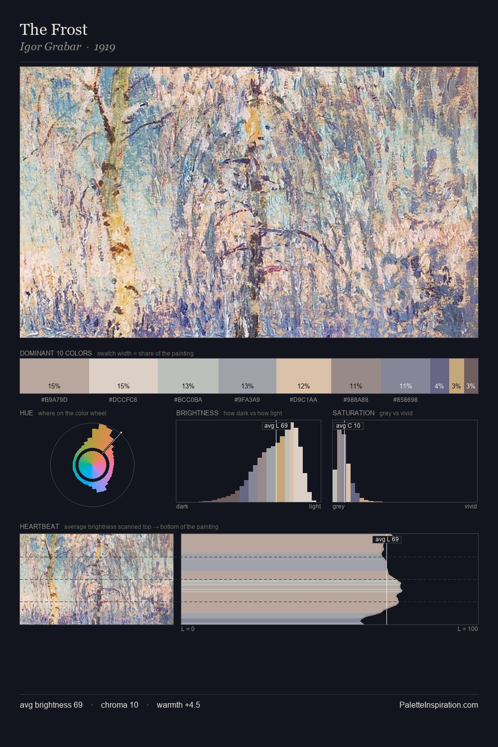
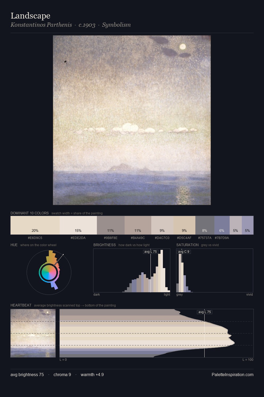
Values in Utagawa Toyokuni II tilt decisively toward white, giving the palette its luminous character. Cool hues prevail: blues, greens, and greys anchor the palette's emotional temperature. Chroma hovers near zero; colour declares itself through subtle shifts in hue rather than outright saturation. Utagawa Toyokuni II gives 68.4% of the composition to a single #FAF7E2 - a decisive chromatic anchor. #E1DBCF functions as the palette's exclamation mark: highest chroma, lowest percentage (4.0%). At 43 units across the value scale, the palette keeps contrast readable without letting it dominate. The mid-to-high key, cool bias, and moderate chroma point to outdoor observation - sky and diffused daylight as the dominant light source. In the context of Utagawa Toyokuni II's full range of palettes, group 1 represents one movement in an ongoing chromatic dialogue.
Example use cases
- publishing
- corporate identity
- consumer apps
- hospitality
- design agencies
I Love This!
Copy, export, or download for your project