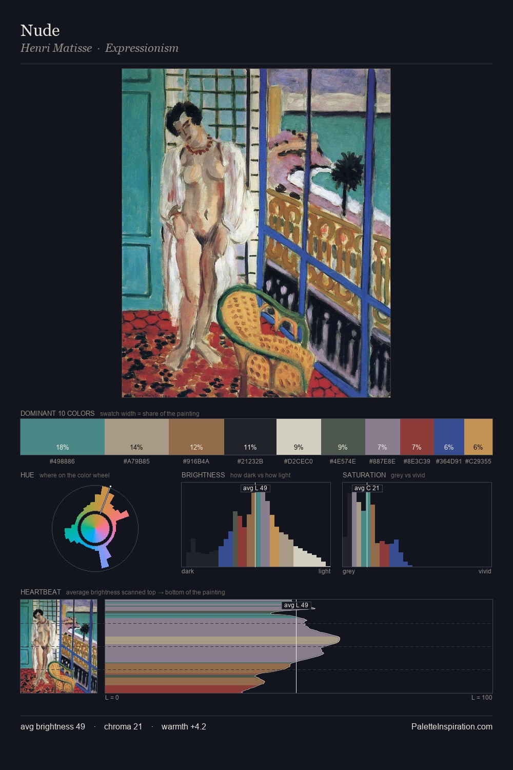
Utagawa Kuniyoshi Palette 5

Palette Analysis
Utagawa Kuniyoshi is high in key: pale, luminous, and filled with optical air. Blues and teal-greys govern the palette, lending it an aquatic or atmospheric quality. All colours lean toward grey, building depth through value rather than colour punch. Utagawa Kuniyoshi gives 52.9% of the composition to a single #E7D6BB - a decisive chromatic anchor. Only 2.0% is devoted to #9F4F43, yet that small allocation delivers the palette's entire chromatic tension. From deepest dark to palest light, the palette traverses 63 units of the value scale - a span that creates natural depth. The mid-to-high key, cool bias, and moderate chroma point to outdoor observation - sky and diffused daylight as the dominant light source. Utagawa Kuniyoshi's palette 5 carries its own internal logic while remaining in conversation with the artist's broader colour intelligence.
Example use cases
- ceramics & pottery
- boutique hospitality
- menswear
- heritage food brands
- craft & artisan brands
I Love This!
Copy, export, or download for your project