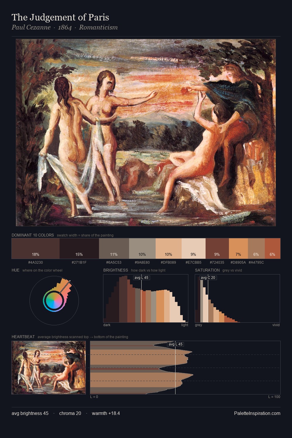
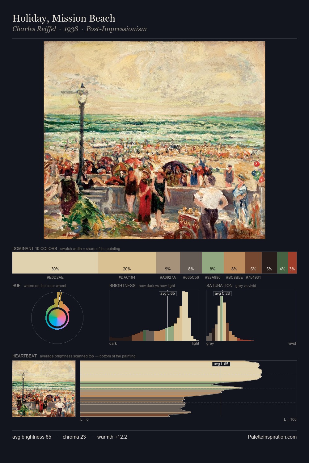
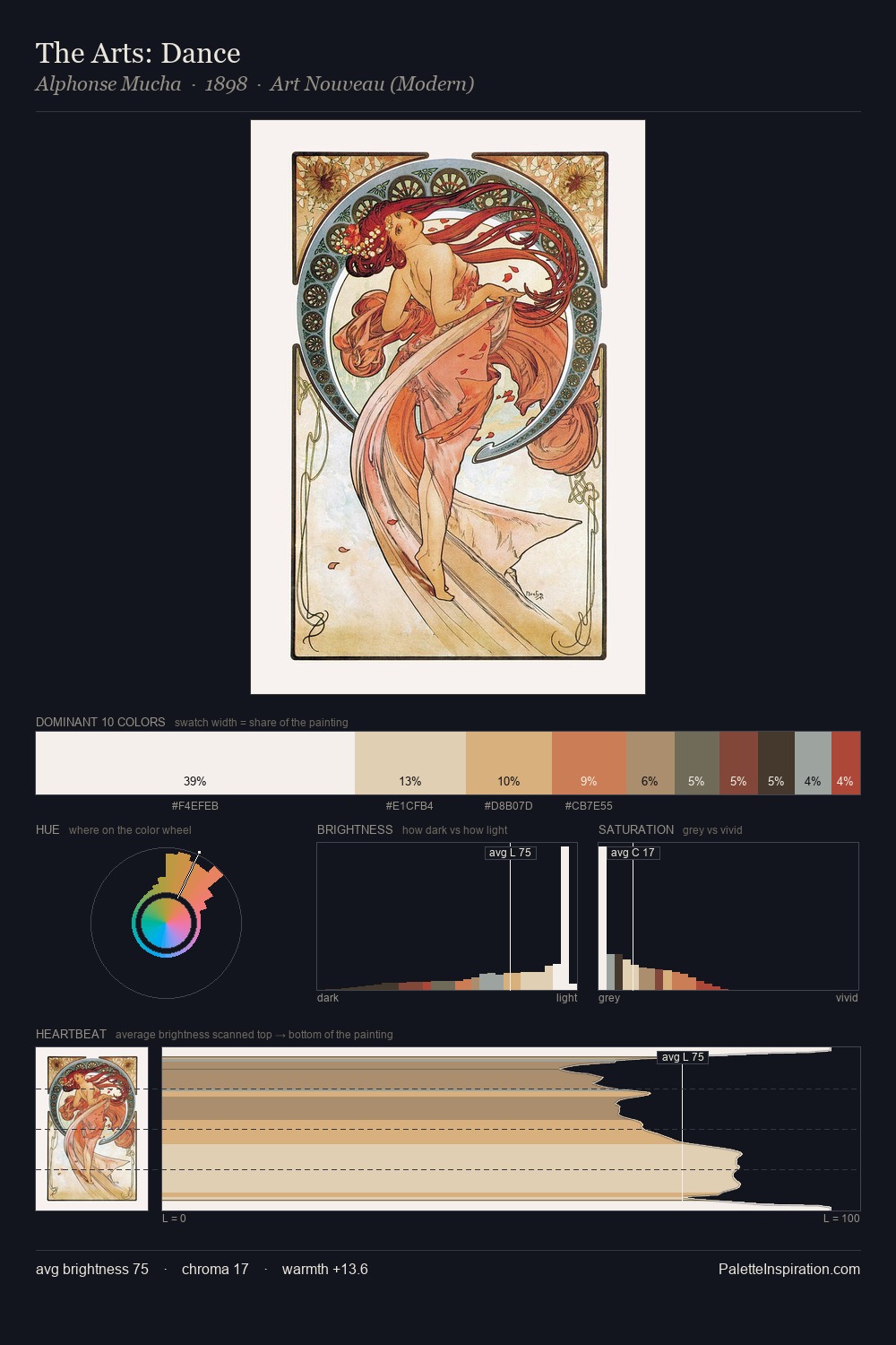
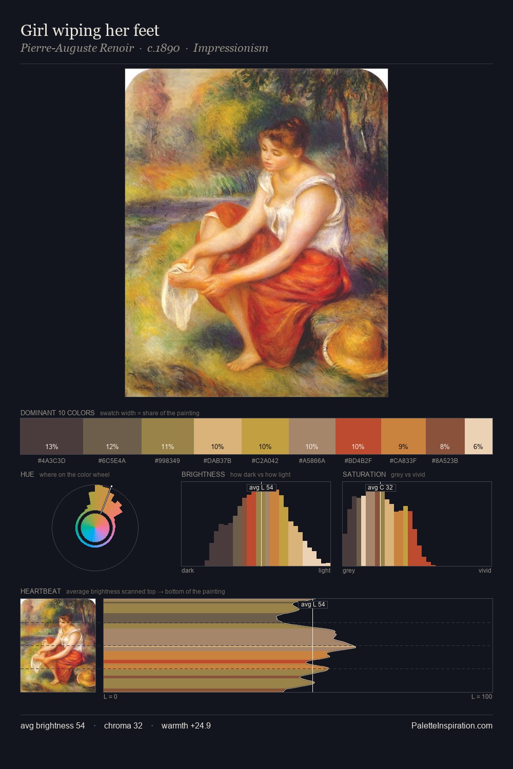
Utagawa Kuniyoshi Palette 2
Muted Topaz
Muted Deliberately desaturated - chroma pulled toward gray, the restraint of tonal painting.
Topaz Golden yellow - the color of topaz gemstone, warm and slightly saturated.

Palette Analysis
The value structure of Utagawa Kuniyoshi is mid-key: quiet, controlled, and cohesive. The dominant temperature is warm, with earth tones and fire-hues setting the emotional key. All colours lean toward grey, building depth through value rather than colour punch. The saturated accent, #CE8B4F, registers at 4.3% - sparse enough to feel like a deliberate surprise. 55 units of value range underpin the palette's structural clarity: the eye always knows where light falls. Palette 2 sits within the larger chromatic argument that Utagawa Kuniyoshi's complete body of work advances.
Example use cases
- interior design
- furniture brands
- cookbook publishing
- wine & spirits
- food packaging
I Love This!
Use This Palette
Copy, export, or download for your project
Copy, export, or download for your project
Copy:
Download:
Share: