Ustad Mansur Palette 1
Gleaming Ecru
Gleaming Bright and polished - high-key, often warm, suggesting reflective or luminous surfaces.
Ecru Unbleached linen - warm mid-neutral, slightly grayed, raw and natural.

Palette Analysis
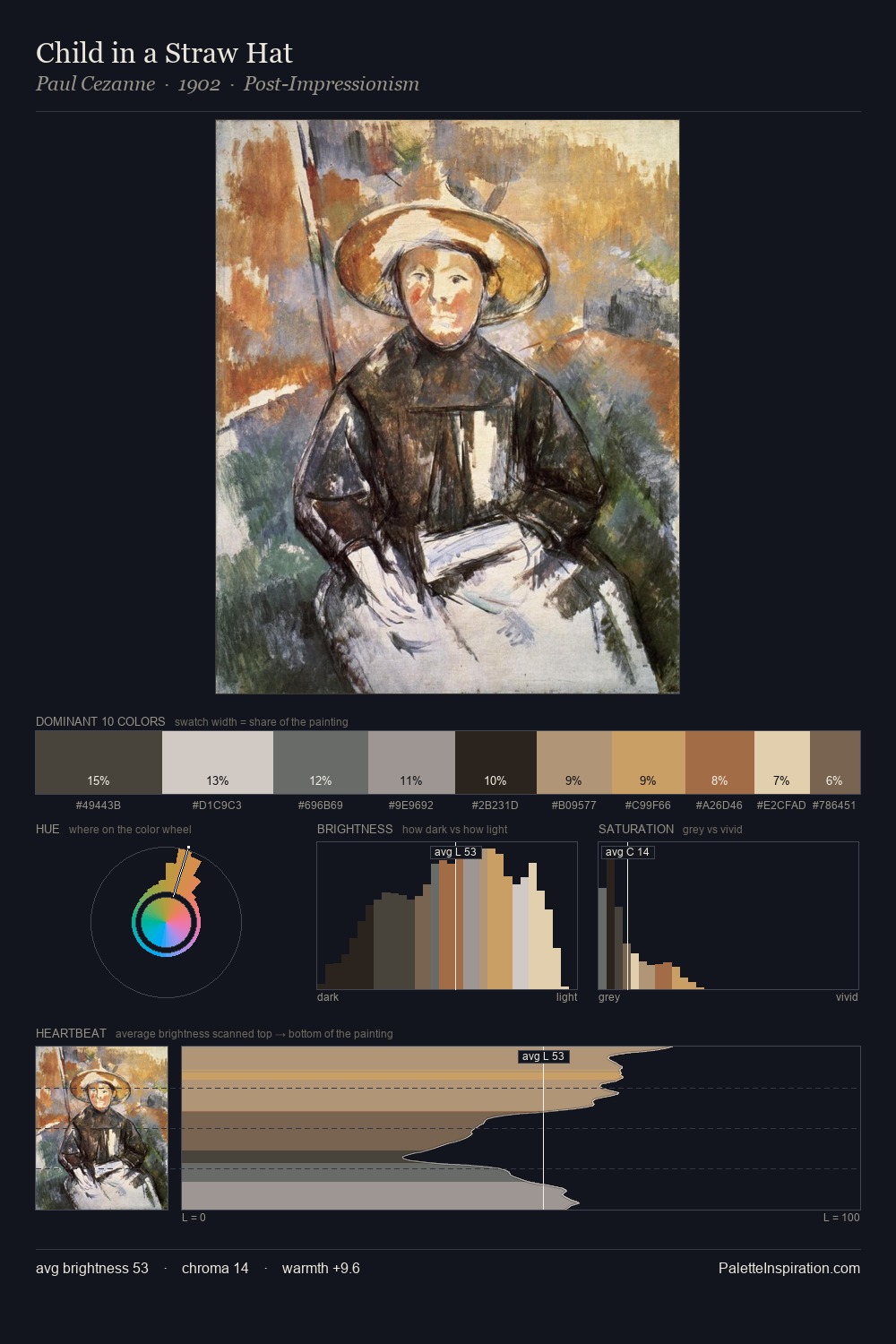
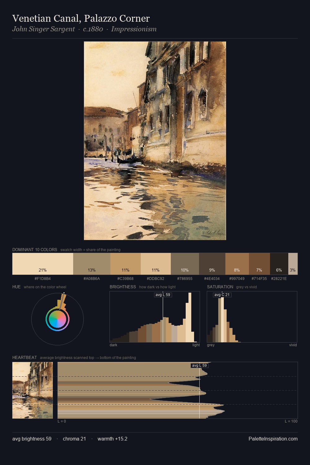
Ustad Mansur is high in key: pale, luminous, and filled with optical air. Warm and cool are kept in productive tension, creating the kind of chromatic harmony that sustains the eye. All colours lean toward grey, building depth through value rather than colour punch. #D8C39E claims 38.1% of the surface, functioning as the work's tonal foundation. The highest-chroma note - #DEB279 - appears at just 3.5%, deployed as a precision accent against the quieter ground. From deepest dark to palest light, the palette traverses 64 units of the value scale - a span that creates natural depth. Ustad Mansur's palette 1 carries its own internal logic while remaining in conversation with the artist's broader colour intelligence.
Example use cases
- publishing
- corporate identity
- consumer apps
- hospitality
- design agencies
I Love This!
Use This Palette
Copy, export, or download for your project
Copy, export, or download for your project
Copy:
Download:
Share: