Ulrika Pasch Master Palette
Penumbral Tawny
Penumbral Partial shadow - the transitional zone between light and full dark, soft-edged.
Tawny Warm orange-brown - a traditional term for the color of tanned leather or lion fur.

Palette Analysis
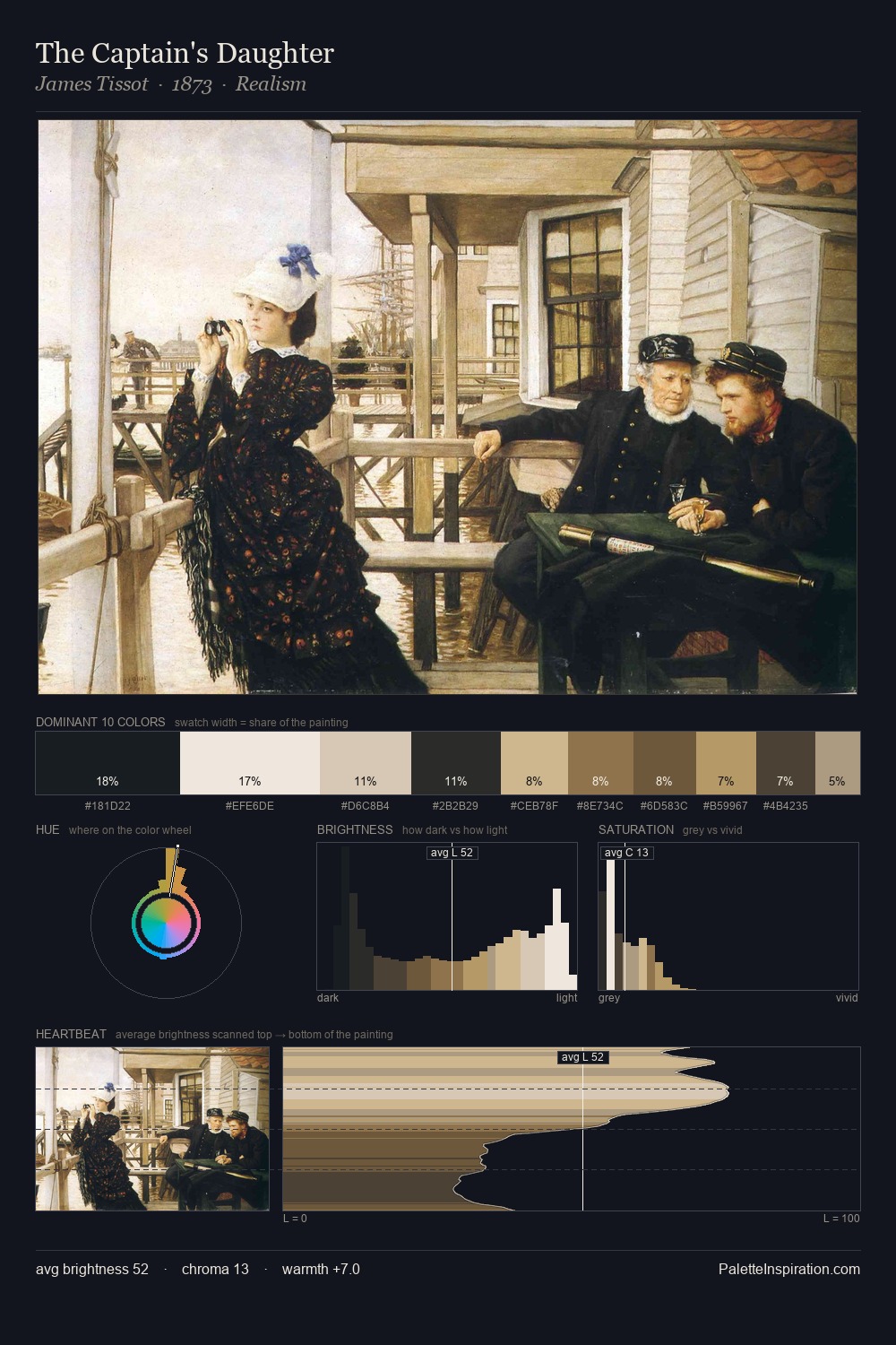
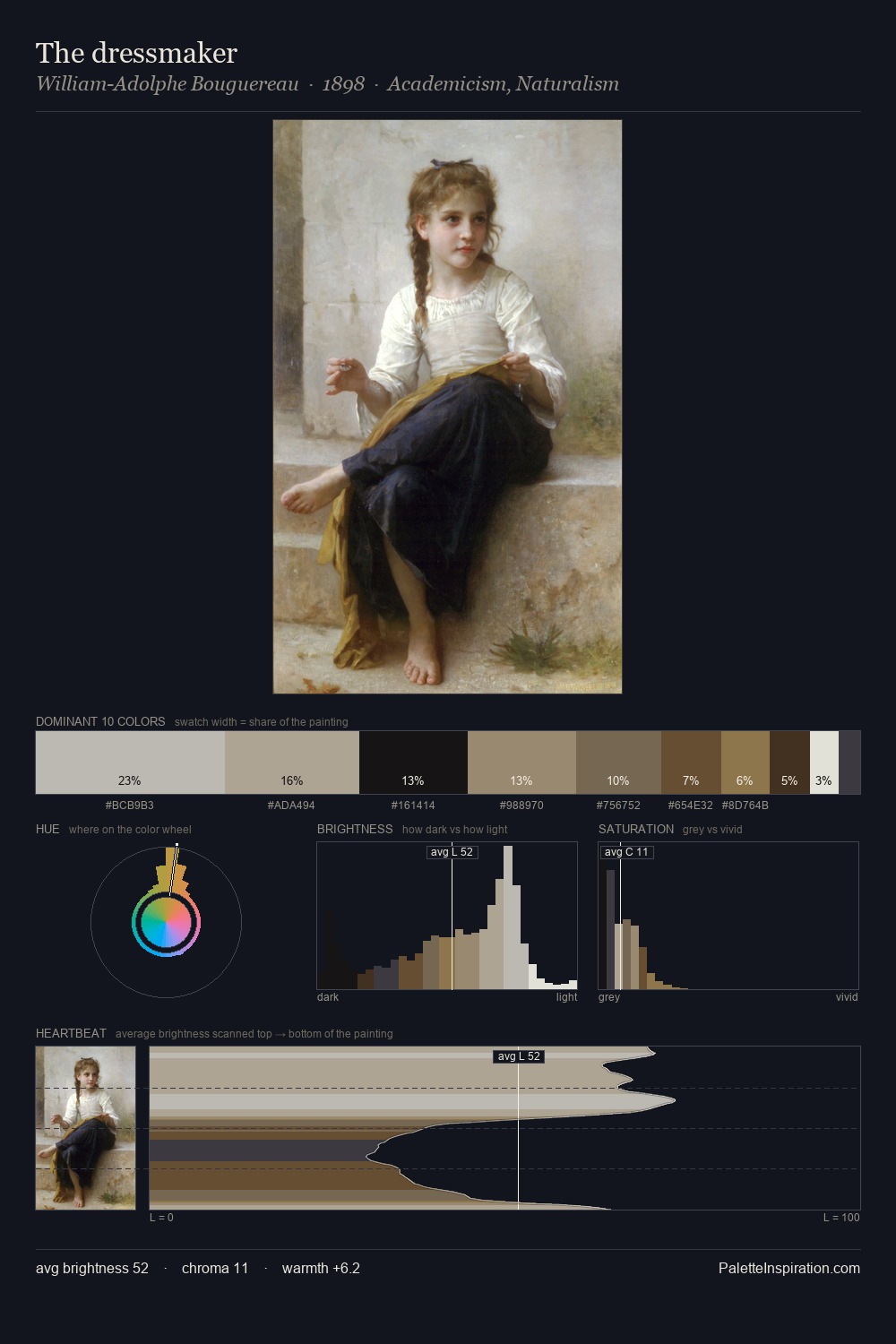
Mid-key values give Ulrika Pasch its characteristic quietness - nothing blazes, nothing disappears. Warm hues command this palette; Ulrika Pasch favours the reds, oranges, and yellows of firelight and earth. The absence of saturated colour is itself an expressive choice: this is a palette of restraint and atmosphere. At 8.0%, #6A472A carries the palette's sharpest chromatic charge: an accent that earns its place precisely because it is withheld. 78 units of value range underpin the palette's structural clarity: the eye always knows where light falls. The palette is a signature: Ulrika Pasch's particular sense of value, warmth, and colour weight made legible.
Example use cases
- theater design
- jewelry brands
- tobacco-adjacent retail
- event branding
- film & entertainment
I Love This!
Use This Palette
Copy, export, or download for your project
Copy, export, or download for your project
Copy:
Download:
Share: