Uemura Shoen Palette 2

Palette Analysis
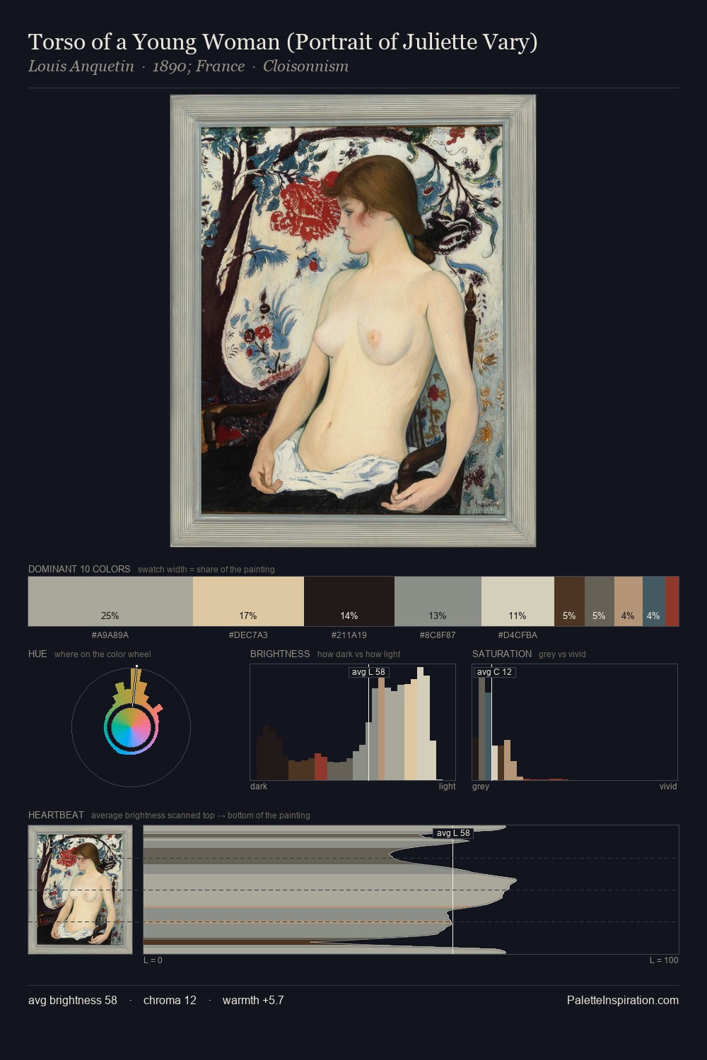
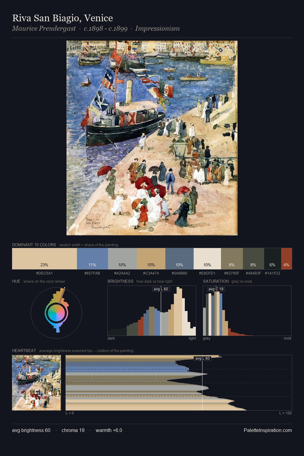
Values in Uemura Shoen tilt decisively toward white, giving the palette its luminous character. Uemura Shoen keeps warm and cool in parity, a balance that lends the work a perceptual shimmer. Chroma is moderate: colours carry enough saturation to be read as colour, but the palette stops well short of garish intensity. Only 7.0% is devoted to #A2462F, yet that small allocation delivers the palette's entire chromatic tension. From deepest dark to palest light, the palette traverses 78 units of the value scale - a span that creates natural depth. Together these qualities point to the open-air Impressionist method: recording light rather than local colour. Palette 2 sits within the larger chromatic argument that Uemura Shoen's complete body of work advances.
Example use cases
- publishing
- corporate identity
- consumer apps
- hospitality
- design agencies
I Love This!
Copy, export, or download for your project