Tsukioka Yoshitoshi Palette 1

Palette Analysis
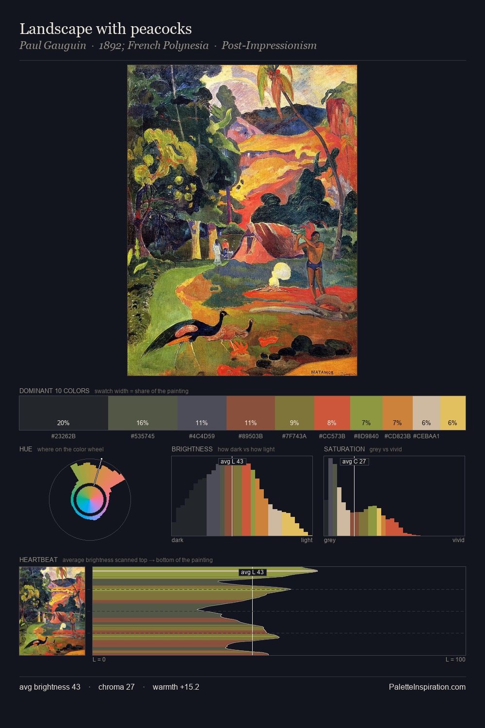
Tsukioka Yoshitoshi works in the upper reaches of the value scale, creating an atmosphere of brightness and expansiveness. Tsukioka Yoshitoshi tilts toward cool - blues and silver-greys carry the structural weight. Chroma is kept low across all colours, producing the soft, enveloping quality that characterises tonal painting. The dominant colour, #FDF2D6, takes 72.5% of the total area, establishing the overall mood before any other hue is introduced. Only 1.3% is devoted to #DEB741, yet that small allocation delivers the palette's entire chromatic tension. A value spread of 55 units gives the palette both depth and air - shadows are genuinely dark, lights genuinely light. High luminosity and cool temperature suggest the plein-air condition: unfiltered daylight and open sky. In the context of Tsukioka Yoshitoshi's full range of palettes, group 1 represents one movement in an ongoing chromatic dialogue.
Example use cases
- publishing
- corporate identity
- consumer apps
- hospitality
- design agencies
I Love This!
Copy, export, or download for your project