Toros Roslin Palette 2

Palette Analysis
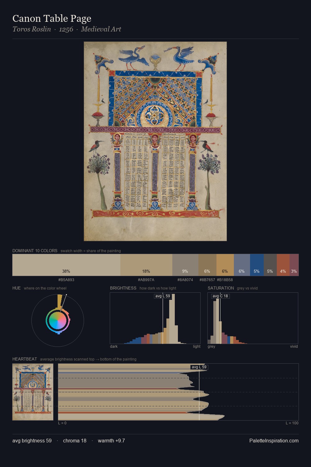
Mid-key values give Toros Roslin its characteristic quietness - nothing blazes, nothing disappears. Cool tones set the register here - the blues and greens easily outweigh any warm accents. Chroma hovers near zero; colour declares itself through subtle shifts in hue rather than outright saturation. The dominant colour, #B8A993, takes 36.4% of the total area, establishing the overall mood before any other hue is introduced. The highest-chroma note - #A27147 - appears at just 5.6%, deployed as a precision accent against the quieter ground. At 31 units across the value scale, the palette keeps contrast readable without letting it dominate. The mid-to-high key, cool bias, and moderate chroma point to outdoor observation - sky and diffused daylight as the dominant light source. Toros Roslin's palette 2 carries its own internal logic while remaining in conversation with the artist's broader colour intelligence.
Example use cases
- ceramics & pottery
- boutique hospitality
- menswear
- heritage food brands
- craft & artisan brands
I Love This!
Copy, export, or download for your project