Toros Roslin Palette 1
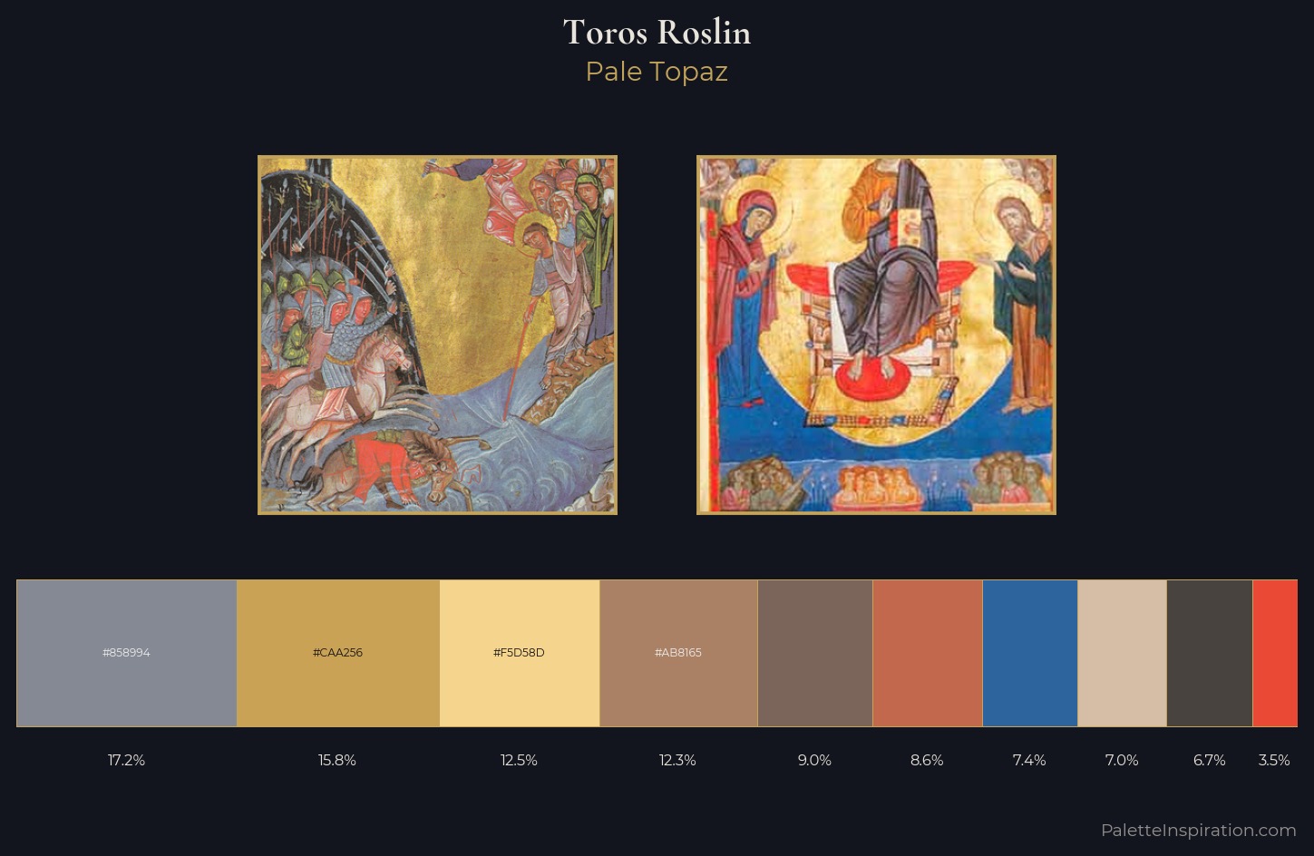
Palette Analysis
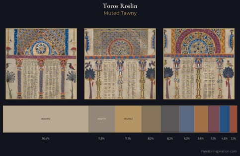
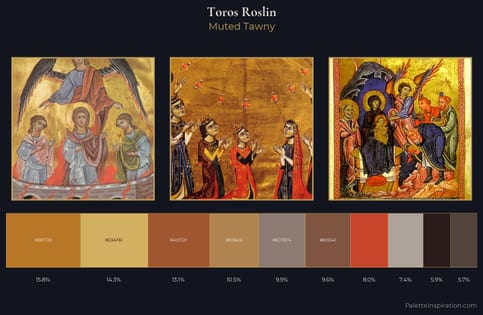
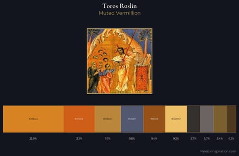
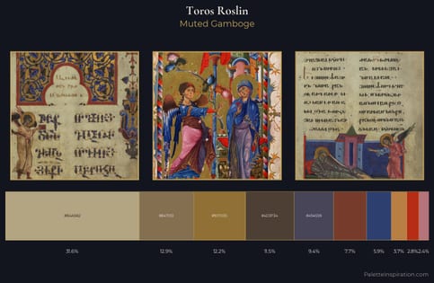
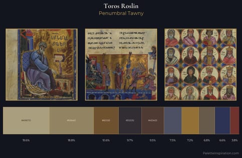
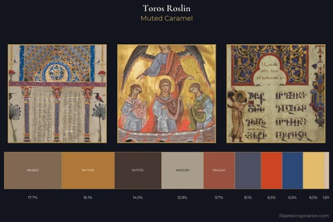
Toros Roslin is high in key: pale, luminous, and filled with optical air. Warm and cool tones are held in careful balance - neither family dominates, creating tension and resolution simultaneously. Saturation is measured and controlled, giving the palette presence without visual aggression. Only 3.5% is devoted to #EA4A35, yet that small allocation delivers the palette's entire chromatic tension. 49 units of value spread create a palette that is varied but unified - contrast in the service of harmony. The palette reads as an Impressionist one - light-biased, chromatically direct, and built on temperature contrast rather than value opposition. Toros Roslin's palette 1 carries its own internal logic while remaining in conversation with the artist's broader colour intelligence.
Example use cases
- ceramics & pottery
- boutique hospitality
- menswear
- heritage food brands
- craft & artisan brands
I Love This!
Copy, export, or download for your project