Tonalism Palette 3
Gleaming Reverie
Gleaming Bright and polished - high-key, often warm, suggesting reflective or luminous surfaces.
Reverie Dreamy pale violet - a soft, diffuse, slightly purple-gray, like a half-remembered dream.

Palette Analysis
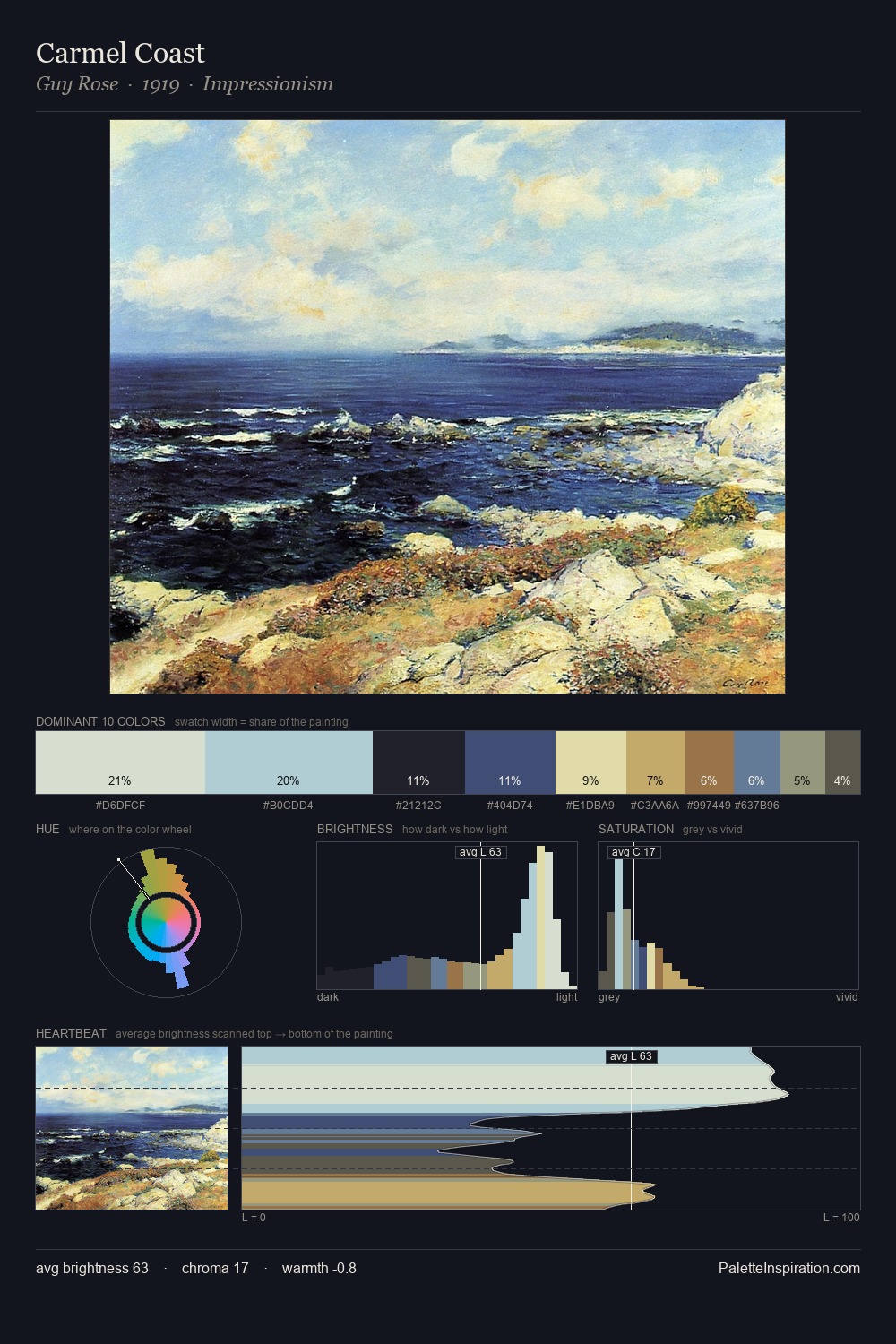
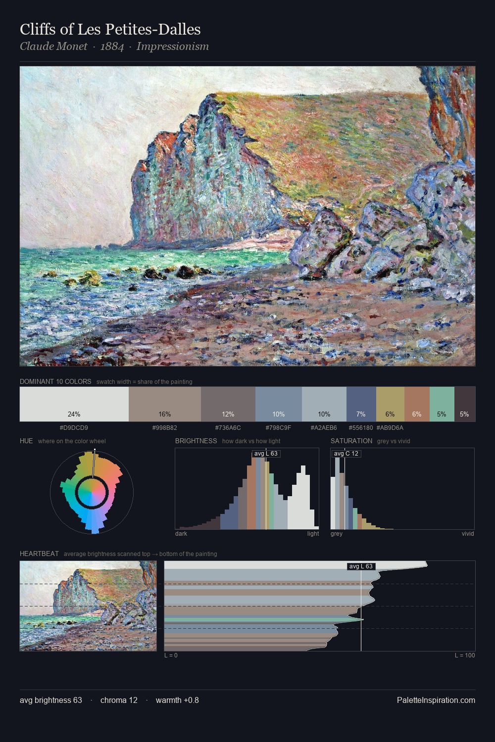
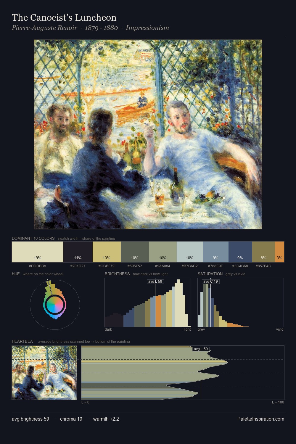
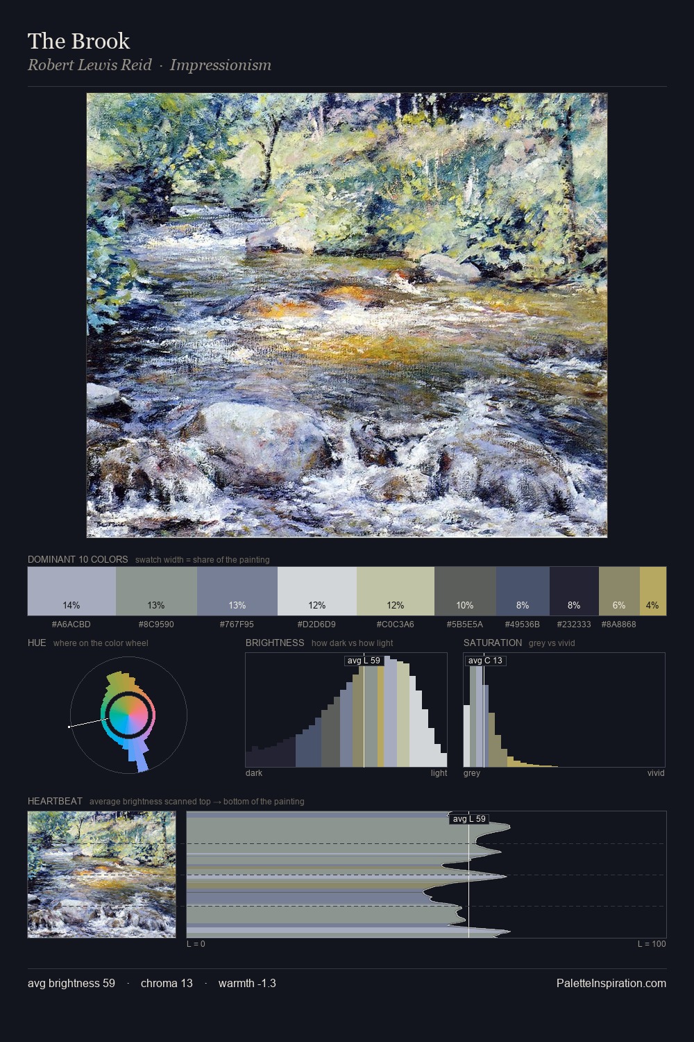
Tonalism works in the upper reaches of the value scale, creating an atmosphere of brightness and expansiveness. Temperature is cool-dominant, with blue and green families claiming the largest areas. Chroma is kept low across all colours, producing the soft, enveloping quality that characterises tonal painting. #B8AD60 delivers the chromatic peak at only 1.4% - a small shot of colour with outsized visual impact. The value range of 49 units sits in the comfortable middle: enough depth, enough light, neither extreme. The mid-to-high key, cool bias, and moderate chroma point to outdoor observation - sky and diffused daylight as the dominant light source.
Example use cases
- food & beverage
- wedding stationery
- lifestyle brands
- interior design
- fashion retail
I Love This!
Use This Palette
Copy, export, or download for your project
Copy, export, or download for your project
Copy:
Download:
Share: