Tom Scott Master Palette

Palette Analysis
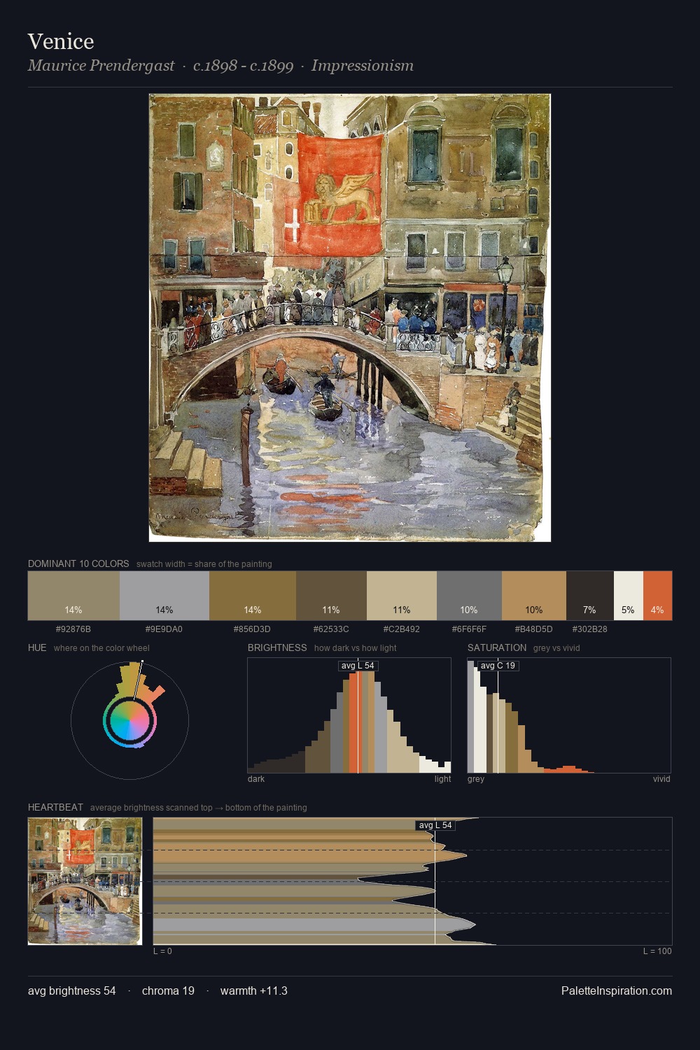
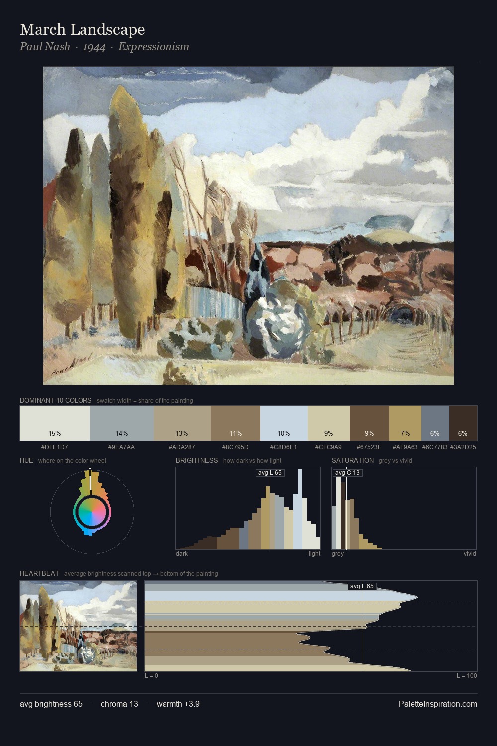
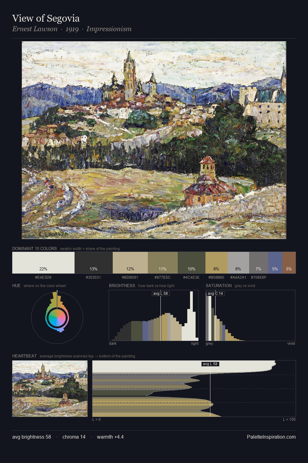
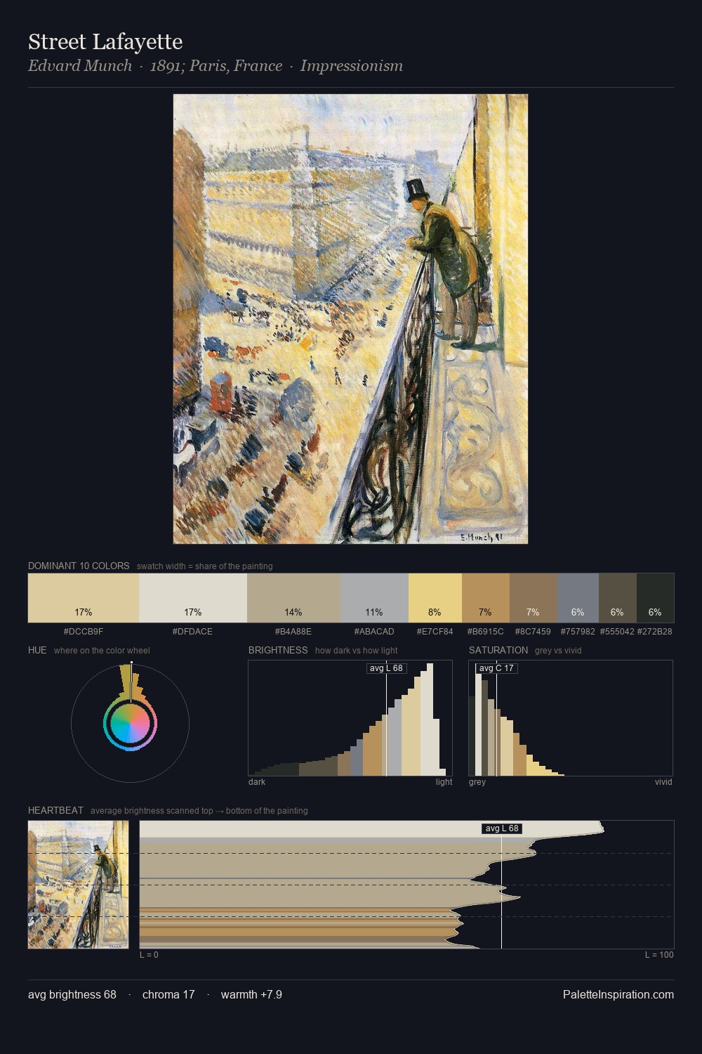
Tom Scott sits in the centre of the value range, lending the palette a sense of even, sustained light. Cool tones set the register here - the blues and greens easily outweigh any warm accents. Every colour is desaturated; the palette proceeds through near-neutrals and gently-coloured greys. The most saturated colour, #C3B89D, is reserved to 10.0% of the surface, where it acts as a focal punctuation. A value spread of 60 units gives the palette both depth and air - shadows are genuinely dark, lights genuinely light. The mid-to-high key, cool bias, and moderate chroma point to outdoor observation - sky and diffused daylight as the dominant light source. These proportions encode Tom Scott's instinctive sense of how much of each quality the eye can hold.
Example use cases
- exhibition design
- foundation branding
- estate management
- art education
- museums & galleries
I Love This!
Copy, export, or download for your project