Tintoretto Palette 17

Palette Analysis
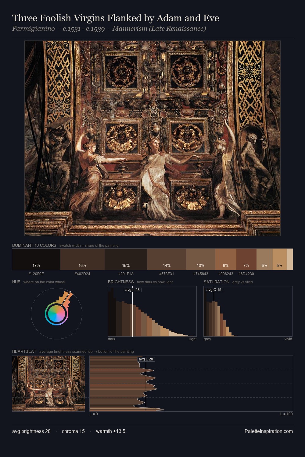
Tintoretto works almost entirely in the lower half of the value scale, privileging depth over brilliance. Temperature reads distinctly warm: the reds and earth tones from Tintoretto carry the compositional weight. Muted throughout, the palette achieves its effects through value and temperature rather than chromatic force. Tintoretto gives 25.3% of the composition to a single #14120E - a decisive chromatic anchor. At 3.8%, #3E2619 carries the palette's sharpest chromatic charge: an accent that earns its place precisely because it is withheld. 53 units of value spread create a palette that is varied but unified - contrast in the service of harmony. This tonal restraint is characteristic of the Tintoretto approach: colour serves light, not the reverse. In the context of Tintoretto's full range of palettes, group 17 represents one movement in an ongoing chromatic dialogue.
Example use cases
- theater design
- jewelry brands
- tobacco-adjacent retail
- event branding
- film & entertainment
I Love This!
Copy, export, or download for your project