Timurid Period Master Palette

Palette Analysis
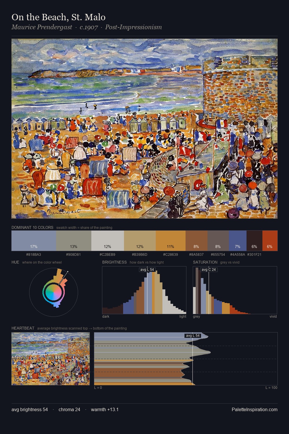
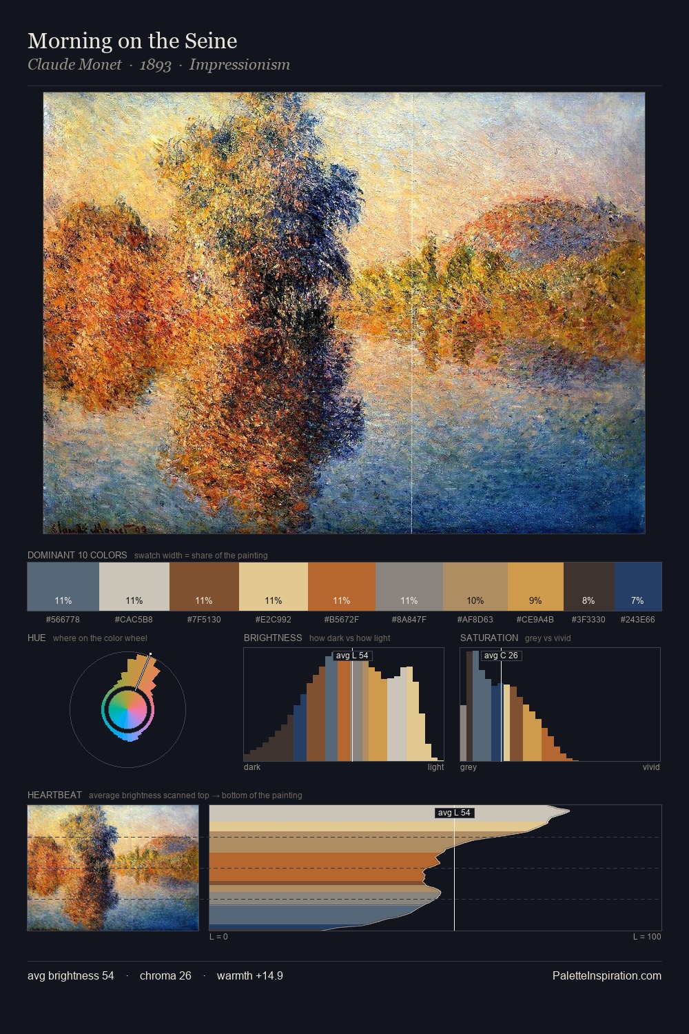
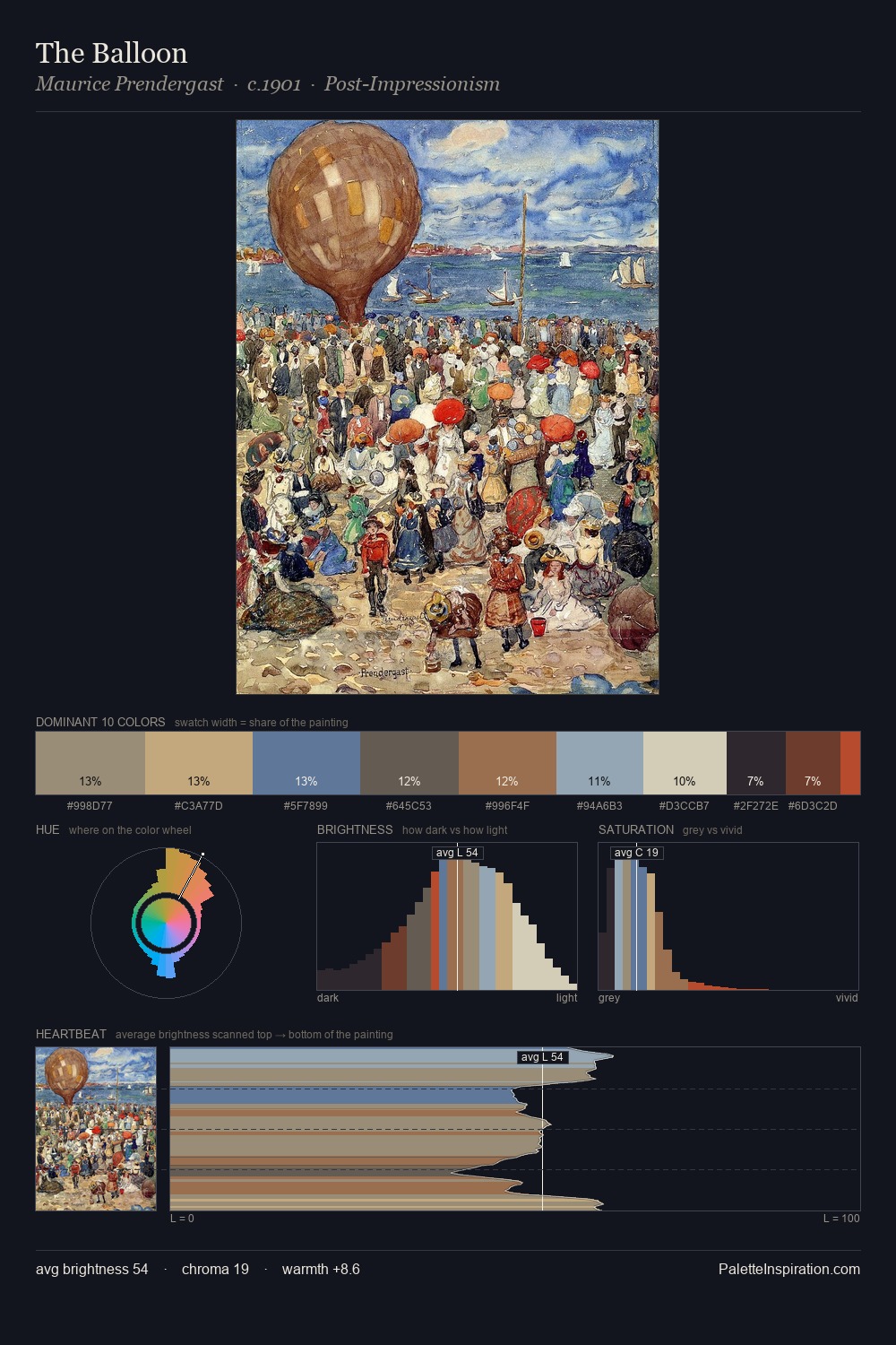
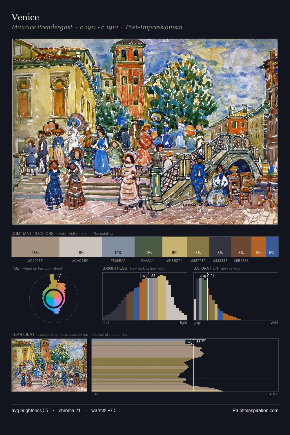
Timurid Period as a style is partly defined by its colour: this palette makes that definition concrete. Timurid Period occupies the comfortable middle of the value scale, avoiding both extremes to hold the eye in a sustained middle grey. The palette tilts toward cool - blues and silver-greys carry the structural weight. Saturation is deliberately withheld - the beauty here lies in the near-monochromatic gradations rather than colour difference. The most saturated colour, #784724, is reserved to 4.1% of the surface, where it acts as a focal punctuation. The full value range is 55 units: broad enough to build convincing three-dimensional form. High luminosity and cool temperature suggest the plein-air condition: unfiltered daylight and open sky. Any work aspiring to the Timurid Period sensibility would find reliable footing in these values.
Example use cases
- ceramics & pottery
- boutique hospitality
- menswear
- heritage food brands
- craft & artisan brands
I Love This!
Copy, export, or download for your project