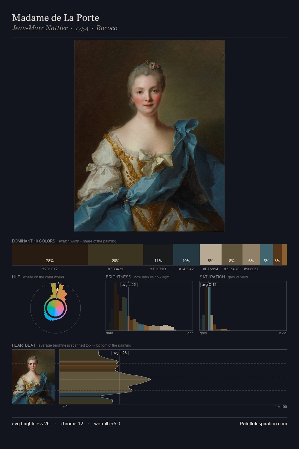
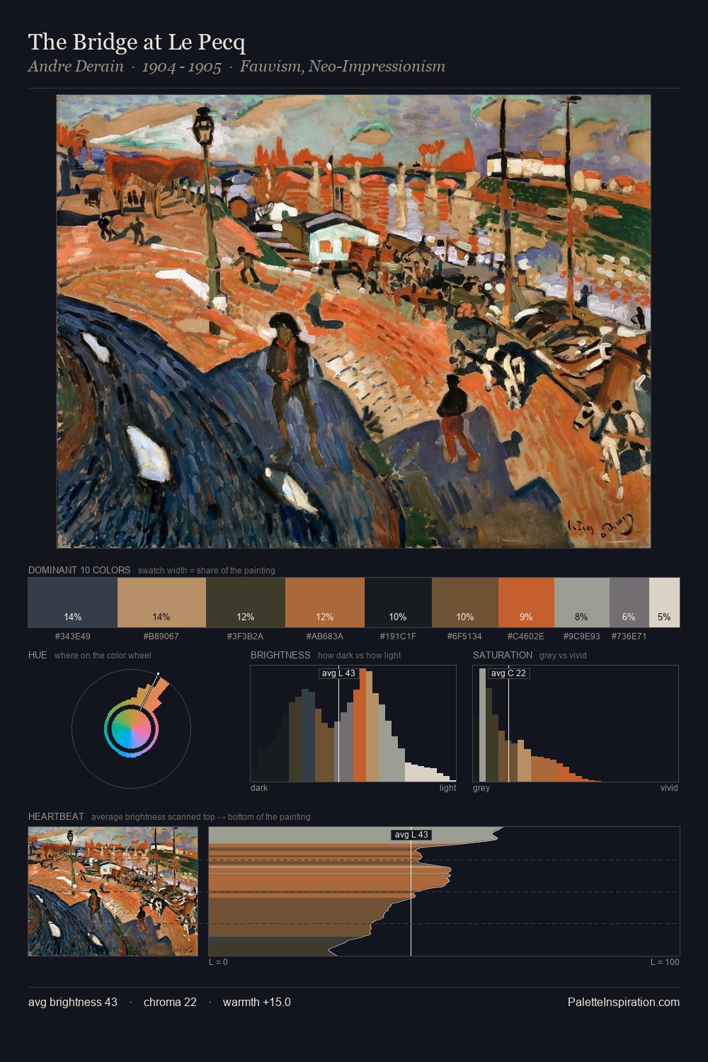
Thomas Somerscales Palette 5

Palette Analysis
Thomas Somerscales occupies the comfortable middle of the value scale, avoiding both extremes to hold the eye in a sustained middle grey. Temperature is cool-dominant, with blue and green families claiming the largest areas. All colours lean toward grey, building depth through value rather than colour punch. The dominant colour, #A3A6A7, takes 28.5% of the total area, establishing the overall mood before any other hue is introduced. Only 3.8% is devoted to #B3705A, yet that small allocation delivers the palette's entire chromatic tension. The value range spans 56 units across the palette, providing the full gamut from deep shadow to near-white and ensuring clear tonal hierarchy. The mid-to-high key, cool bias, and moderate chroma point to outdoor observation - sky and diffused daylight as the dominant light source. This is palette 5 of Thomas Somerscales's sequence - a single chapter in a chromatic story told across many works.
Example use cases
- exhibition design
- foundation branding
- estate management
- art education
- museums & galleries
I Love This!
Copy, export, or download for your project