Thomas Smith Master Palette

Palette Analysis
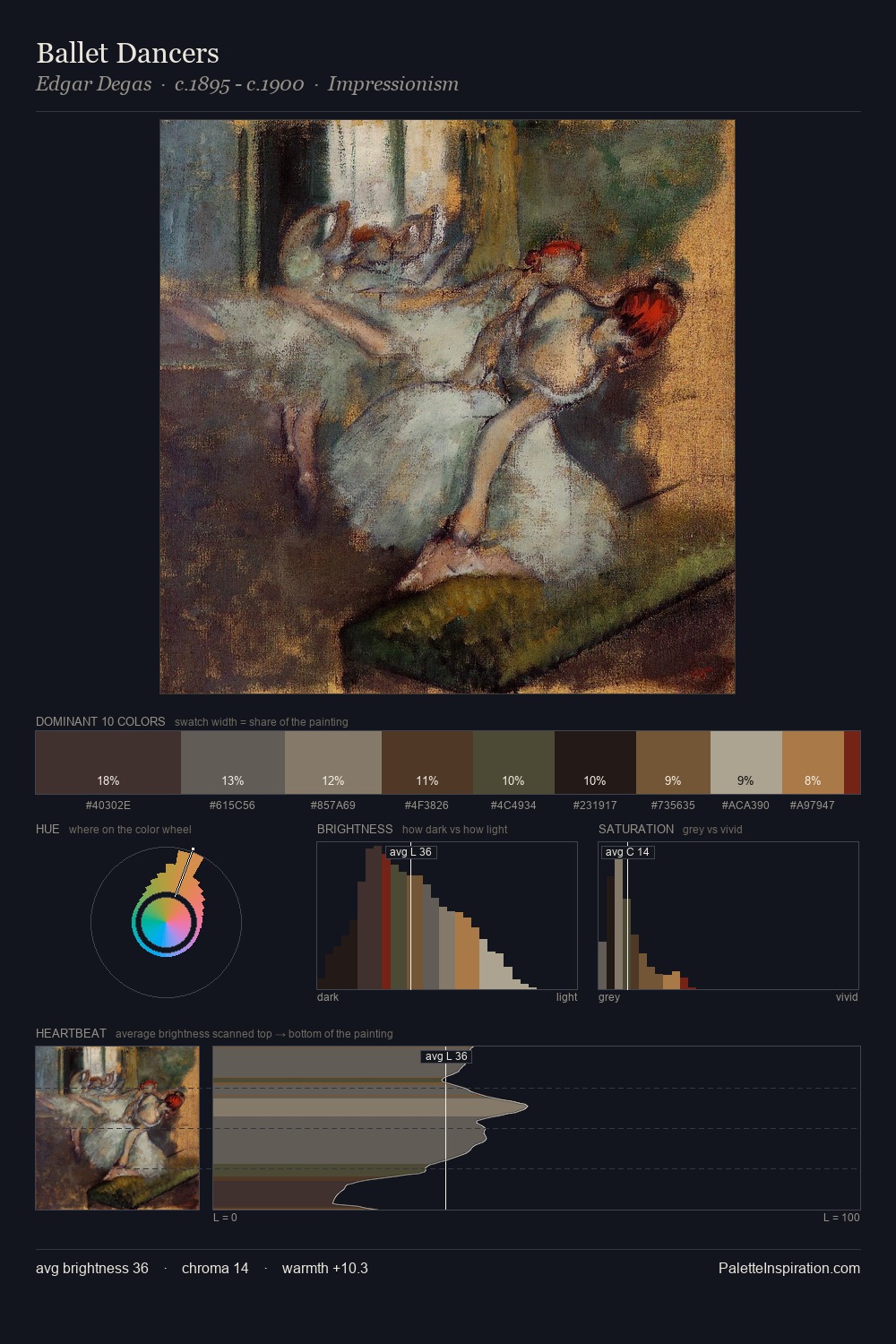
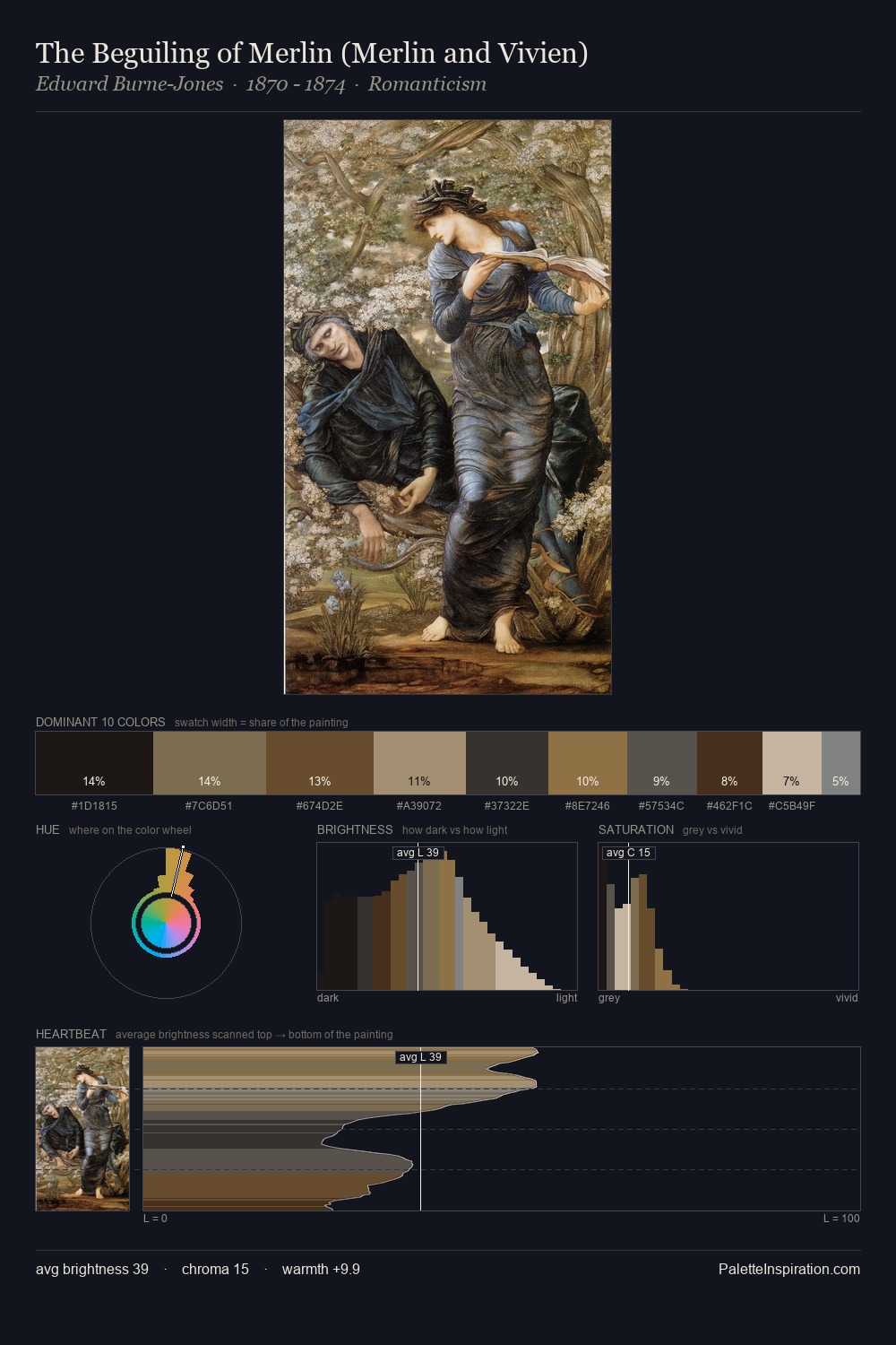
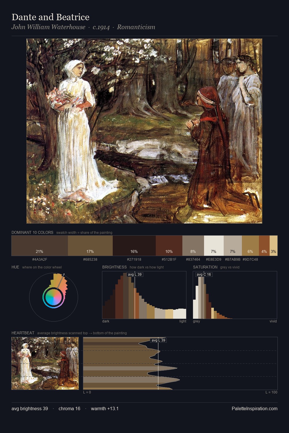
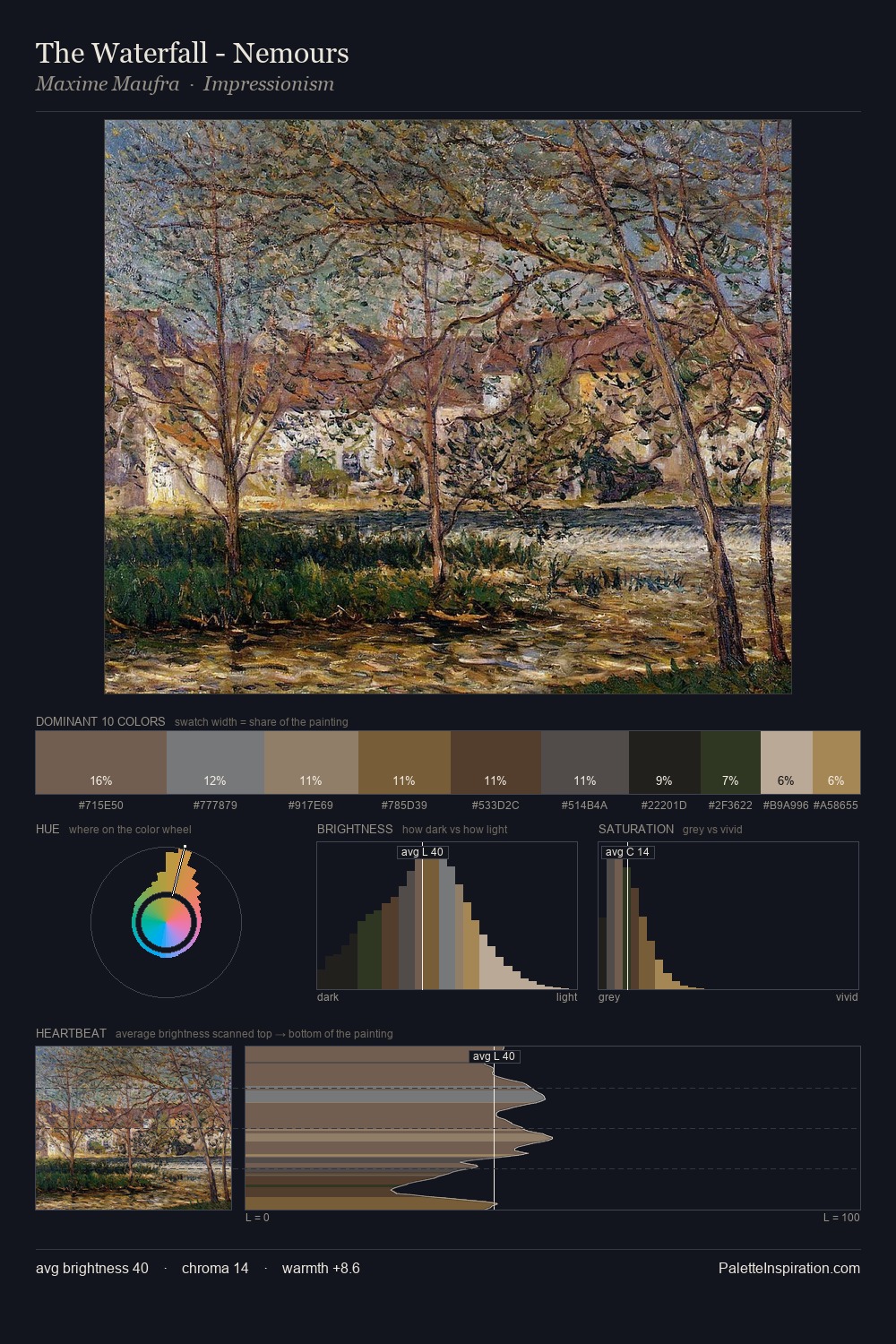
Thomas Smith occupies the comfortable middle of the value scale, avoiding both extremes to hold the eye in a sustained middle grey. Warm hues command this palette; Thomas Smith favours the reds, oranges, and yellows of firelight and earth. Every colour is desaturated; the palette proceeds through near-neutrals and gently-coloured greys. 25.0% of the palette belongs to #4C2D18, a concentration that makes it the unmistakable visual centre. The saturated accent, #806C48, registers at 5.0% - sparse enough to feel like a deliberate surprise. 51 units of value spread create a palette that is varied but unified - contrast in the service of harmony. These proportions encode Thomas Smith's instinctive sense of how much of each quality the eye can hold.
Example use cases
- theater design
- jewelry brands
- tobacco-adjacent retail
- event branding
- film & entertainment
I Love This!
Copy, export, or download for your project