Thomas Hudson Palette 3

Palette Analysis
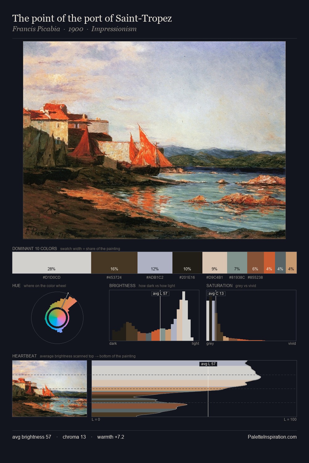
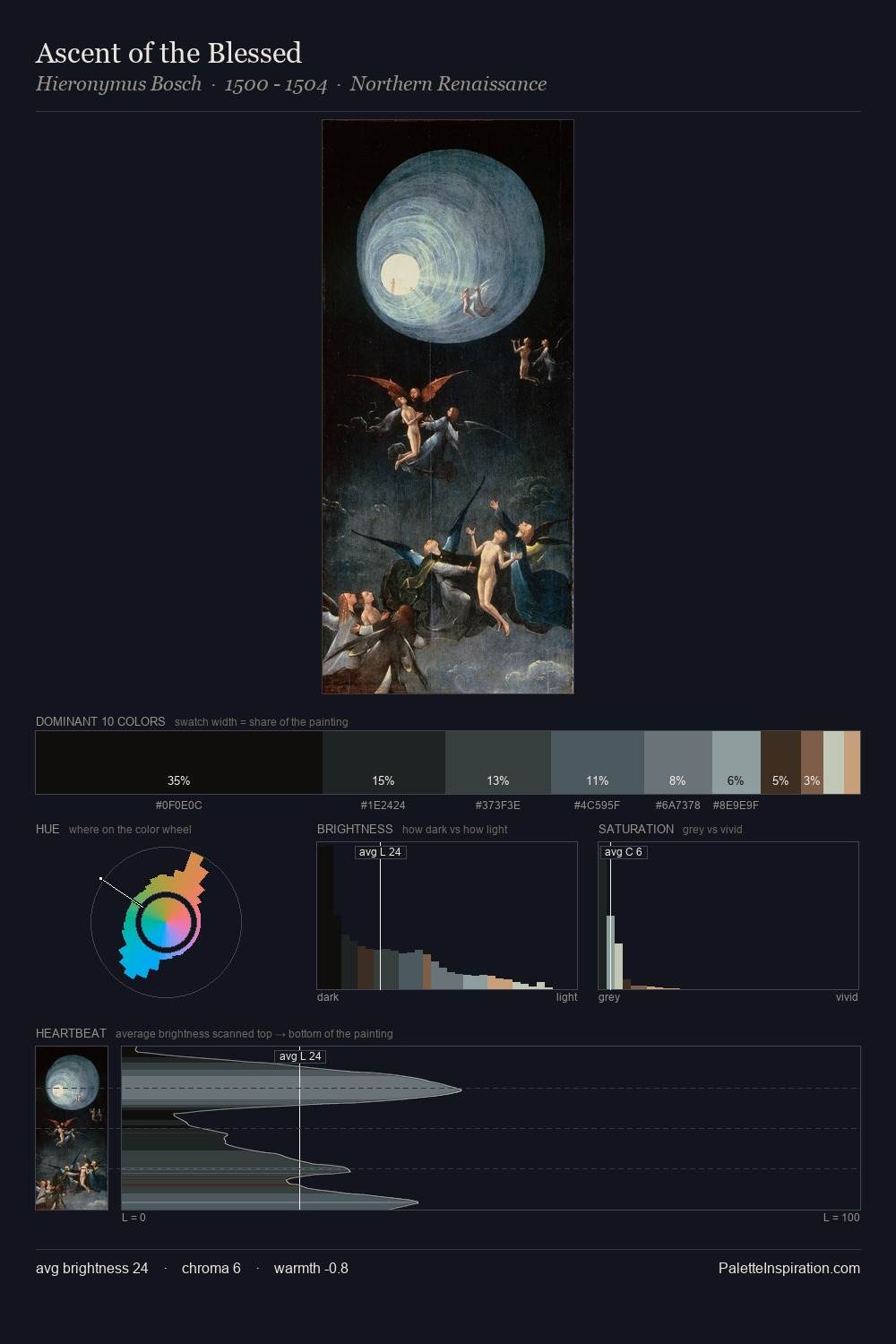
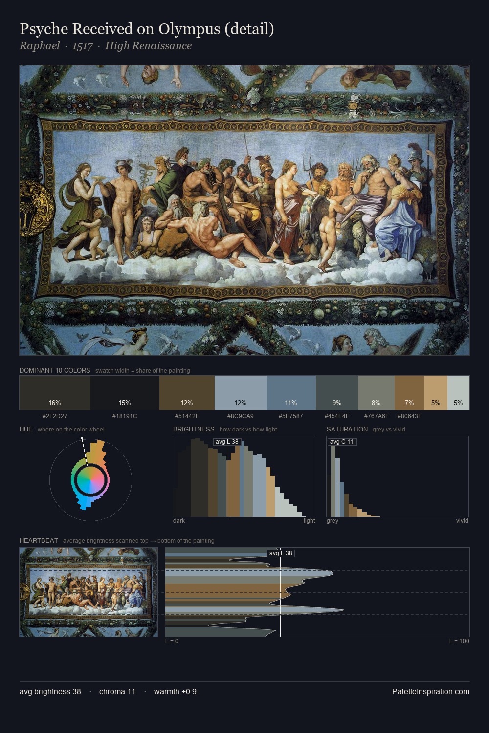
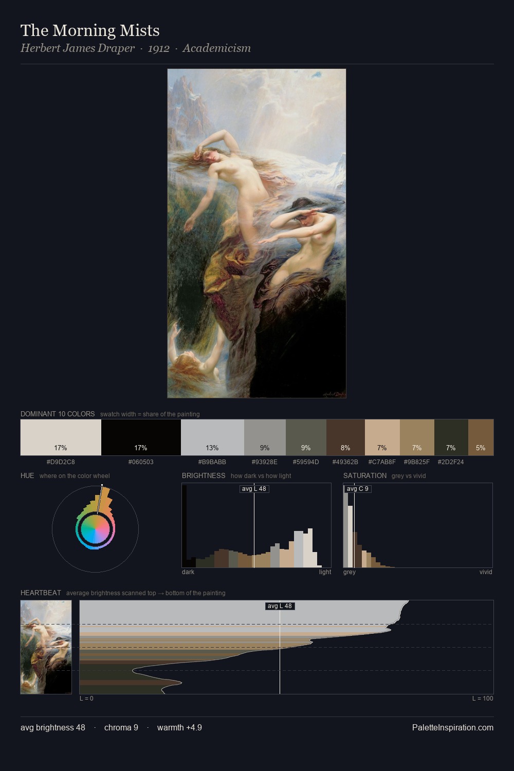
The palette of Thomas Hudson sits in the lower register of the value scale - dense, contained, and weighted. Cool hues prevail: blues, greens, and greys anchor the palette's emotional temperature. Saturation is deliberately withheld - the beauty here lies in the near-monochromatic gradations rather than colour difference. Thomas Hudson gives 28.4% of the composition to a single #0A0F0A - a decisive chromatic anchor. The saturated accent, #7D5534, registers at 5.4% - sparse enough to feel like a deliberate surprise. 64 units of value range underpin the palette's structural clarity: the eye always knows where light falls. This tonal restraint is characteristic of the Thomas Hudson approach: colour serves light, not the reverse. Thomas Hudson's palette 3 carries its own internal logic while remaining in conversation with the artist's broader colour intelligence.
Example use cases
- theater design
- jewelry brands
- tobacco-adjacent retail
- event branding
- film & entertainment
I Love This!
Copy, export, or download for your project