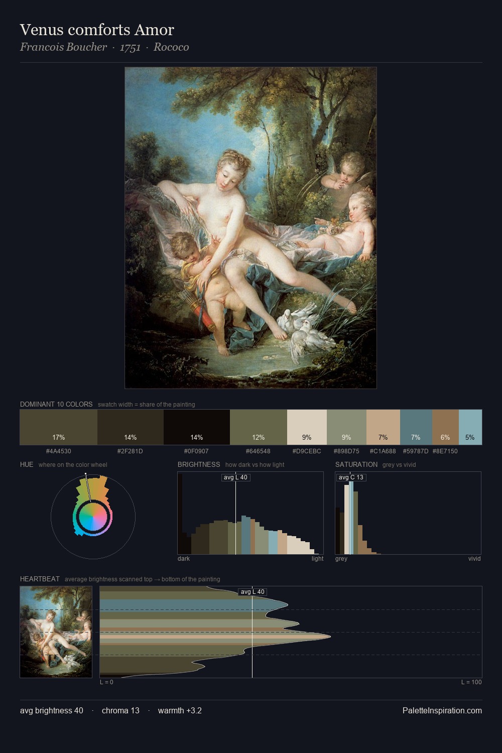
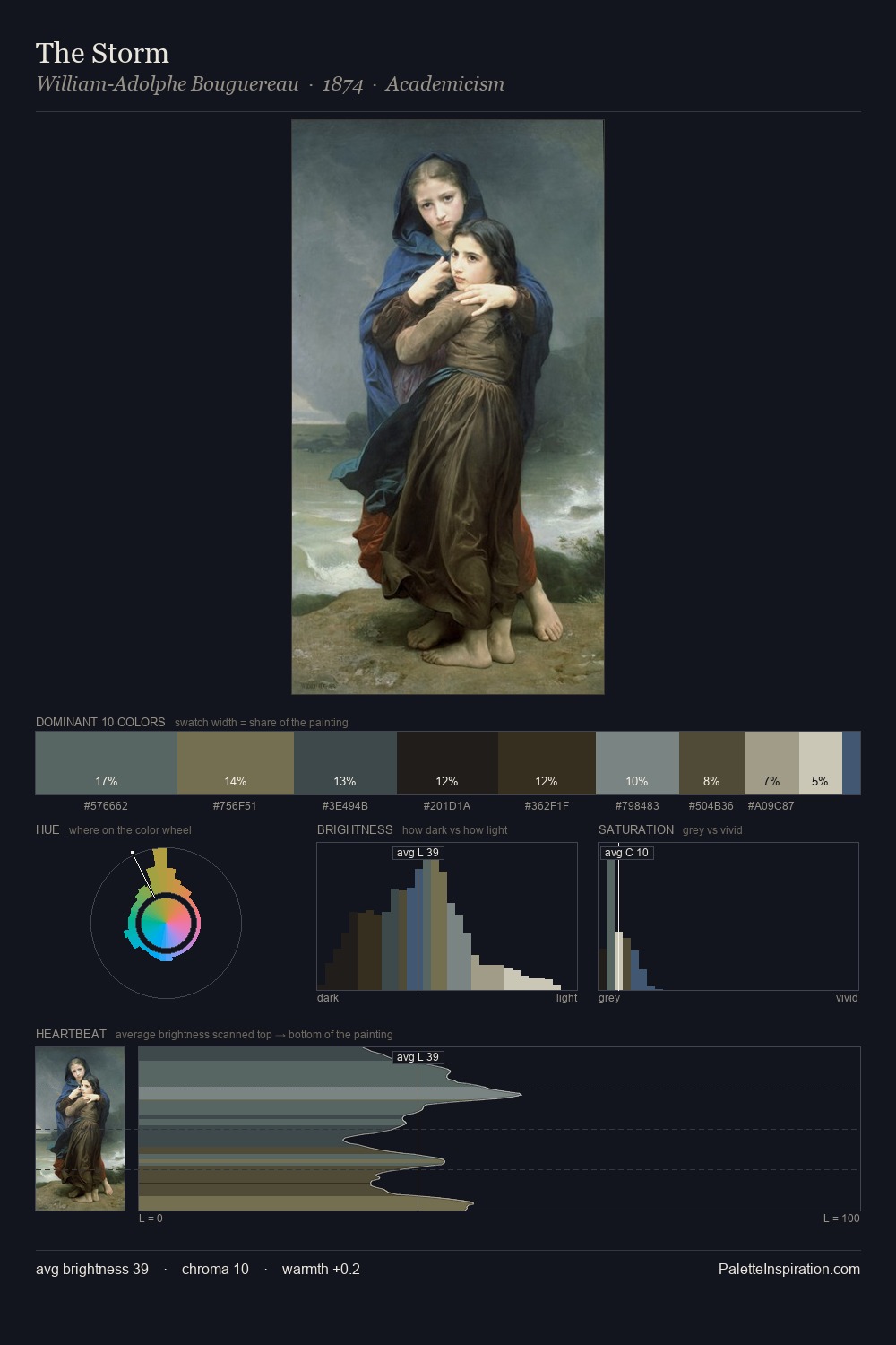
Thomas Hudson Palette 2

Palette Analysis
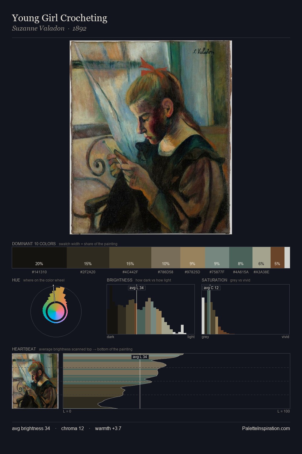
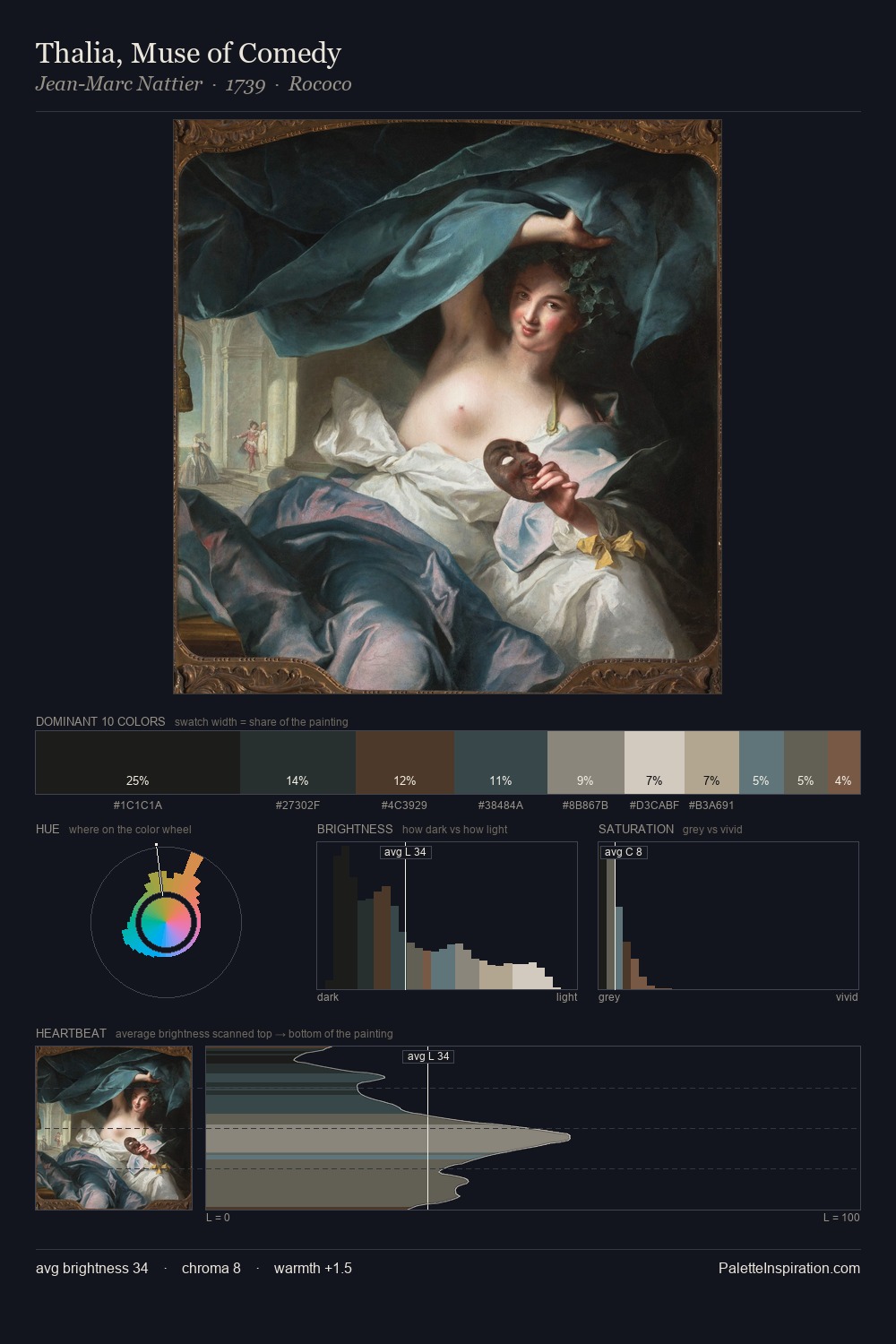
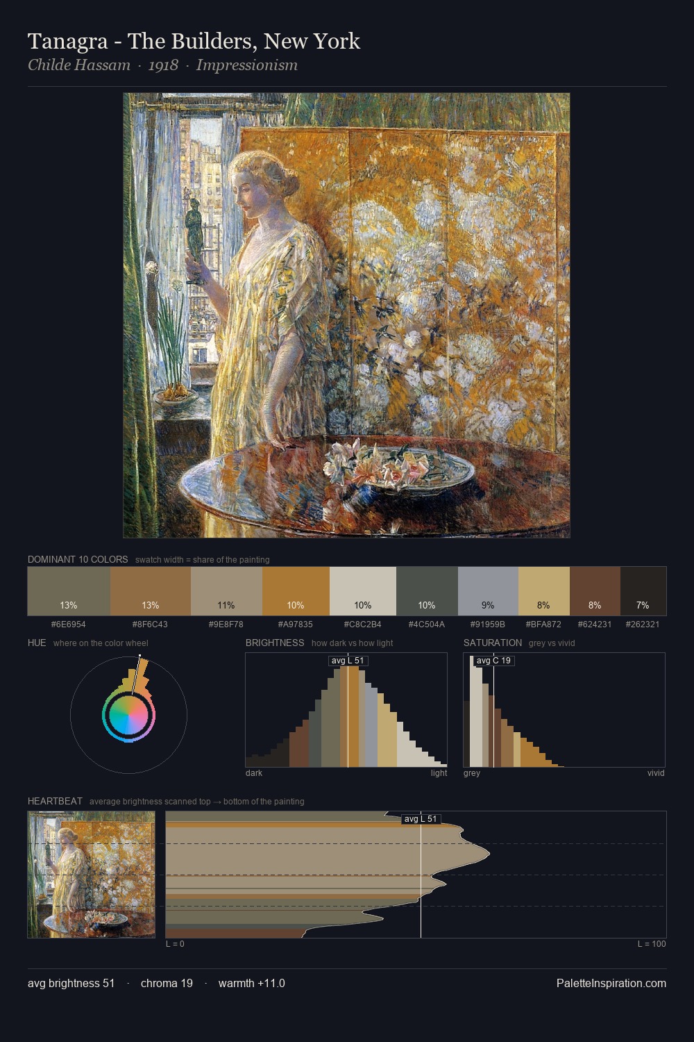
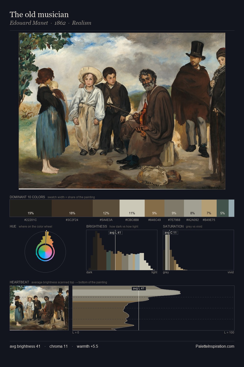
Thomas Hudson sits in the centre of the value range, lending the palette a sense of even, sustained light. Thomas Hudson tilts toward cool - blues and silver-greys carry the structural weight. Saturation is deliberately withheld - the beauty here lies in the near-monochromatic gradations rather than colour difference. 25.5% of the palette belongs to #171B1E, a concentration that makes it the unmistakable visual centre. Only 8.7% is devoted to #E2D7C9, yet that small allocation delivers the palette's entire chromatic tension. A value spread of 66 units gives the palette both depth and air - shadows are genuinely dark, lights genuinely light. High luminosity and cool temperature suggest the plein-air condition: unfiltered daylight and open sky. This is palette 2 of Thomas Hudson's sequence - a single chapter in a chromatic story told across many works.
Example use cases
- theater design
- jewelry brands
- tobacco-adjacent retail
- event branding
- film & entertainment
I Love This!
Copy, export, or download for your project