Thomas Francis Dicksee Palette 1

Palette Analysis
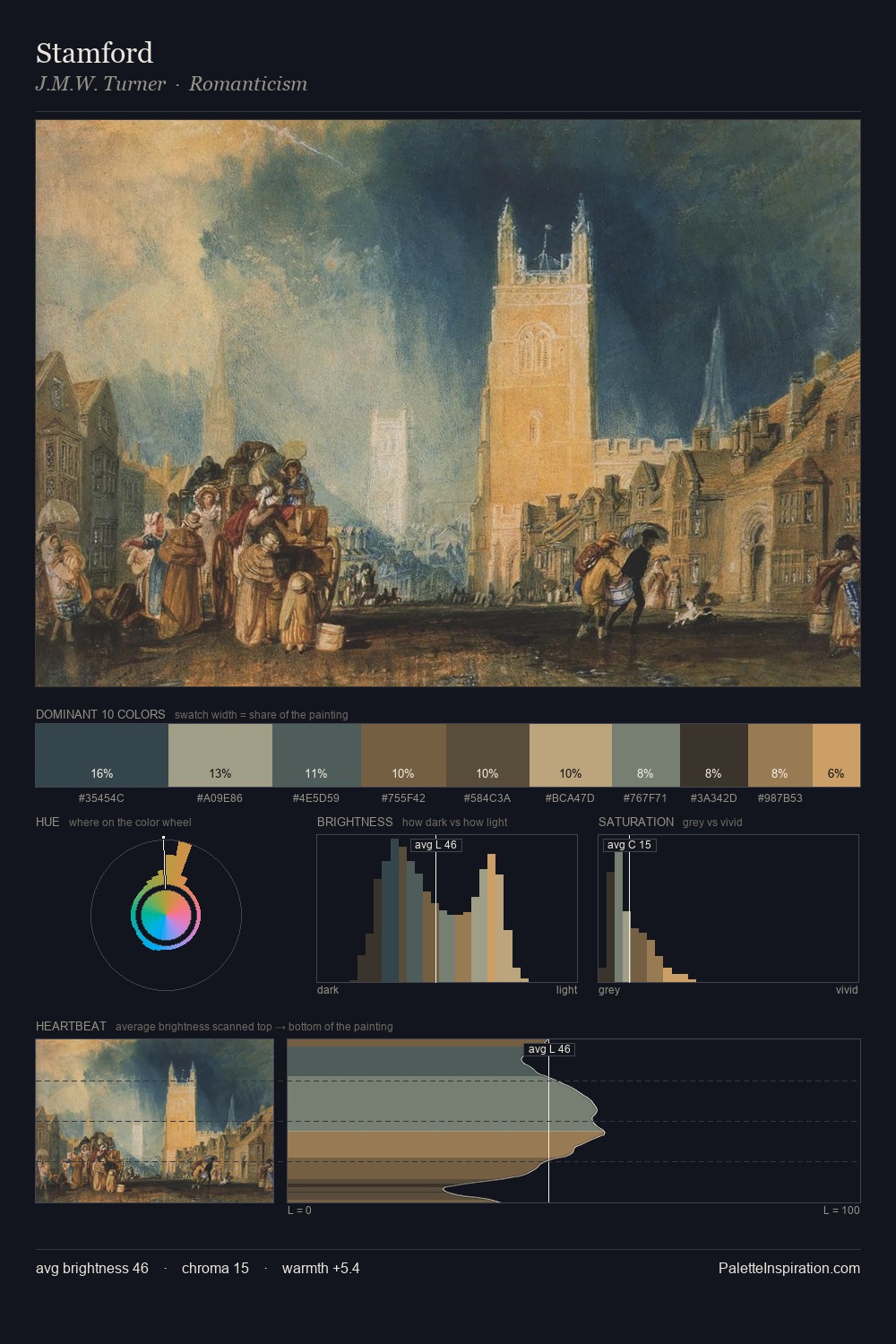
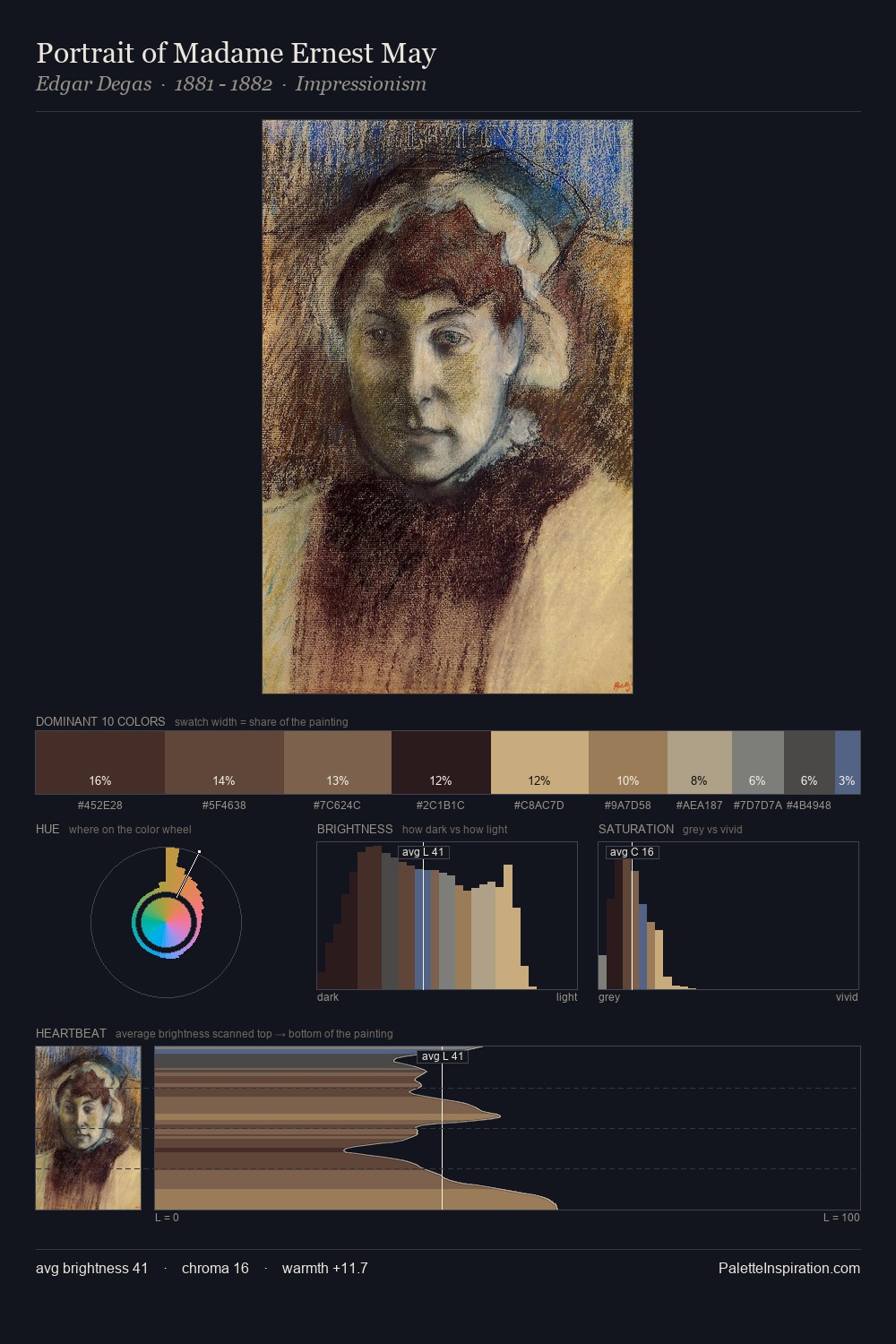
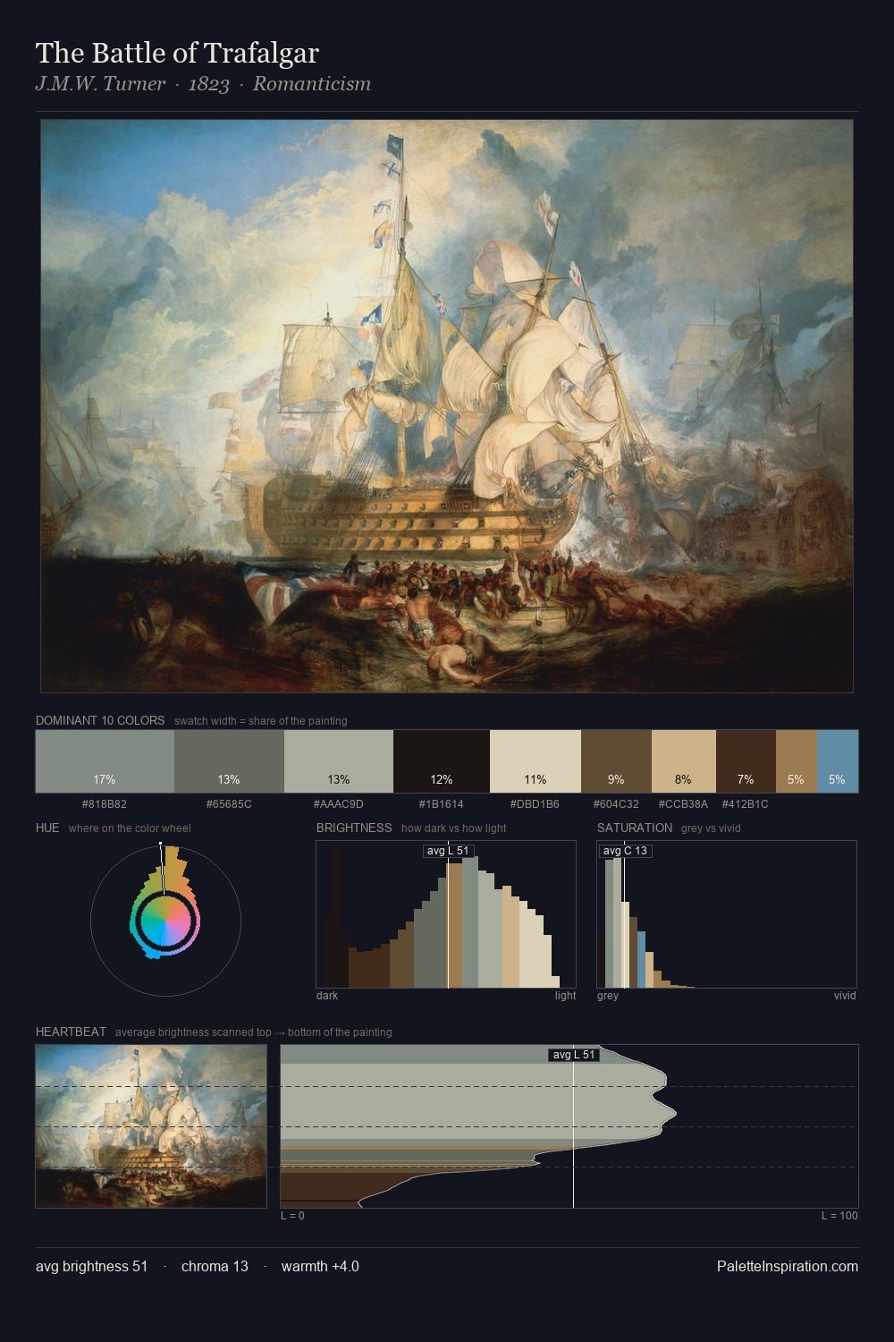
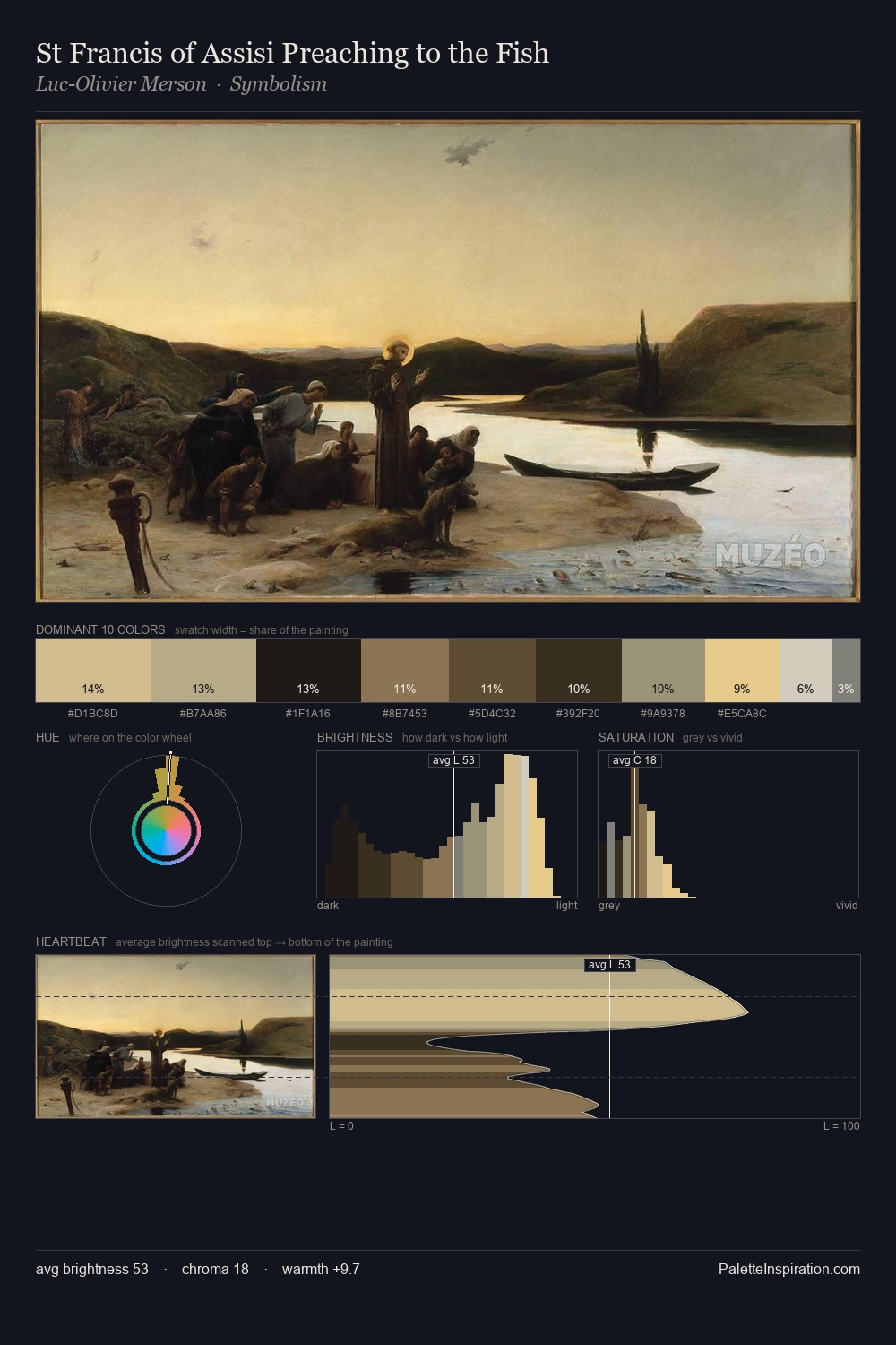
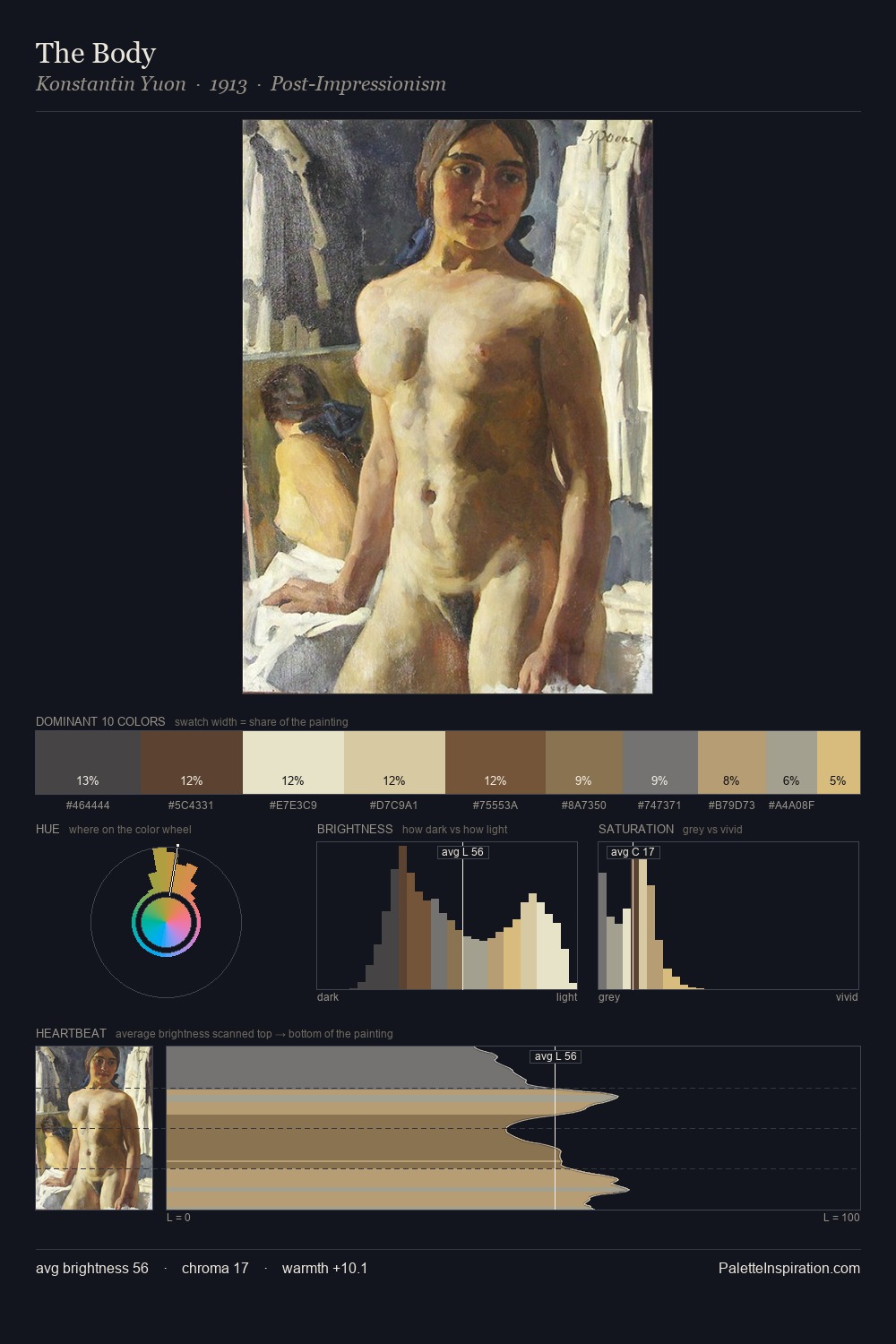
Thomas Francis Dicksee occupies the comfortable middle of the value scale, avoiding both extremes to hold the eye in a sustained middle grey. Thomas Francis Dicksee builds on cool foundations: the palette favours the blue-cyan-green arc. Every colour is desaturated; the palette proceeds through near-neutrals and gently-coloured greys. #5F422D functions as the palette's exclamation mark: highest chroma, lowest percentage (5.4%). The palette spans 51 value units: a measured range that delivers coherence over drama. The palette has the character of outdoor light: cool, mid-bright, with colour rendered faithfully rather than expressively. Thomas Francis Dicksee's palette 1 carries its own internal logic while remaining in conversation with the artist's broader colour intelligence.
Example use cases
- food packaging
- leather accessories
- travel & outdoor
- natural cosmetics
- interior design
I Love This!
Copy, export, or download for your project
![[Unkown] palette card](/cards/0014172.jpg)