Thomas Buchanan Read Palette 2

Palette Analysis
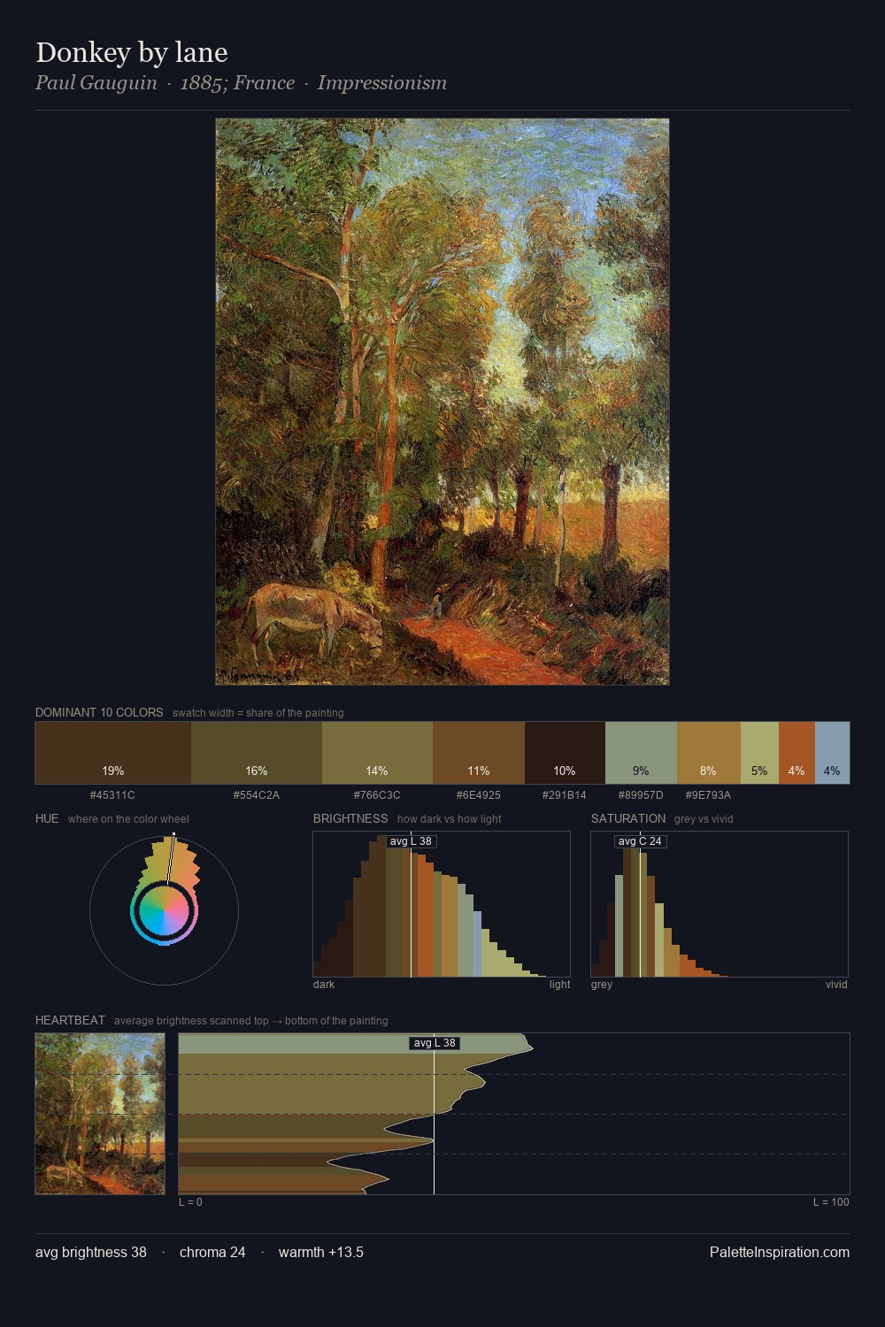
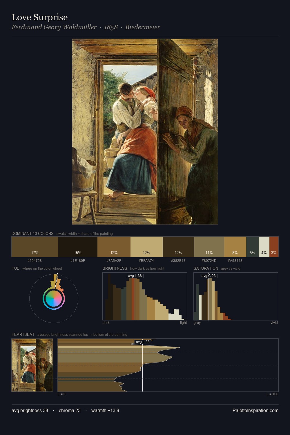
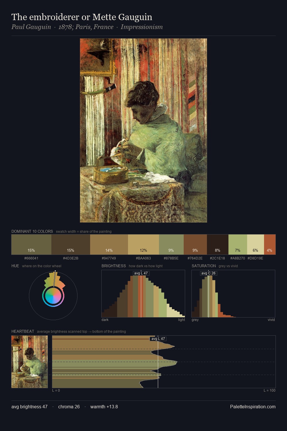
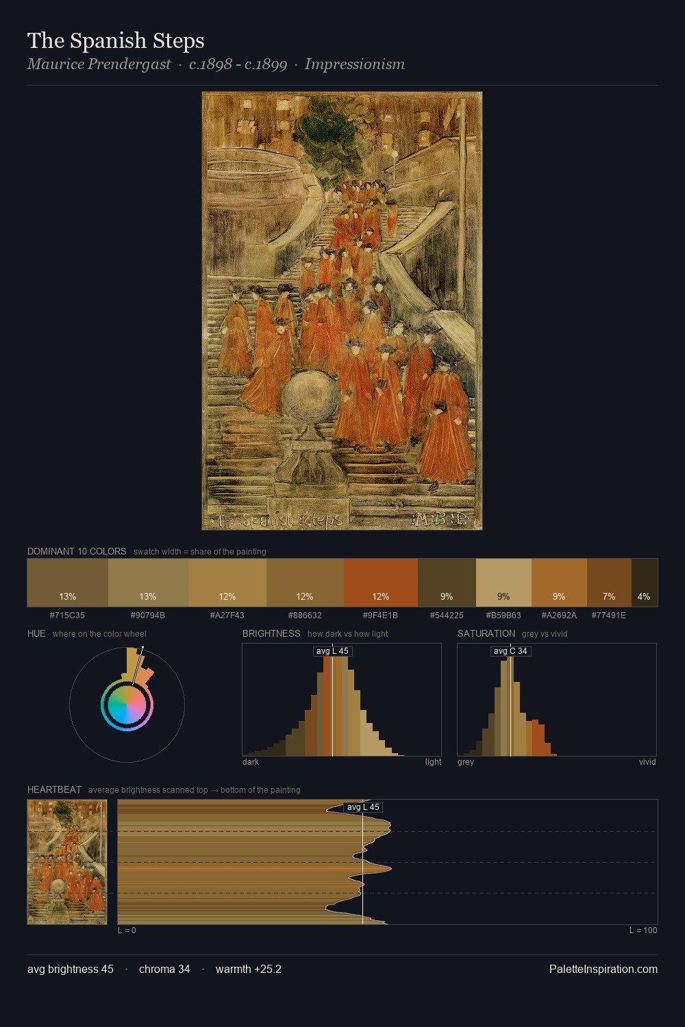
Thomas Buchanan Read occupies the comfortable middle of the value scale, avoiding both extremes to hold the eye in a sustained middle grey. Temperature is cool-dominant, with blue and green families claiming the largest areas. Saturation is deliberately withheld - the beauty here lies in the near-monochromatic gradations rather than colour difference. The most saturated colour, #A97C3F, is reserved to 5.0% of the surface, where it acts as a focal punctuation. Value range is moderate at 47 units - enough contrast for legibility, not so much as to fragment the tonal unity. High luminosity and cool temperature suggest the plein-air condition: unfiltered daylight and open sky. This is palette 2 of Thomas Buchanan Read's sequence - a single chapter in a chromatic story told across many works.
Example use cases
- music labels
- luxury hospitality
- editorial photography
- leather goods
- premium streaming
I Love This!
Copy, export, or download for your project