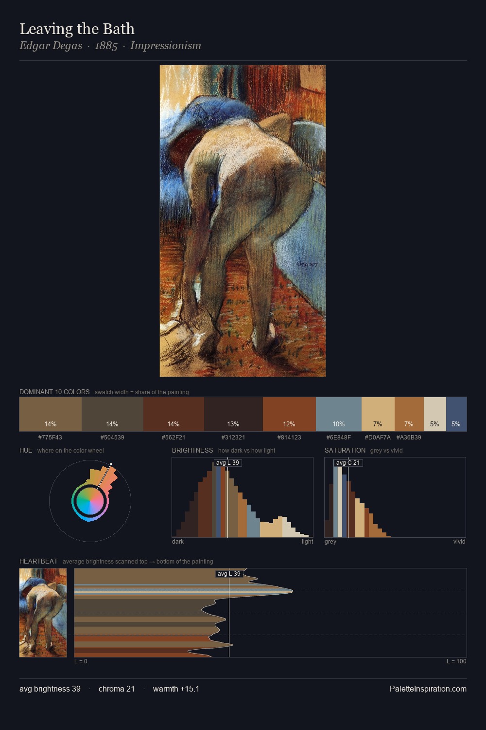
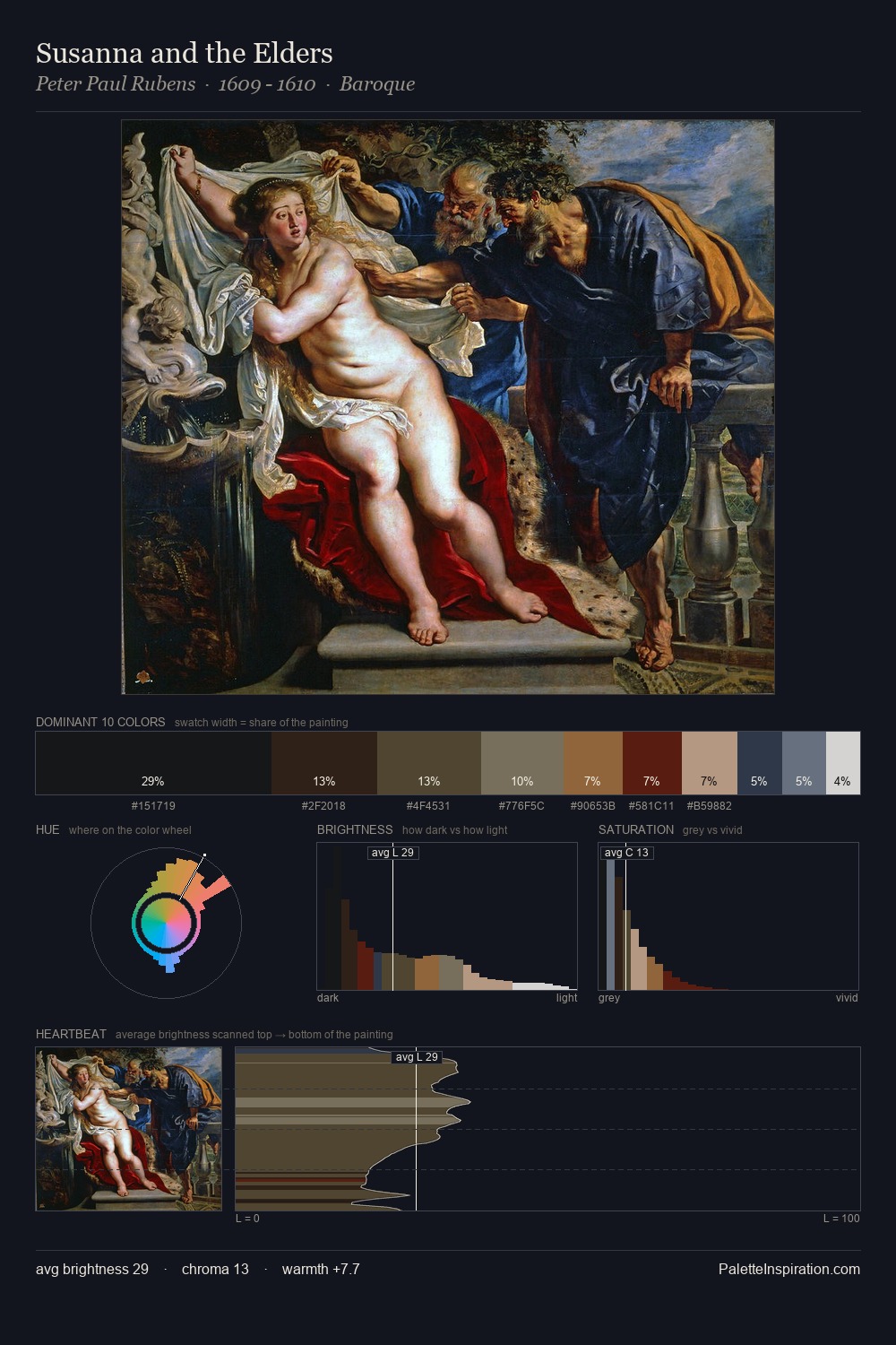
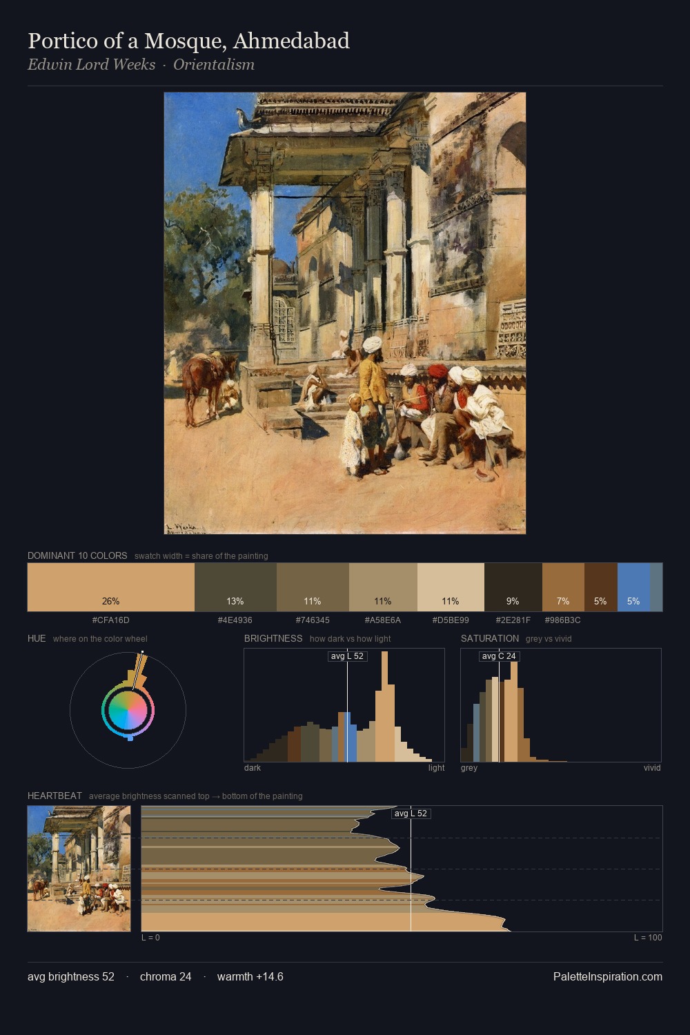
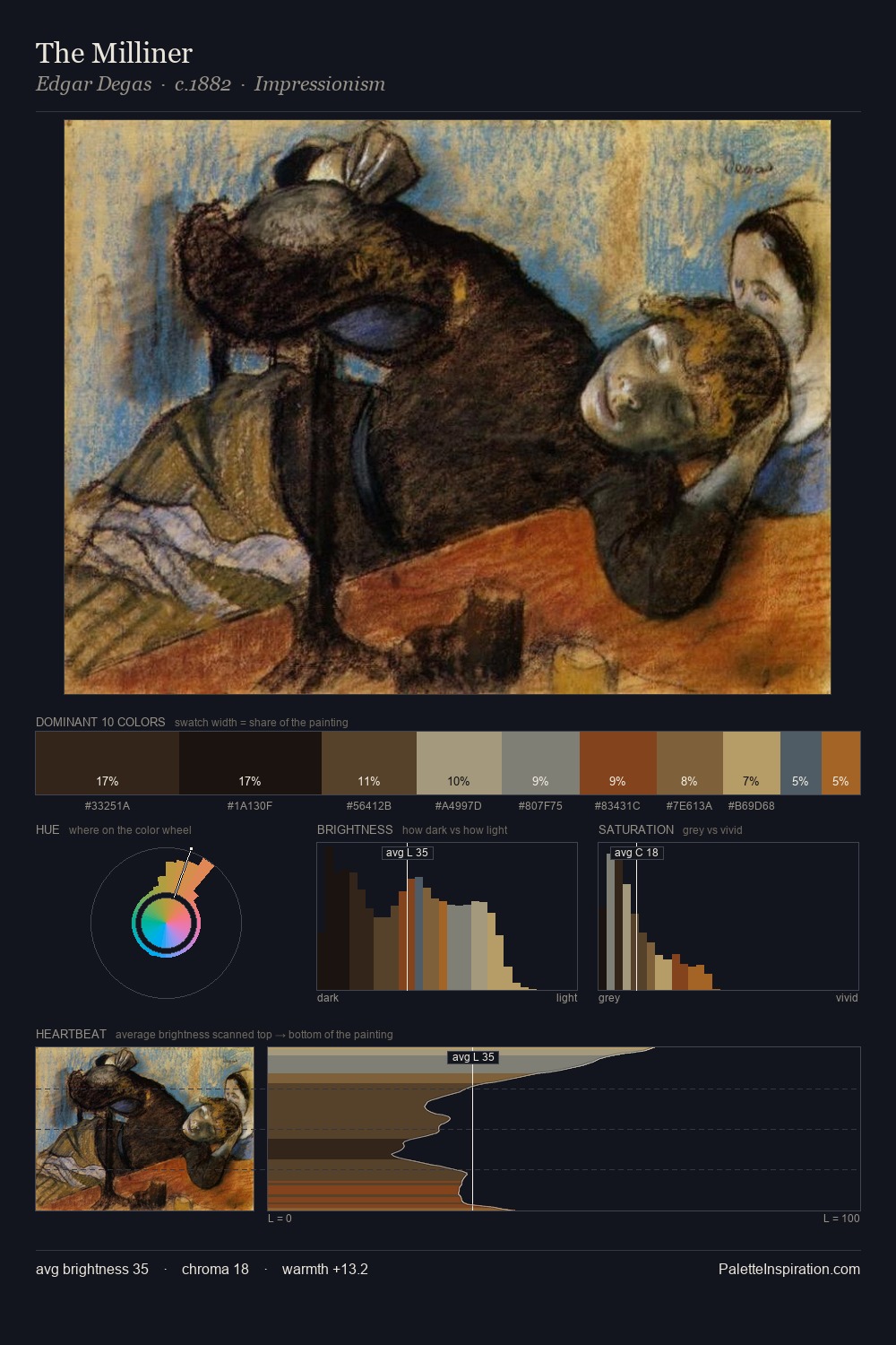
Thomas Barker of Bath Palette 3

Palette Analysis
Thomas Barker of Bath keeps values measured and balanced, a hallmark of tonal restraint. Warm hues command this palette; Thomas Barker of Bath favours the reds, oranges, and yellows of firelight and earth. The absence of saturated colour is itself an expressive choice: this is a palette of restraint and atmosphere. #1B1917 at 29.7% of the palette: an overwhelming presence that pulls all other colours into its gravitational field. The highest-chroma note - #CEA86F - appears at just 5.1%, deployed as a precision accent against the quieter ground. At 54 units across the value scale, the palette keeps contrast readable without letting it dominate. Palette 3 sits within the larger chromatic argument that Thomas Barker of Bath's complete body of work advances.
Example use cases
- theater design
- jewelry brands
- tobacco-adjacent retail
- event branding
- film & entertainment
I Love This!
Copy, export, or download for your project