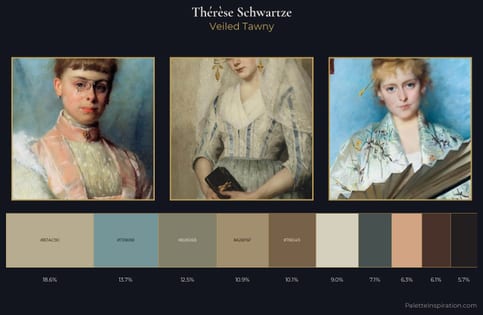
Thérèse Schwartze Palette 3
Palette Analysis
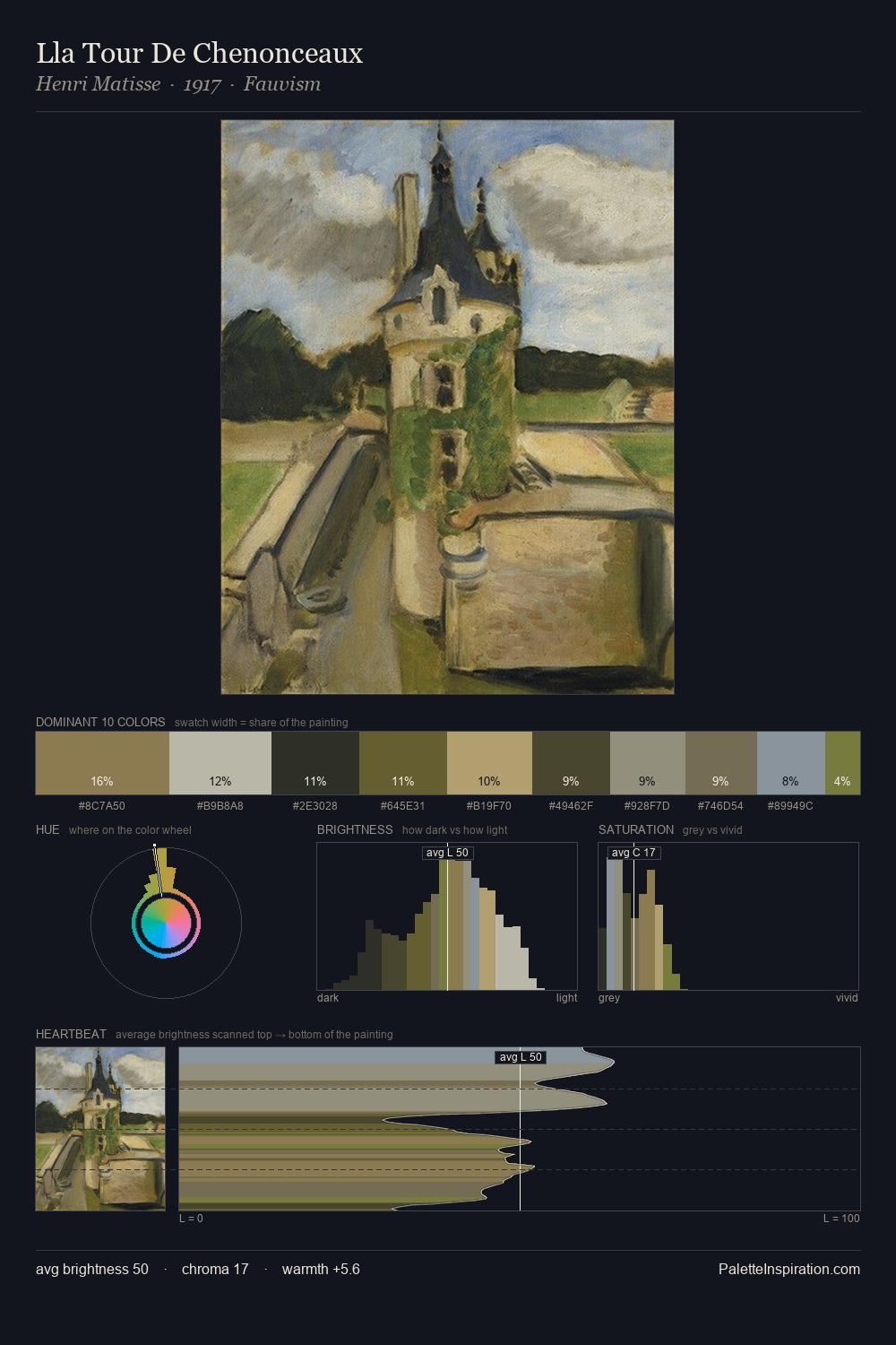
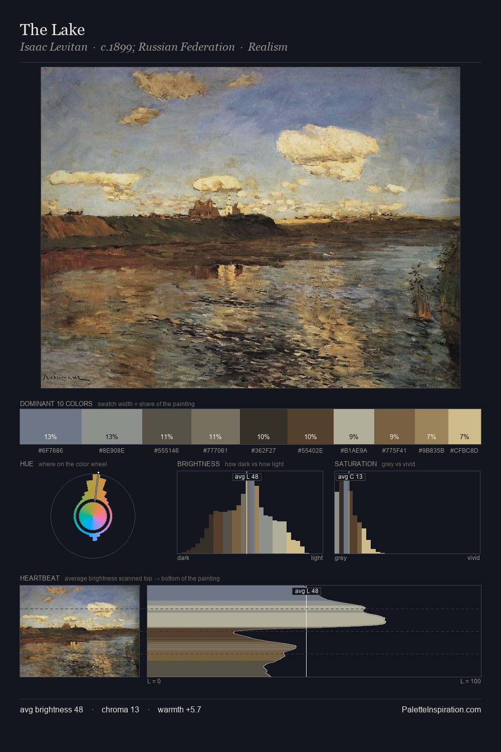
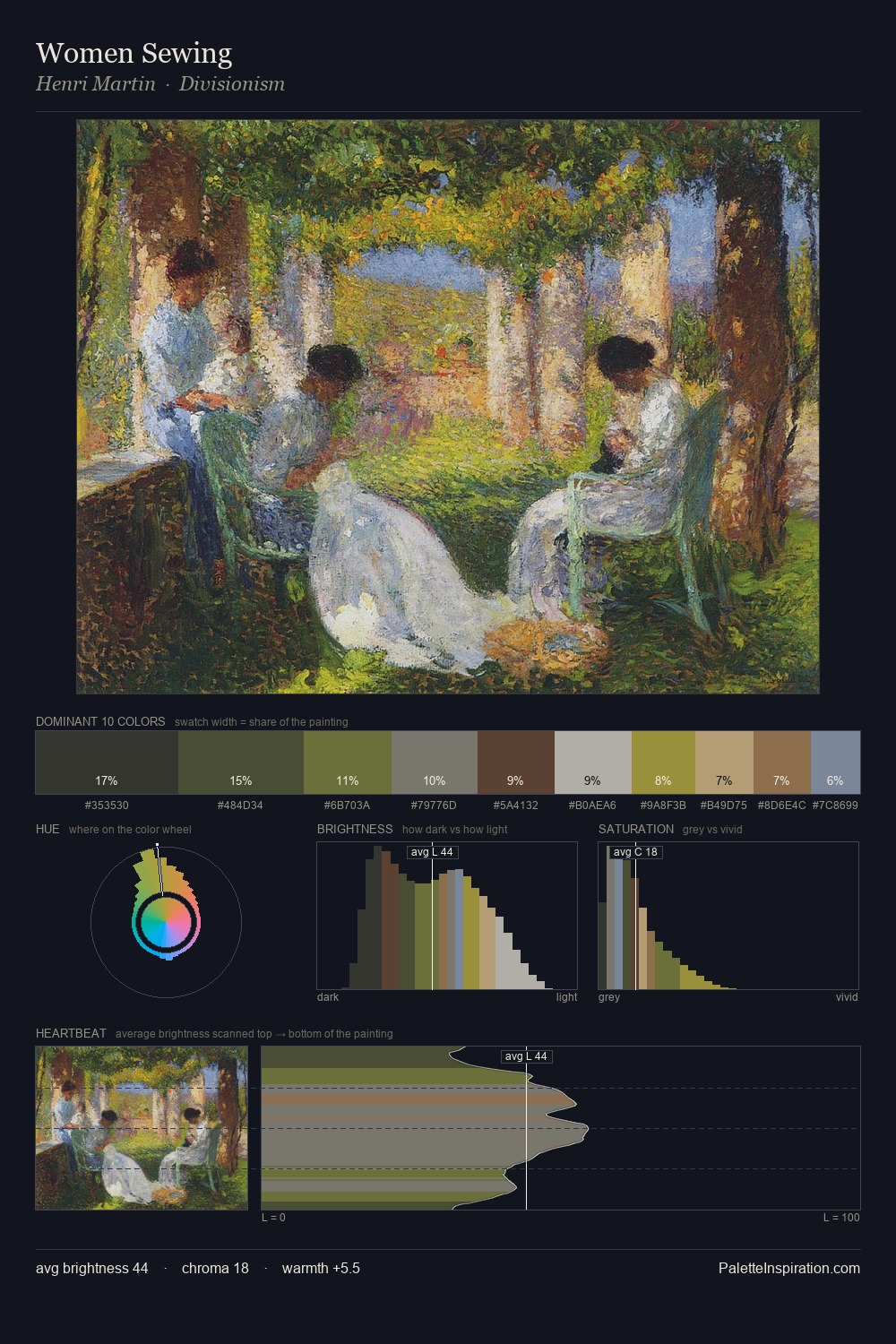
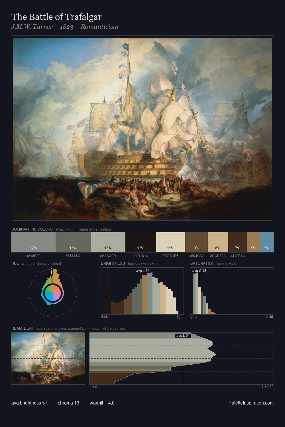
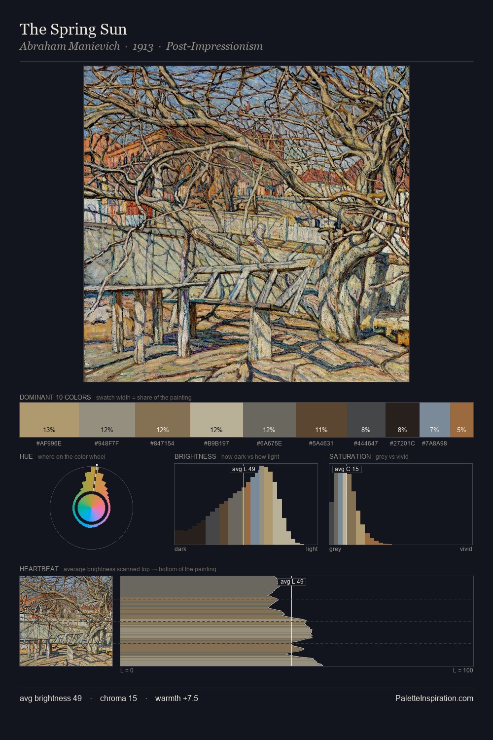
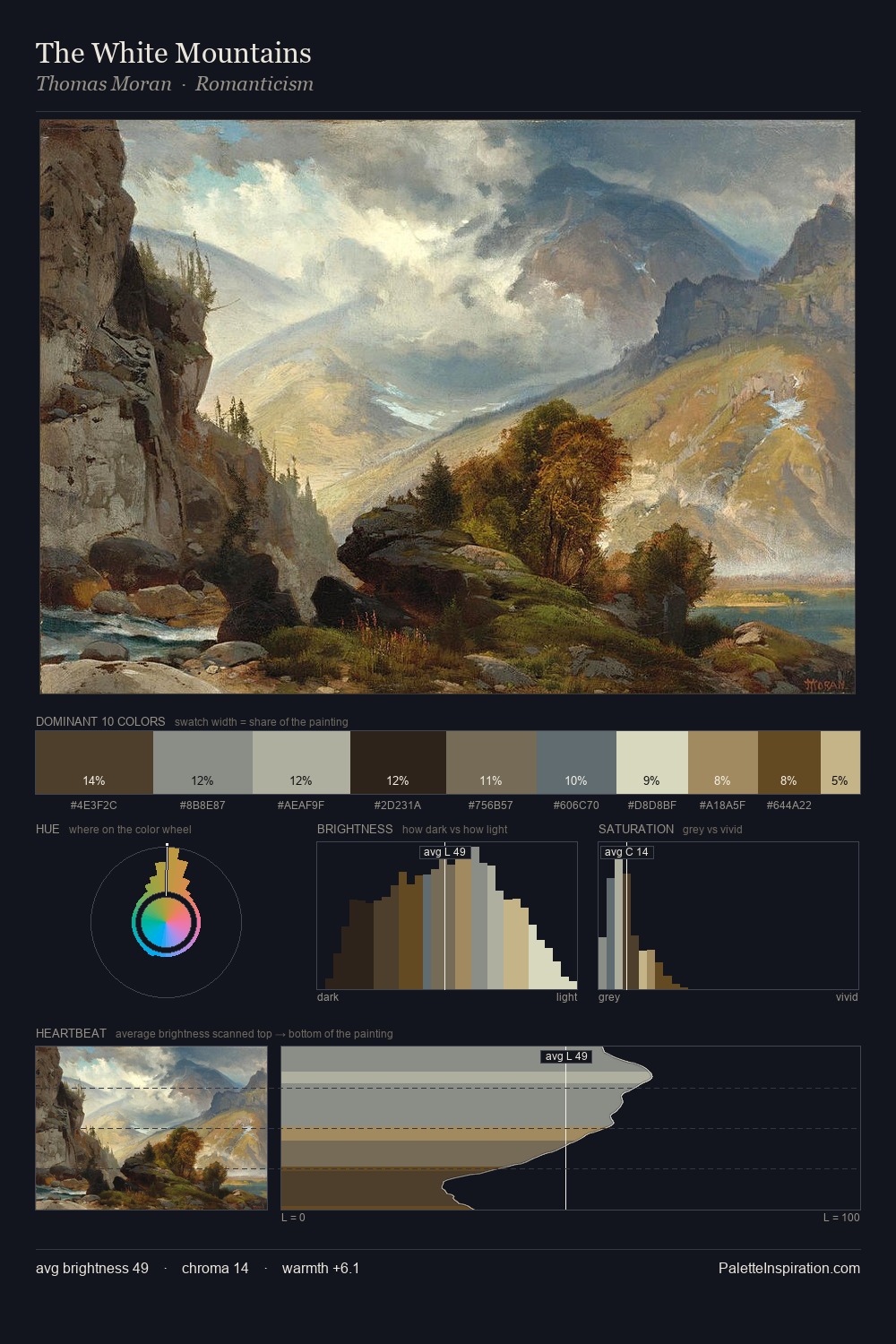
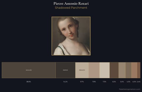
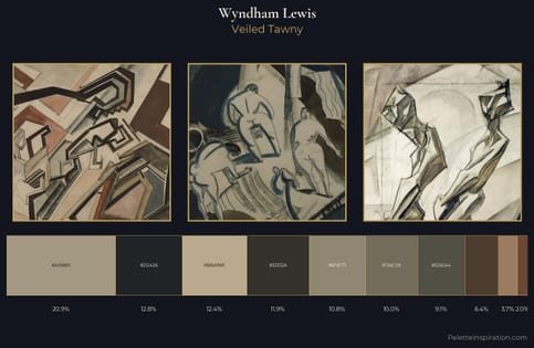
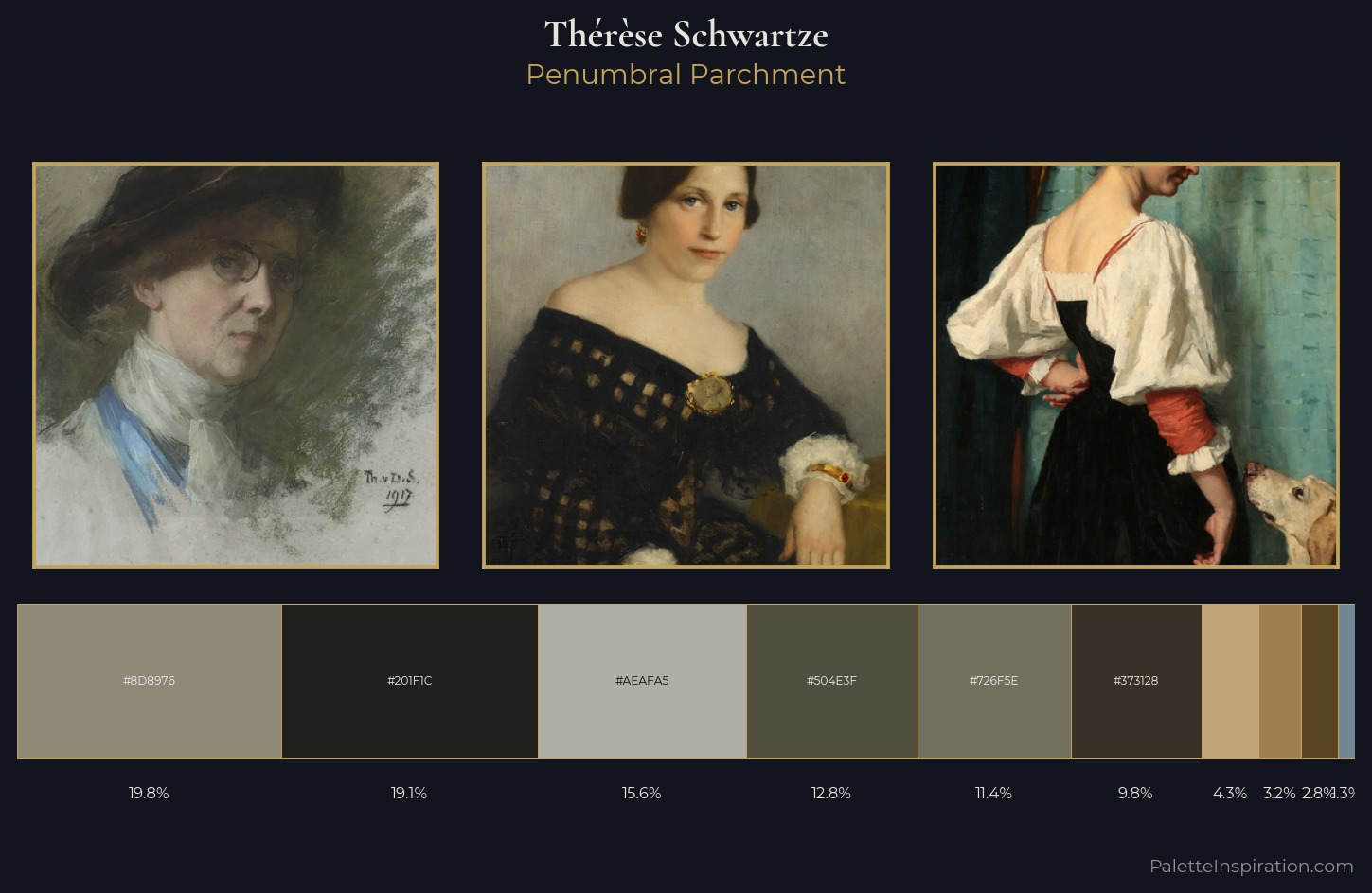
Thérèse Schwartze distributes its values across the middle register, creating harmony without high contrast. Thérèse Schwartze tilts toward cool - blues and silver-greys carry the structural weight. All colours lean toward grey, building depth through value rather than colour punch. #C0A77B delivers the chromatic peak at only 4.3% - a small shot of colour with outsized visual impact. Value range is moderate at 51 units - enough contrast for legibility, not so much as to fragment the tonal unity. The mid-to-high key, cool bias, and moderate chroma point to outdoor observation - sky and diffused daylight as the dominant light source. Thérèse Schwartze's palette 3 carries its own internal logic while remaining in conversation with the artist's broader colour intelligence.
Example use cases
- theater design
- jewelry brands
- tobacco-adjacent retail
- event branding
- film & entertainment
I Love This!
Copy, export, or download for your project