Theodore Gudin Palette 5
Muted Tawny
Muted Deliberately desaturated - chroma pulled toward gray, the restraint of tonal painting.
Tawny Warm orange-brown - a traditional term for the color of tanned leather or lion fur.

Palette Analysis
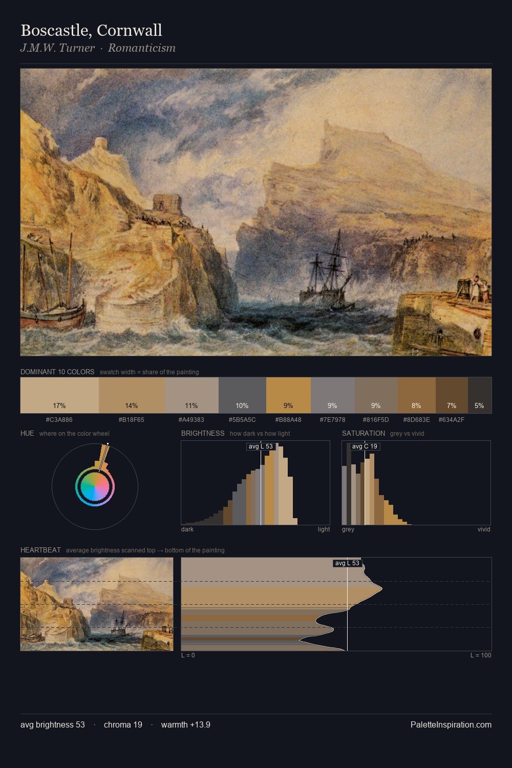
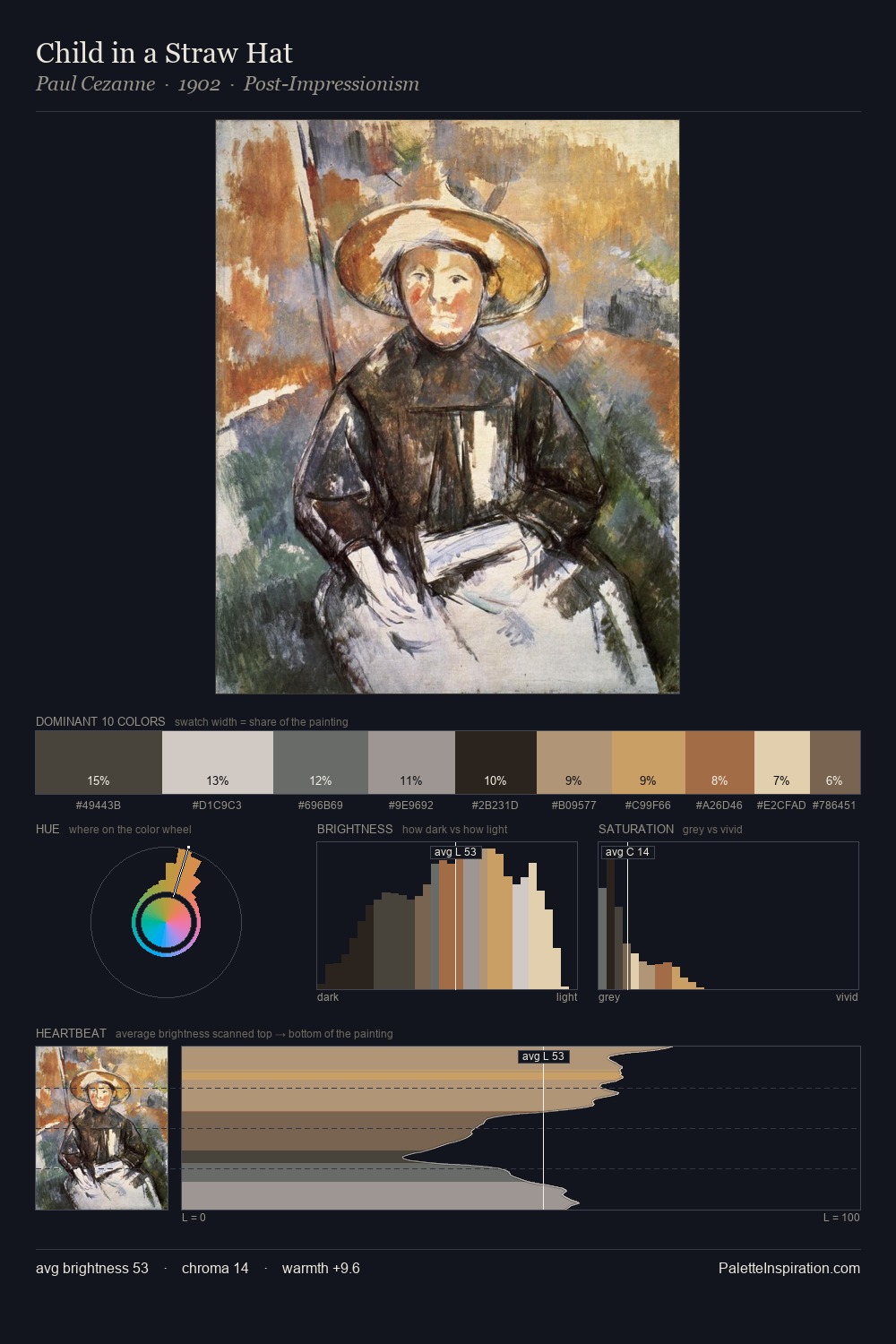
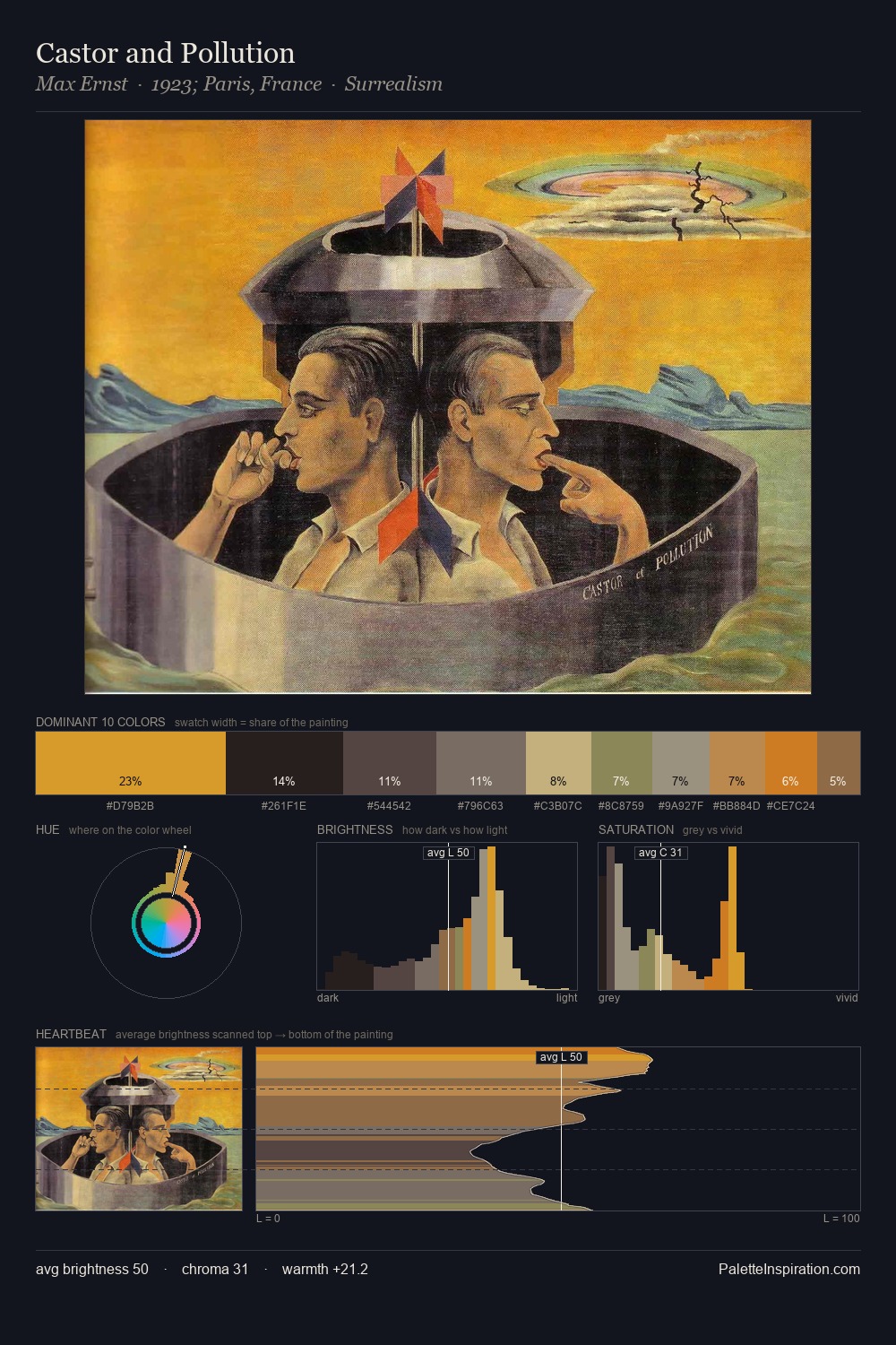
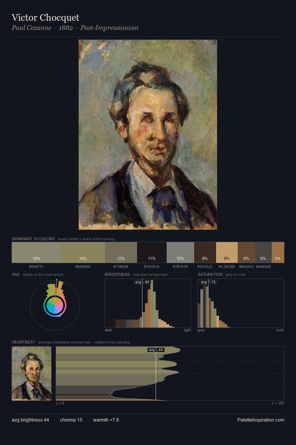
The value structure of Theodore Gudin is mid-key: quiet, controlled, and cohesive. Warm hues command this palette; Theodore Gudin favours the reds, oranges, and yellows of firelight and earth. Saturation is deliberately withheld - the beauty here lies in the near-monochromatic gradations rather than colour difference. The most saturated colour, #C3AA7E, is reserved to 5.5% of the surface, where it acts as a focal punctuation. 47 units of value spread create a palette that is varied but unified - contrast in the service of harmony. Palette 5 sits within the larger chromatic argument that Theodore Gudin's complete body of work advances.
Example use cases
- exhibition design
- foundation branding
- estate management
- art education
- museums & galleries
I Love This!
Use This Palette
Copy, export, or download for your project
Copy, export, or download for your project
Copy:
Download:
Share: