Theo van Doesburg Palette 1

Palette Analysis
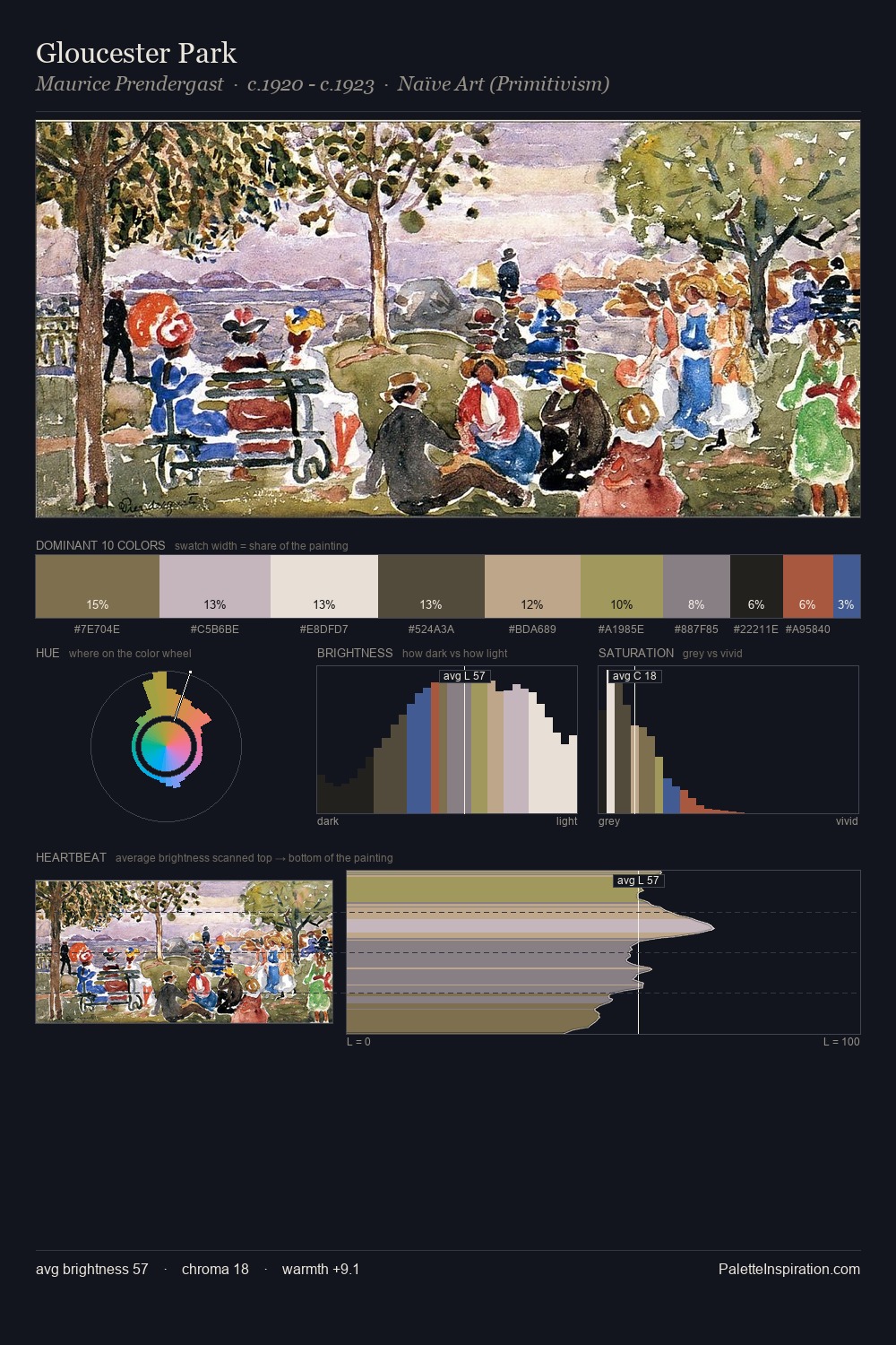
Theo van Doesburg works in the upper reaches of the value scale, creating an atmosphere of brightness and expansiveness. Theo van Doesburg builds on cool foundations: the palette favours the blue-cyan-green arc. Every colour is desaturated; the palette proceeds through near-neutrals and gently-coloured greys. The most saturated colour, #DCCFB2, is reserved to 4.9% of the surface, where it acts as a focal punctuation. The value range spans 83 units across the palette, providing the full gamut from deep shadow to near-white and ensuring clear tonal hierarchy. The palette has the character of outdoor light: cool, mid-bright, with colour rendered faithfully rather than expressively. Theo van Doesburg's palette 1 carries its own internal logic while remaining in conversation with the artist's broader colour intelligence.
Example use cases
- archival print
- university identity
- rare books
- cultural institutions
- nonprofit identity
I Love This!
Copy, export, or download for your project