Tavik Frantisek Simon Palette 1

Palette Analysis
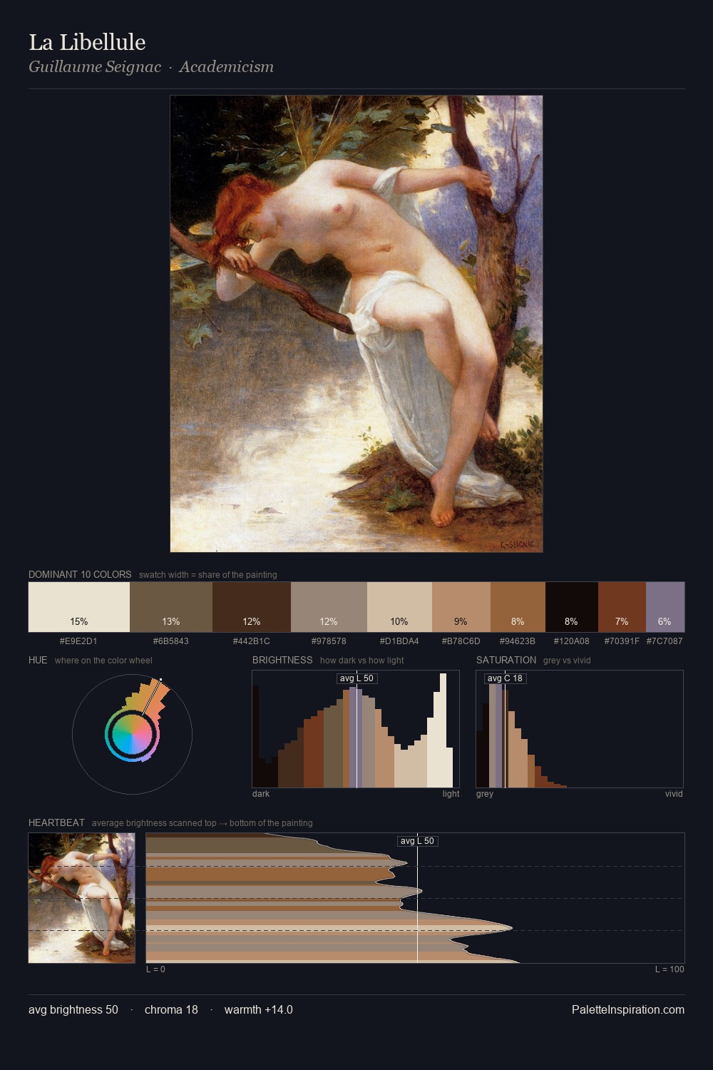
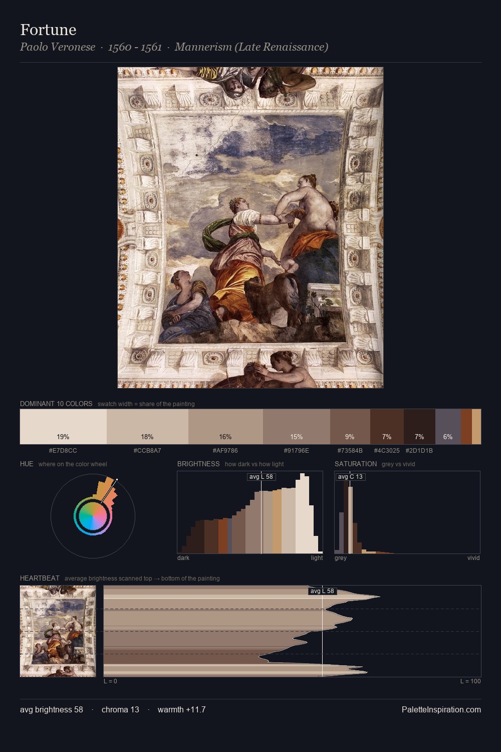
Tavik Frantisek Simon works in the upper reaches of the value scale, creating an atmosphere of brightness and expansiveness. Blues and teal-greys govern the palette, lending it an aquatic or atmospheric quality. Muted throughout, the palette achieves its effects through value and temperature rather than chromatic force. 27.7% of the palette belongs to #EBDCC8, a concentration that makes it the unmistakable visual centre. The highest-chroma note - #7C3613 - appears at just 1.2%, deployed as a precision accent against the quieter ground. Spanning 52 units on the value axis, the palette achieves the balance between tonal flatness and fragmentation. High luminosity and cool temperature suggest the plein-air condition: unfiltered daylight and open sky. Tavik Frantisek Simon's palette 1 carries its own internal logic while remaining in conversation with the artist's broader colour intelligence.
Example use cases
- ceramics & pottery
- boutique hospitality
- menswear
- heritage food brands
- craft & artisan brands
I Love This!
Copy, export, or download for your project