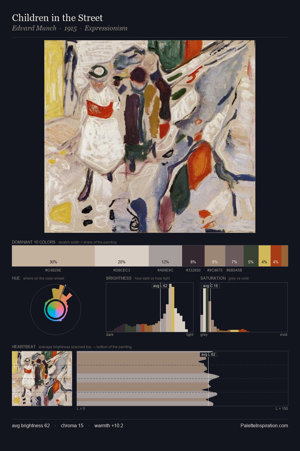
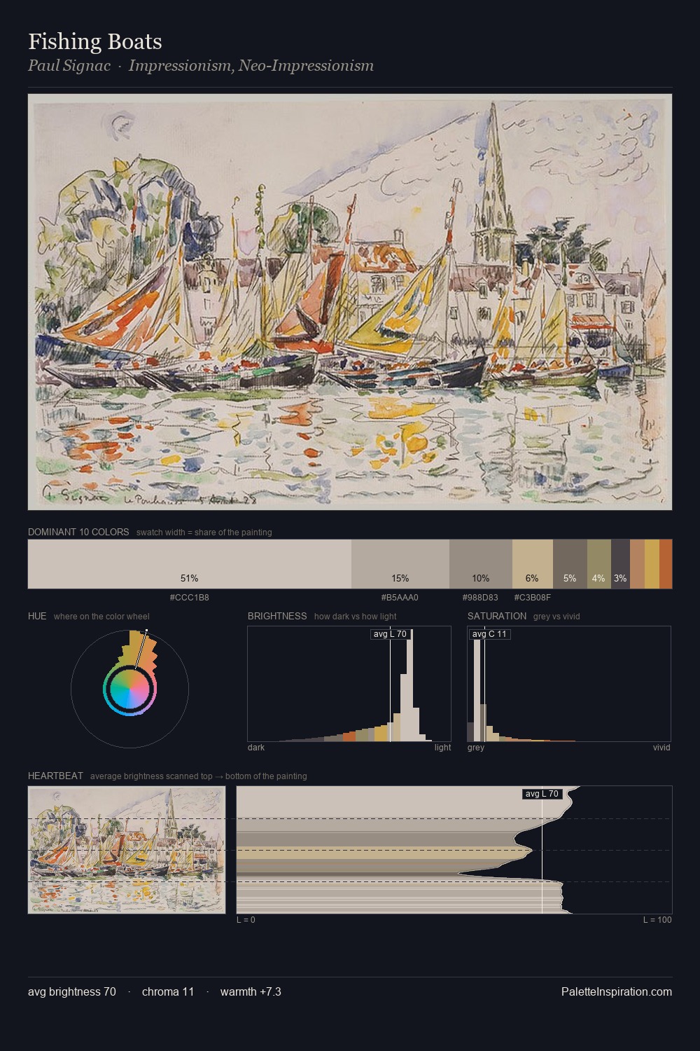
Balthasar Wigand Palette 3

Palette Analysis
Balthasar Wigand is high-key - luminous, open, and weighted toward light. Balthasar Wigand orchestrates warmth above all else - reds, ambers, and siennas take the lead. Chroma hovers near zero; colour declares itself through subtle shifts in hue rather than outright saturation. #D4CECA claims 30.8% of the surface, functioning as the work's tonal foundation. The most saturated colour, #C3B5A2, is reserved to 8.2% of the surface, where it acts as a focal punctuation. The value range spans 55 units across the palette, providing the full gamut from deep shadow to near-white and ensuring clear tonal hierarchy. Balthasar Wigand's palette 3 carries its own internal logic while remaining in conversation with the artist's broader colour intelligence.
Example use cases
- florist branding
- event design
- real estate
- jewelry retail
- hospitality branding
I Love This!
Copy, export, or download for your project