Tarsila do Amaral Palette 2

Palette Analysis
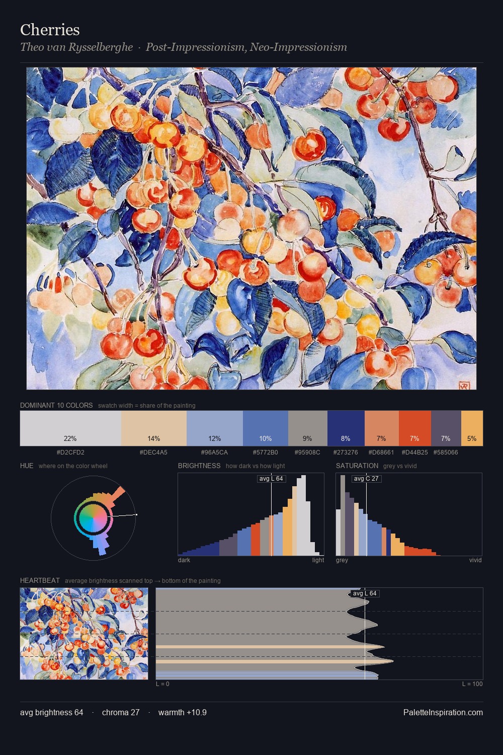
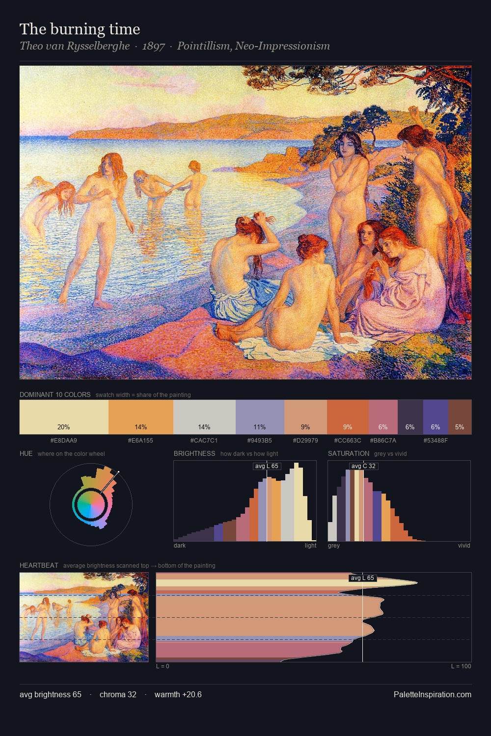
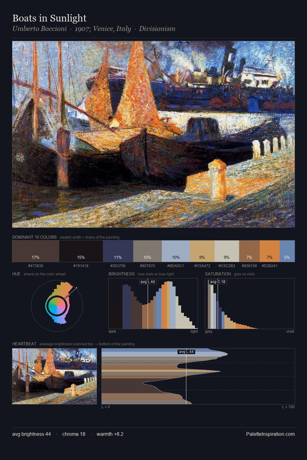
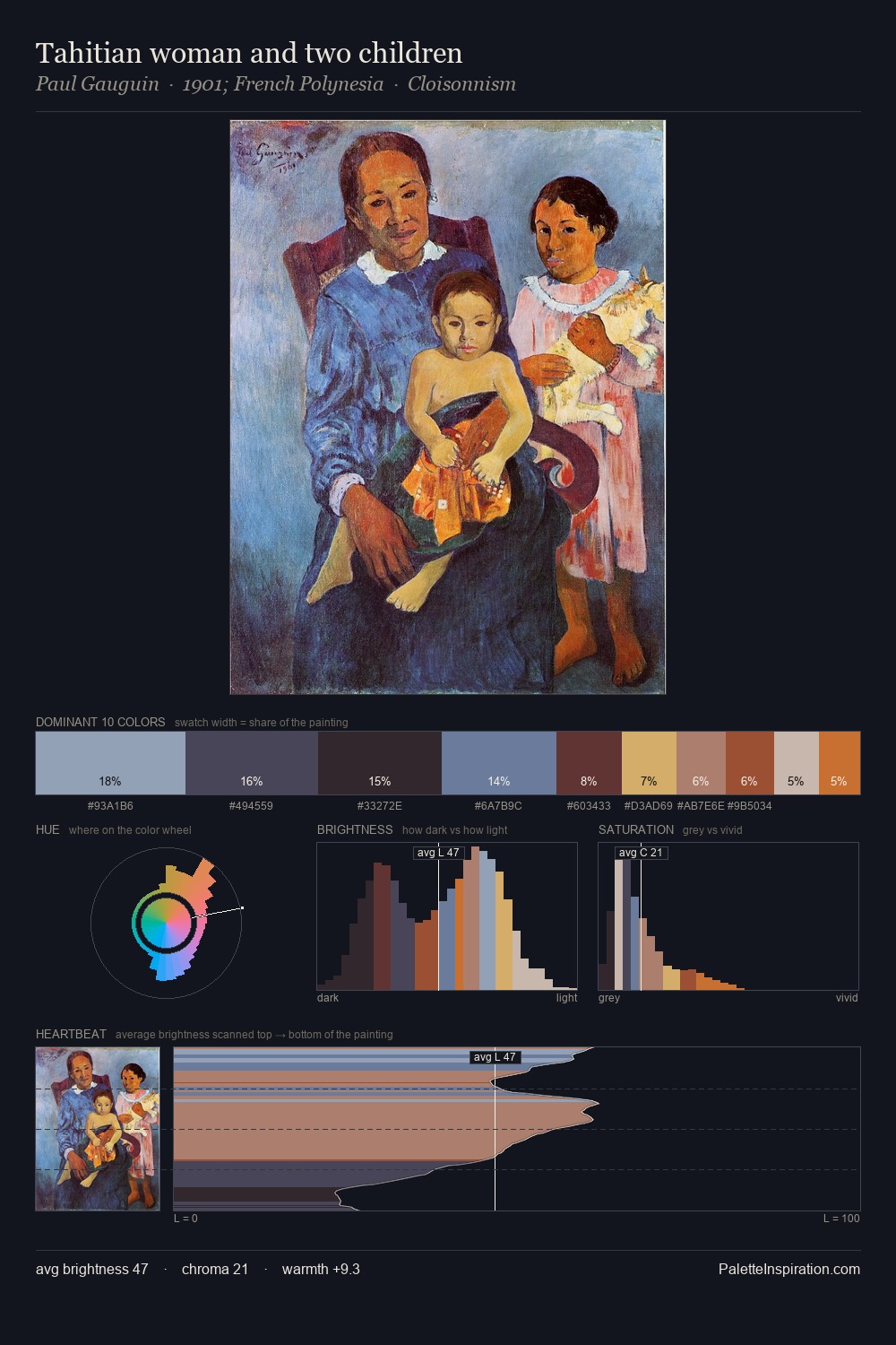
Tarsila do Amaral distributes its values across the middle register, creating harmony without high contrast. Cool hues prevail: blues, greens, and greys anchor the palette's emotional temperature. Colours are neither washed out nor blazing; they occupy the productive middle ground of the chroma scale. A single dominant - #82A4C3 at 31.1% - sets the character of the whole composition. #CF9F4E delivers the chromatic peak at only 4.9% - a small shot of colour with outsized visual impact. 54 units of value spread create a palette that is varied but unified - contrast in the service of harmony. The mid-to-high key, cool bias, and moderate chroma point to outdoor observation - sky and diffused daylight as the dominant light source. Tarsila do Amaral's palette 2 carries its own internal logic while remaining in conversation with the artist's broader colour intelligence.
Example use cases
- publishing
- corporate identity
- consumer apps
- hospitality
- design agencies
I Love This!
Copy, export, or download for your project